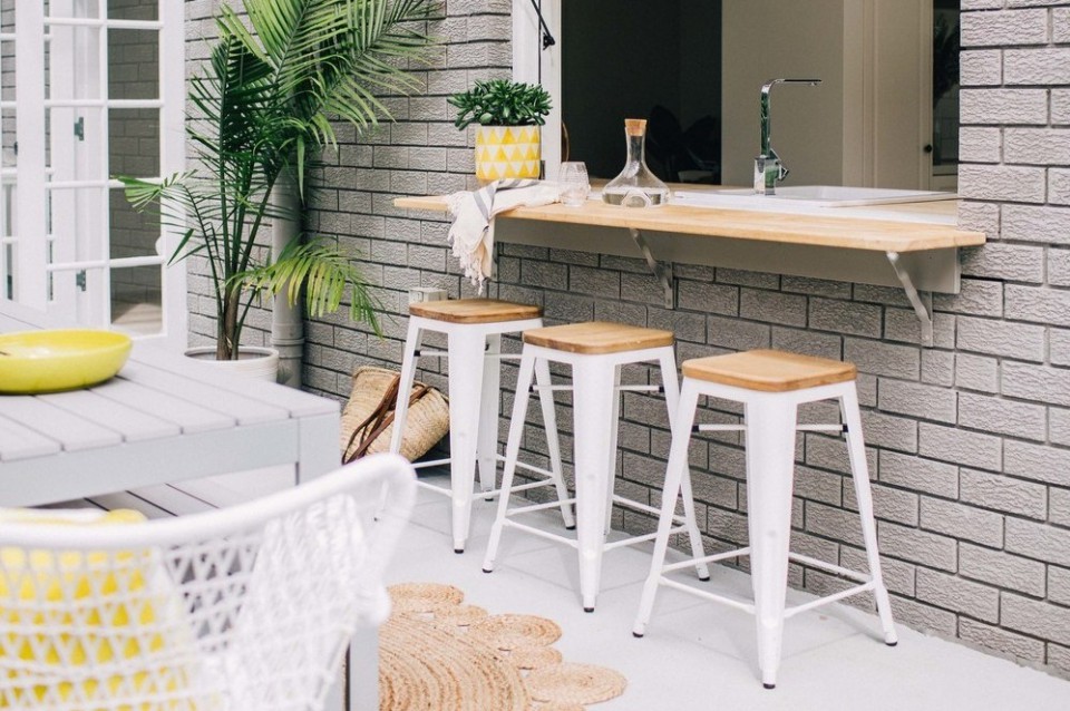
A Stunning White and Grey-themed Kitchen to Inspire Your Kitchen Design
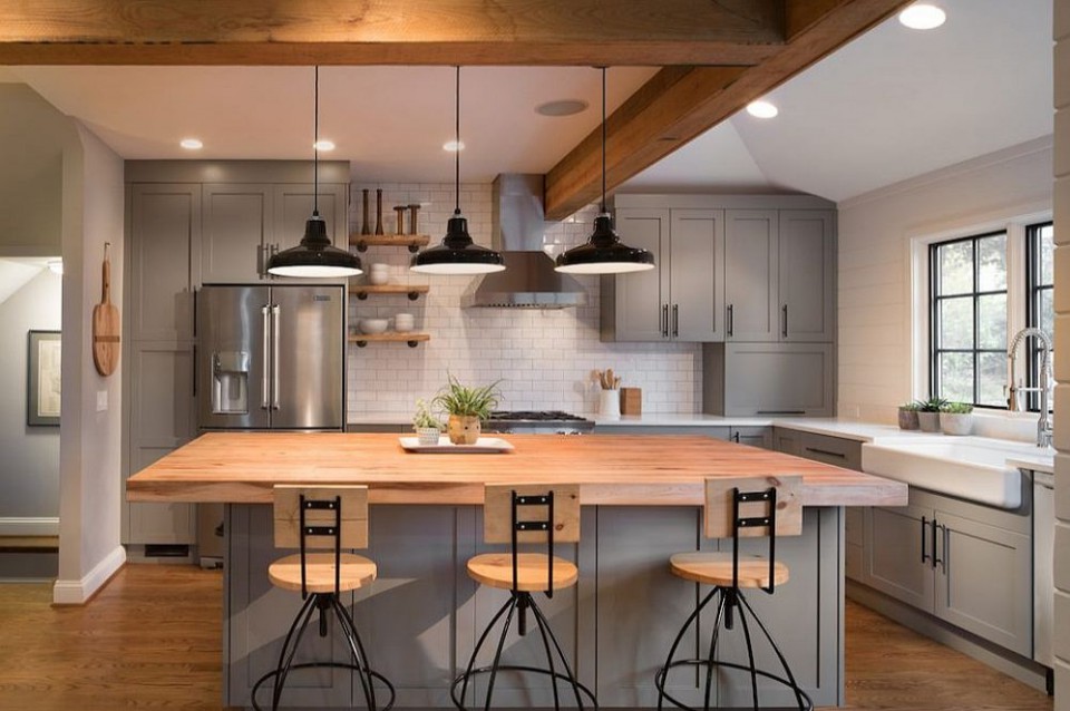
Gray and white are neutral colors. Gray itself has become increasingly popular as a beautiful color for various spaces within the home. The combination of gray and white is a fairly modern and popular color scheme lately, showcasing a cool and stunning style. Gray has shifted from being a neutral and complementary color to a primary color in the room. Here are examples of the use of these neutral colors as the primary colors in the kitchen.
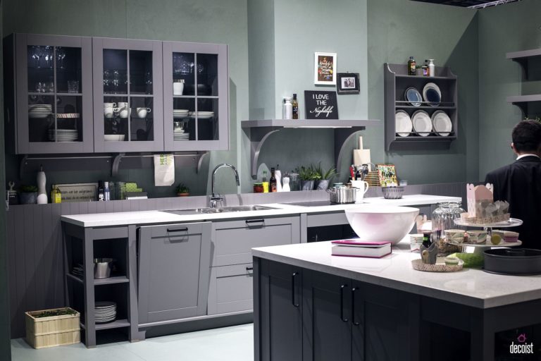
A modern kitchen is seen adorned in shades of gray with minimal lighting. The white color on the kitchen table and floor helps reflect light in this predominantly gray space. Furniture in the room, such as cabinets and shelves, looks neat with this setup.
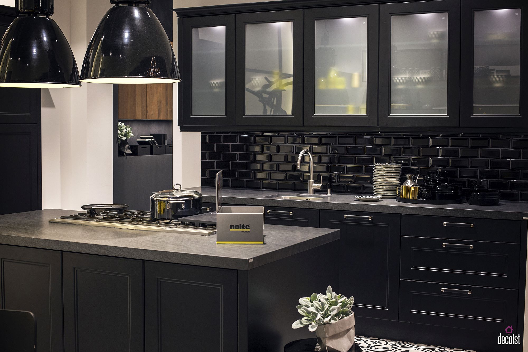
This time, gray is paired with black, giving the room a more elegant and luxurious appearance. Additionally, the black color in the room appears glossy and reflects light. The frosted glass on the cabinets obscures the contents of the shelves, making the room look more organized.
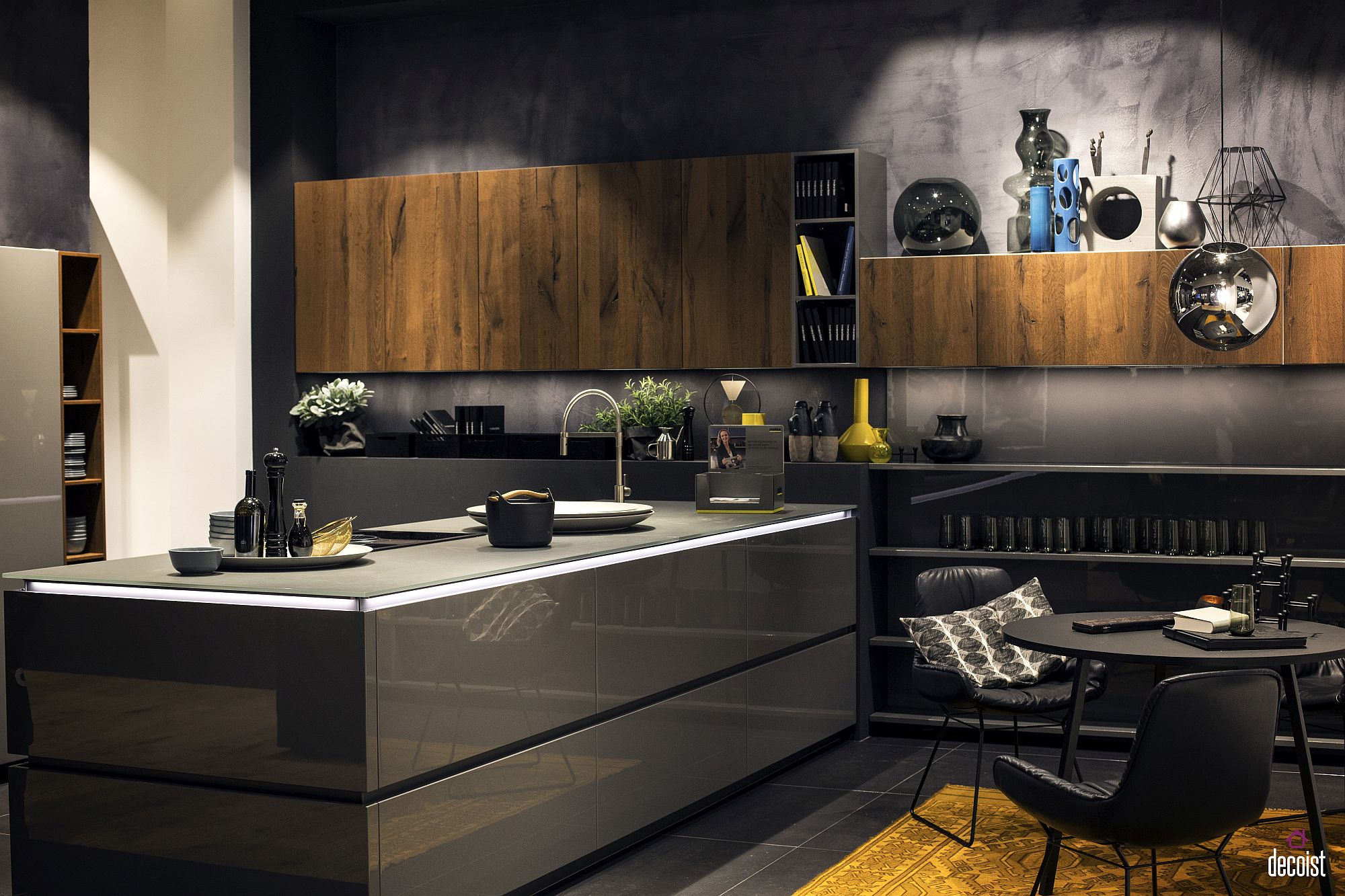
The combination with wood materials can be equally captivating. The color and texture of wood become prominent accents in a room dominated by gray. With the right lighting, a beautiful and serene atmosphere can be created in this kitchen. The presence of wood color prevents the room from feeling monotonous.
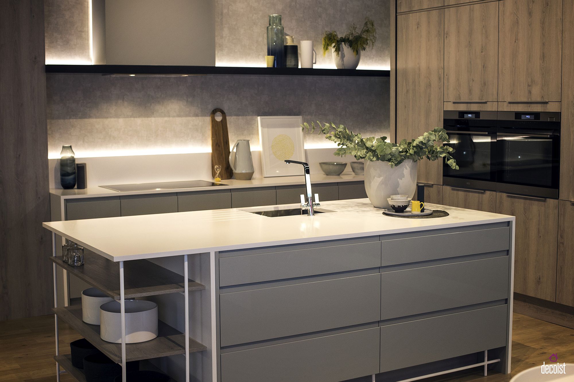
Gray that leans towards white can also be attractive in this design. Of course, the room appears brighter. Moreover, there's lighting under the open storage shelves. The right lighting will undoubtedly make the room feel more calming.
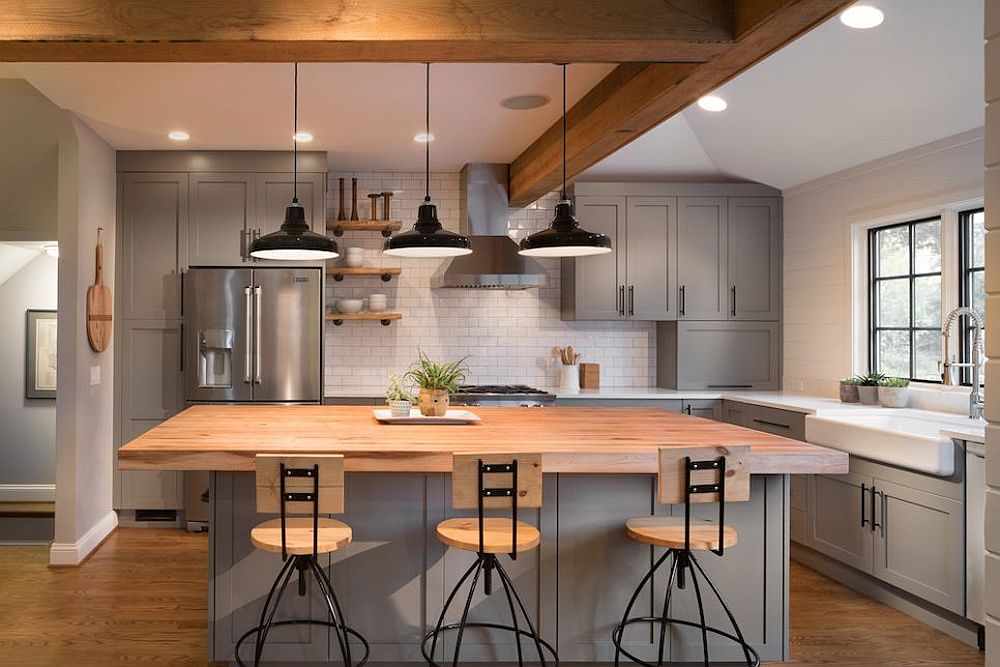
Natural and enjoyable. That's the impression given when looking at a kitchen with a combination of three colors: gray, light wood, and white. These colors bring the room to life. Various elements in the room feel just right. Certainly, the wooden table and benches become points of interest in the room. Maximum lighting is obtained from lamps and natural light.
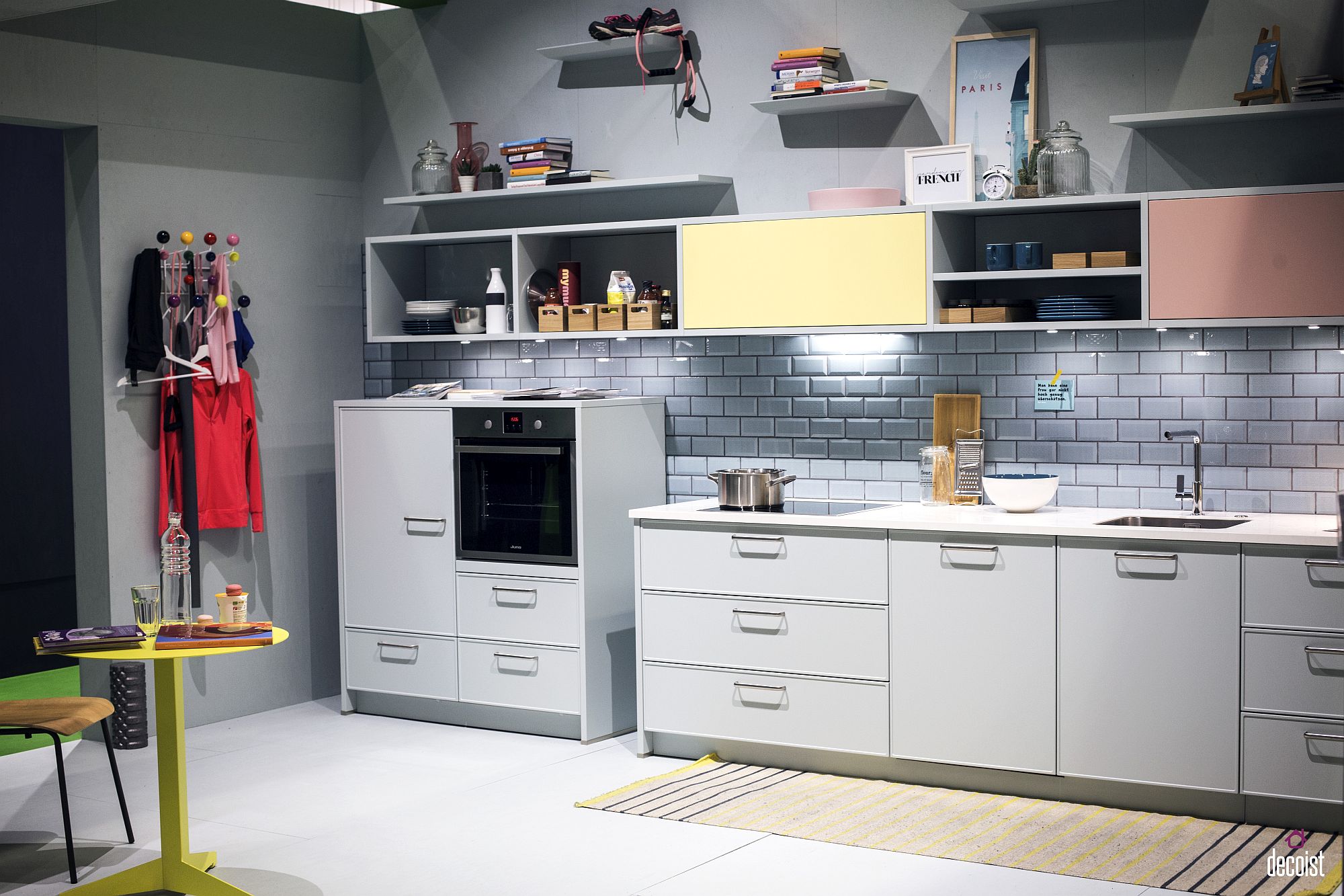
White needs to be enlivened with a variety of colors, as seen in this design. A few pastel color accents on the shelf doors can add a touch of cheerfulness to the kitchen. This area looks very clean. Furthermore, the tile arrangement on the kitchen wall enhances the room's beauty.
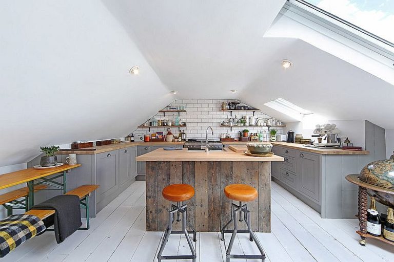
Aside from color, the shape of the kitchen also significantly affects the ambiance of the space. With a sloping ceiling and skylight, this kitchen feels more intimate and welcoming to those inside. Fortunately, the ceiling color is white, so the room doesn't look too cramped, providing relief in this kitchen design.
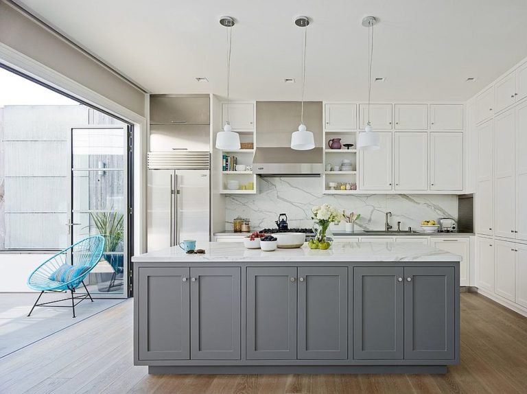
When the room is adorned with mostly white furniture, adding patterns like marble on the walls, as seen in the picture, provides a unique touch. Its gray color becomes the focal point of the room due to its strong and contrasting hue compared to other colors in the kitchen.

For those who enjoy gathering, eating together, and having a good time in one room, a kitchen equipped with a table and benches can be the right choice. It makes it easy for people inside to grab something from the kitchen. A sturdy and masculine touch is evident with the dominant dark color in this room.
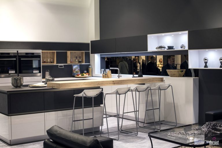
Black and white blend beautifully in this design. The balance between these two colors is clear, as neither dominates when we look towards this kitchen. Not only is the balance evident, but the arrangement of these two colors on the walls and furniture is also suitable and not monotonous.
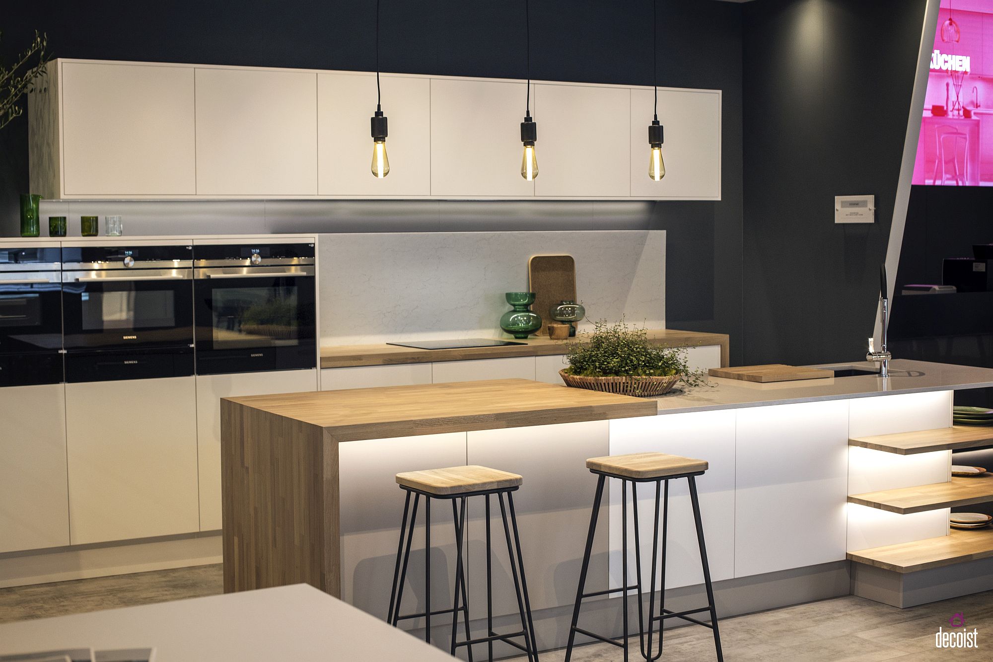
There's no doubt that wood material significantly helps bring life to a neutral-toned room. Additionally, the yellow light from the lamps makes this room feel warmer, surrounded by the black and white color scheme that gives a cool impression.
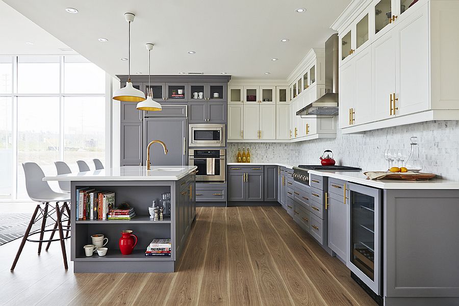
Returning to the combination of gray and white, the room feels slightly formal. The golden-colored panel moldings on the doors also add a luxurious accent to this room. Despite the rigid form of the furniture, this kitchen has a focal point in the golden yellow color, which is the uniqueness of this kitchen."
Source: grey kitchen


