Bicycle shop, a place with a foreign and enjoyable ambiance.
Bicycling is a fun sport, and so is visiting a bicycle shop and browsing through everything inside. However, many bicycle shops have poorly designed interiors and neglect aesthetics. Yet, if the interior design is impressive, it could potentially increase visitors' interest in buying bicycles. For those of you aspiring to open a bicycle shop, here are some bicycle shop design references that are not outdated and have their own allure.
" Factory Five" - (Shanghai)

source picture: soigneur.nl
The first design reference is Factory Five, a cool bicycle shop located in Shanghai, China. The interior design is an excellent example of the exposed material theme. Upon entering the space, you'll notice exposed concrete floors, and further inside, exposed brick surrounds the interior. Moreover, the first view visitors encounter is a row of bike parts placed on wooden shelves and frames hanging from the ceiling, even bikes displayed on the floor. A bar table is set up for sitting or discussing bikes with the shop owner. It's a simple and on-point design. Isn't it appealing?
"Pelago" - (Helsinki)

source picture: soigneur.nl
Next is Pelago, a small, compact, and well-stocked bicycle shop. Pelago gives off a vibe of a straightforward yet attractive bicycle shop. The interior design appears quite ordinary and does not require a significant budget. However, it may not catch the attention of the average passerby to step in and explore the shop unless they are looking for specific spare parts. If you want to create a bicycle shop like this, consider adding colorful decorations and small tables and chairs to encourage longer interactions between customers and the shop owner.
"Velo Cult" - (Portland)

source picture: soigneur.nl
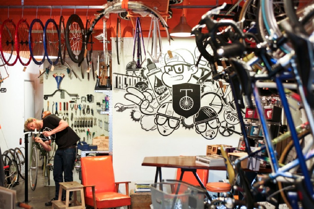
This shop provides a unique first impression, unlike the typical bicycle shops. Upon entering the interior, visitors are greeted by a row of bicycle servicing tools meticulously organized for an aesthetic appeal. The layout is spacious, with a bar concept dedicated to bicycle servicing. Additionally, the ceiling area is adorned with a display of upside-down bicycles to reinforce the interior's theme. Another interesting feature is the availability of tables, chairs, and a designated bar for refreshments. A spacious area, stylish design, and comprehensive facilities make customers want to keep coming back and linger.
"PAVE" - (Barcelona)

source picture: Soigneur.nl
If you have ample space for a bicycle shop and desire a design with a "wow" factor that is simple and clean, PAVE could be the ideal reference. PAVE creates an atmosphere so welcoming that customers may forget it's not just a bicycle shop. PAVE offers comprehensive facilities, including customer seating, toilets, and a coffee corner. For anyone uncertain about purchasing a bicycle, a stop at the coffee corner for a relaxed coffee break and contemplation may be the solution. The bicycle displays are captivating and Instagram-worthy.
"MELLOW JONNY'S" - (Austin)

source picture: Soigneur.nl
Lastly, the final design reference emphasizes the functional proportion of the interior as a whole for displaying multiple bicycles simultaneously. This shop has enough space to showcase dozens of bicycles of various types at the same time. Moreover, the circulation area for walking around and viewing bicycles is quite spacious. Even though there is also a coffee corner and a place for cyclists to hang out, the focus remains on the bicycle displays.
In conclusion, these are brief insights into design references for bicycle shops that may inspire you.

