Interior Renovation of a Minimalist Japanese Home Perfect for Your Inspiration!
The house located in Suita, Japan, has a minimalist design after undergoing renovation from its traditional Japanese appearance. This 92-square-meter dwelling has two floors that were completely transformed in both function and appearance. Alts Design Office, the architectural firm behind it, successfully brought beautiful ideas to life to make the residence more aesthetically pleasing and comfortable.
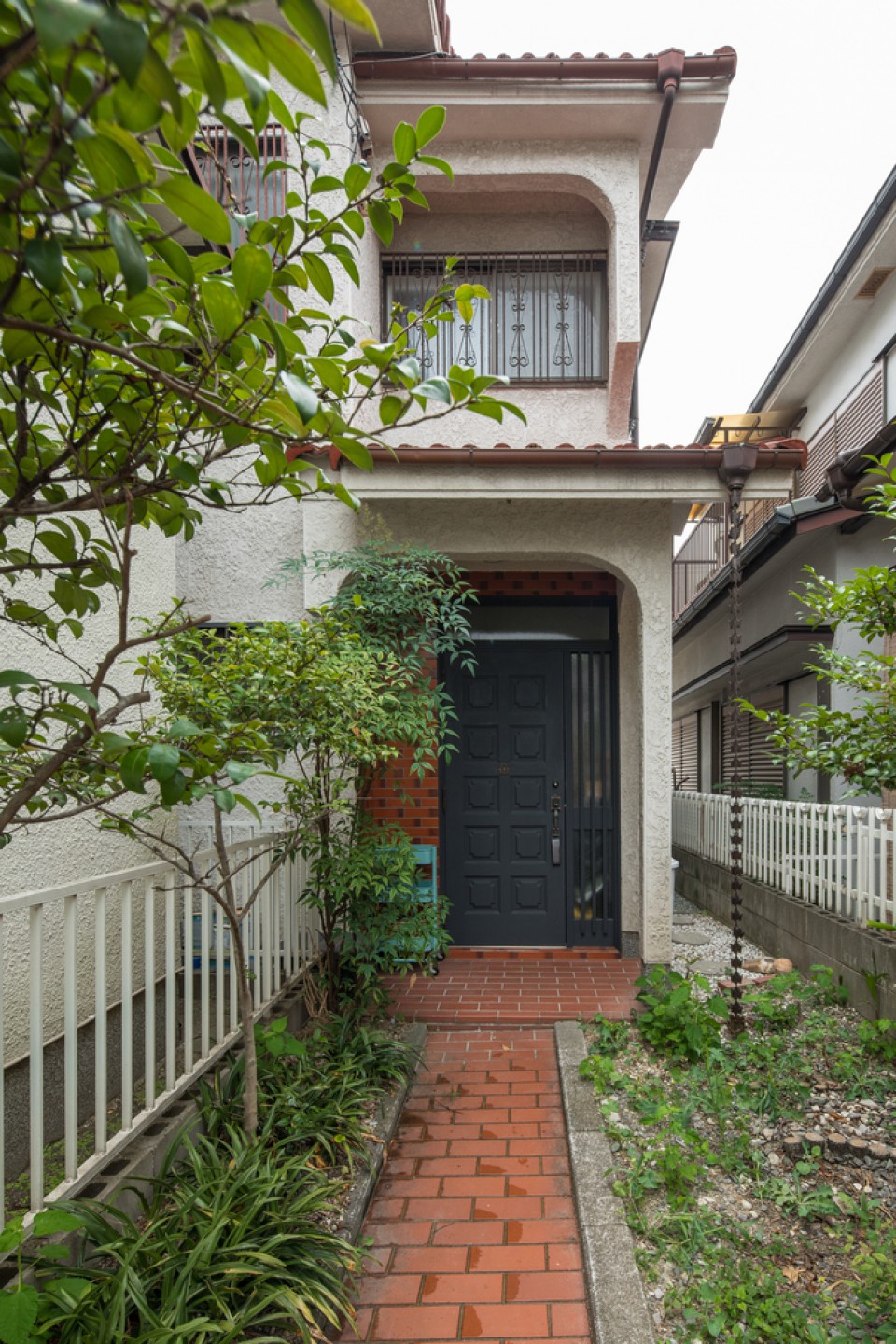
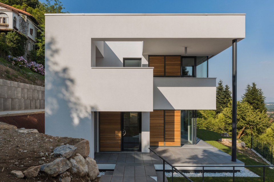
From the outside, the house appears quite ordinary, blending in with the surrounding homes without standing out. The narrow spacing between houses is typical in this area, and the high cost of land makes renovation a more attractive option than rebuilding. The entrance features an elongated pathway and a small garden in the front and on the side. Although the front only reveals a narrow walkway, you'll be amazed when you step inside.
This house has been standing since 1981 and was built with earthquake-resistant construction. Naturally, the renovation had to consider the necessary structural changes to maintain earthquake resilience.
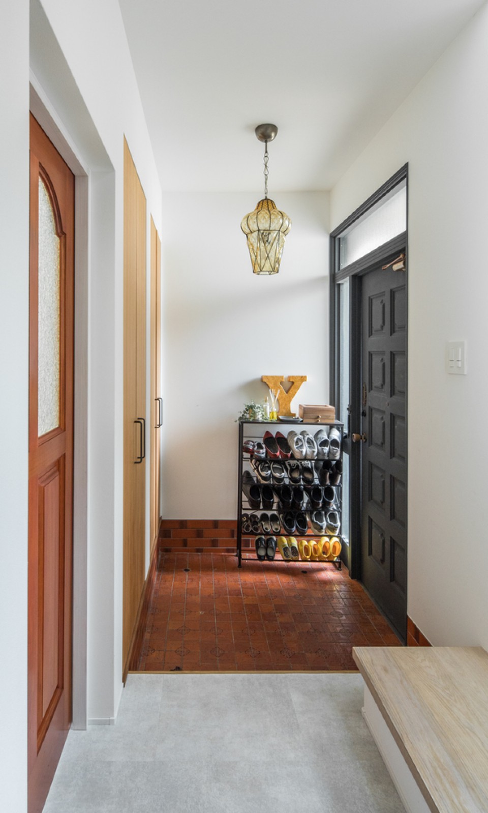
Upon entering the house, you can easily notice the difference in the renovation. Like most Japanese homes, there's a "genkan" area, which serves as a mudroom where shoes can be removed and neatly organized on racks. Additionally, there are storage cabinets for various items needed when going out, such as raincoats or jackets, making it convenient for residents when entering or leaving the house. In this area, the flooring remains in a brick-like appearance, harmonizing with the exterior and serving as a visual divider for the interior.
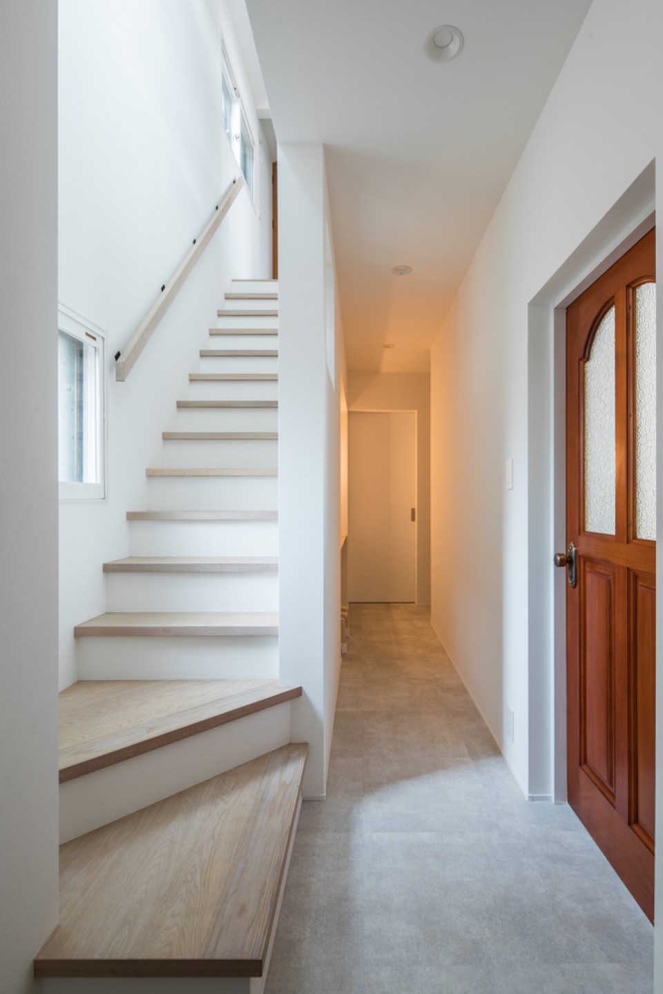
The corridor surrounding the rooms is painted in white, making this narrow space feel open and bright, with natural light coming in through the staircase area. In addition to the color, the stairs have been made safer and more comfortable with covers on each step, which is especially important for households with young children.
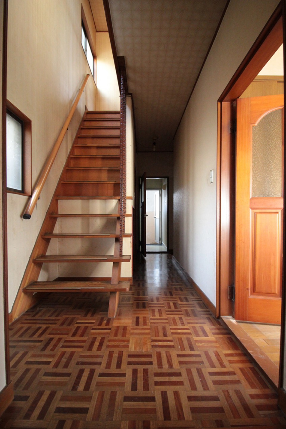
In the previous design, this corridor had a darker ambiance with wooden floors and stairs. Not only was the appearance transformed, but the function of this floor changed as well. The living room and kitchen that were originally on this floor have been converted into bedrooms. Therefore, this floor now houses three bedrooms with an external bathroom. This unique arrangement makes this floor a private area for the occupants.
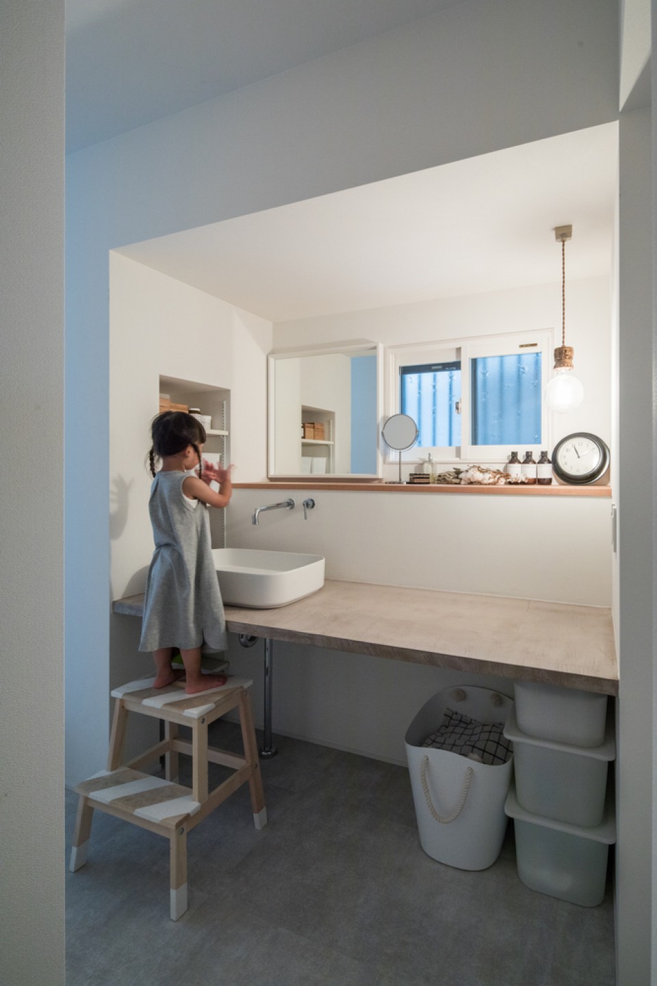
The bathroom and sink area on this ground floor are also well-lit and comfortable for the residents. Children will not be afraid of this bright and spacious living space. This ground floor underwent significant changes, including the addition of partitions and the reassignment of room functions to meet the needs of the occupants. The minimalist design makes it easier to choose materials and maintain the earthquake-resistant essence of the house due to its strong construction.
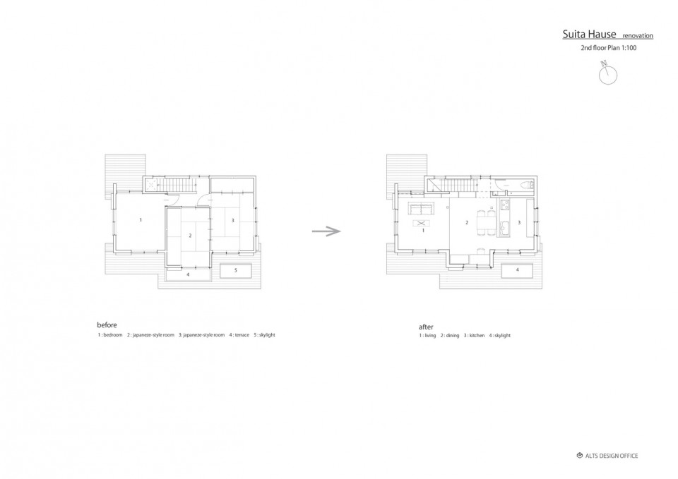
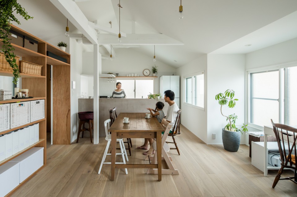
The second floor also saw significant renovations. The three separate rooms with tatami flooring were combined into one, removing room partitions. Two tatami rooms were transformed into a kitchen, dining room, and a workspace, while the room originally used as a bedroom became the family room.
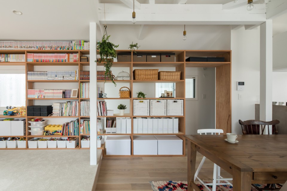
This upper floor is incredibly spacious and open. Wooden shelves separate the space between rooms and the staircase and are filled with various collections, toy boxes, and storage for various equipment and necessities. The consistent color scheme creates a calm and comfortable atmosphere in the room.
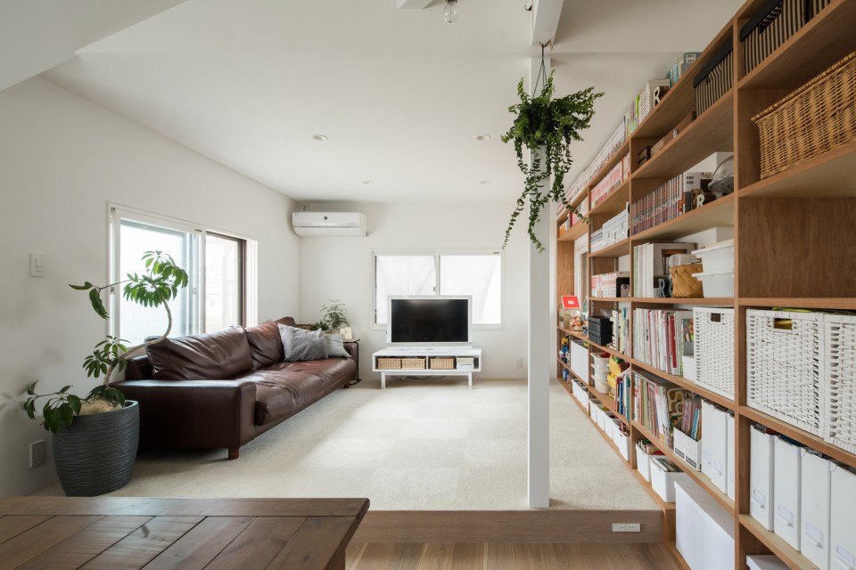
In the family room, there are three windows on each side, allowing maximum light to enter and be reflected in all directions. The bookshelf windows are elegantly designed, avoiding obstruction from decorations or objects around them.
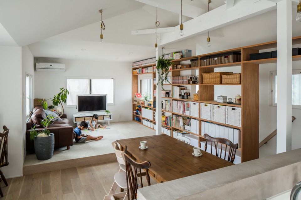
The family room has a raised floor compared to the dining area, serving as a natural divider between the spaces. A comfortable, elongated sofa and a television complete the room. Not only is the floor different, but the ceiling also differs in design. The family room has a flat ceiling, while the dining room and kitchen are designed to expose their structural elements.
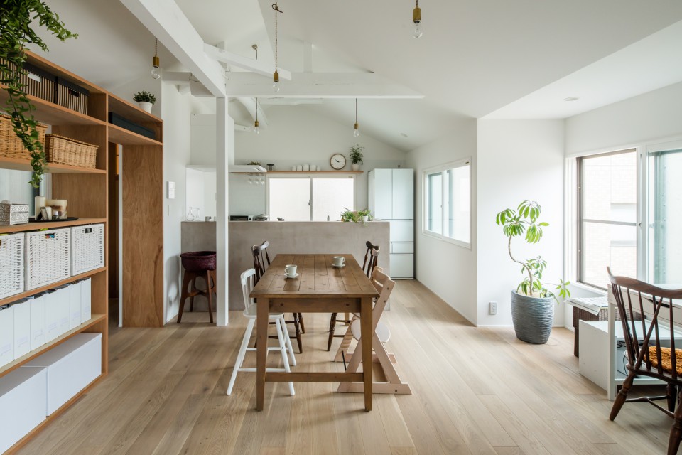
In the dining room, there's a wooden dining table and various chairs with diverse colors and shapes to accommodate the children. The soft-colored wooden floor, combined with natural light, creates a relaxed atmosphere. Hanging pendant lights also adorn the room.
The kitchen, located at the back, is separated by a wall with a height of approximately 1.5 meters to keep it less exposed. Various kitchen appliances and furniture are in white. The incoming light makes the kitchen very comfortable for activities.
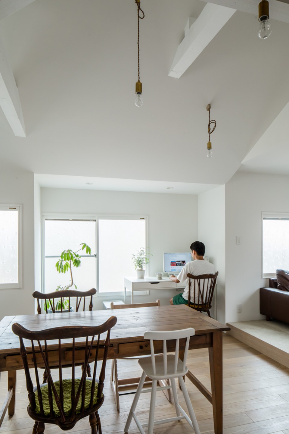
In the same area, there's a white table near the window that serves as the father's workspace. The monitor screen is mounted on the wall to avoid glare while working due to excessive light. The window can be opened to provide fresh air.
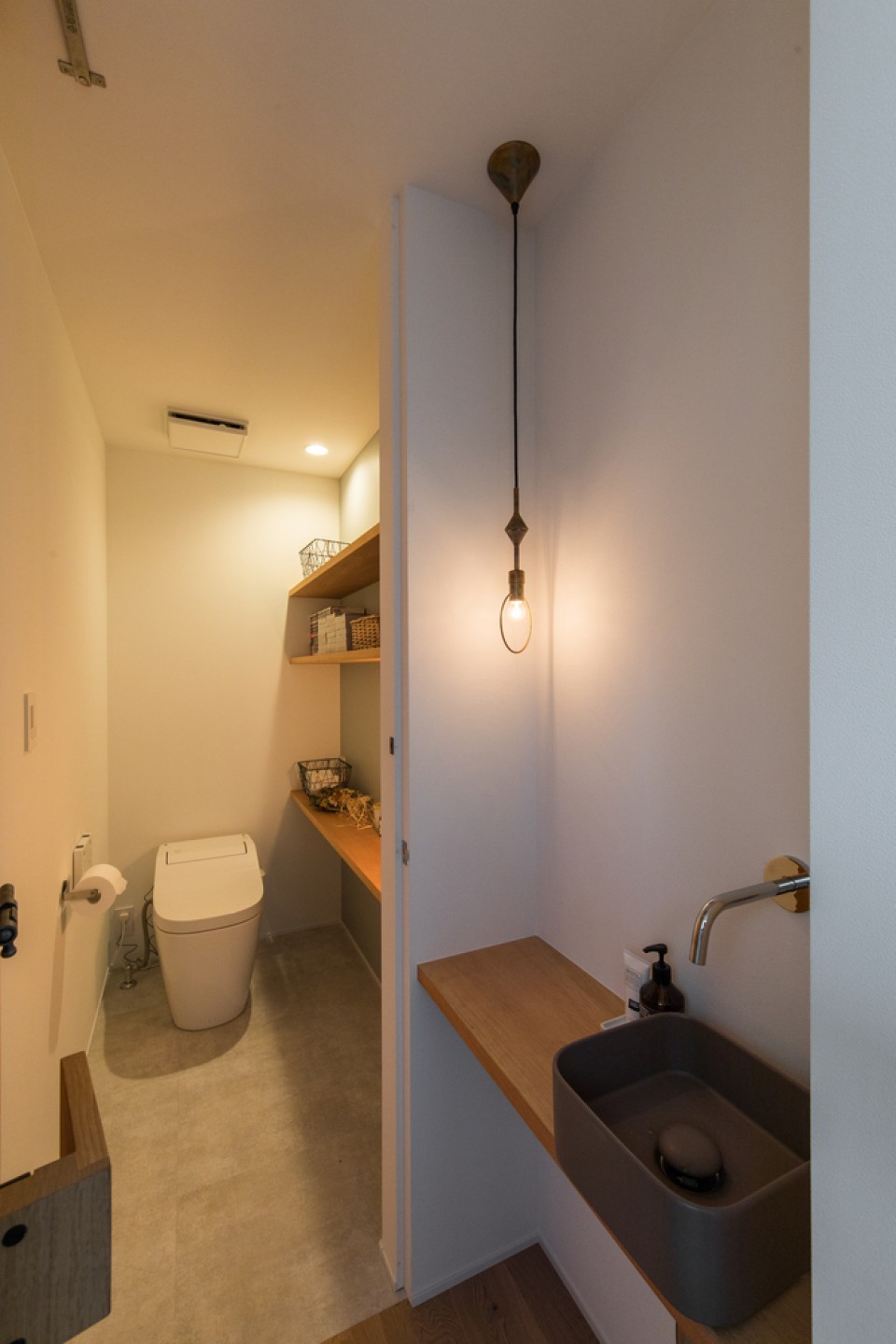
The last room on the second floor is the toilet. Having a toilet on this floor is essential for convenience since it would be uncomfortable to go up and down the stairs just to access it. This toilet is equipped with a sitting toilet and a sink. On the wall, there are open shelves for storing various toilet necessities. This elongated space is well-designed and simple.
Looking at this minimalist Japanese house, it's clear that it was well-designed by the architect from Alts Design Office. By utilizing small spaces, combining colors and materials, and maximizing natural light, the comfort of this design is far superior to the previous layout. Additionally, materials from the previous interior were repurposed, evoking a sense of nostalgia.
source: S house Renovation


