Shades of Grey: An Apartment with Grey Tones in Every Corner
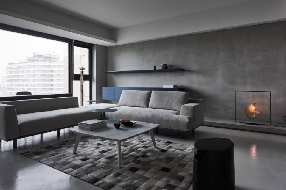
Grey, it turns out, can make a home feel elegant and captivating while adding a touch of sophistication to the interior. In an apartment located in Taipei, Taiwan, concrete walls, cement floors, grey tiles, marble, and dark wood come together beautifully to create a harmonious environment.
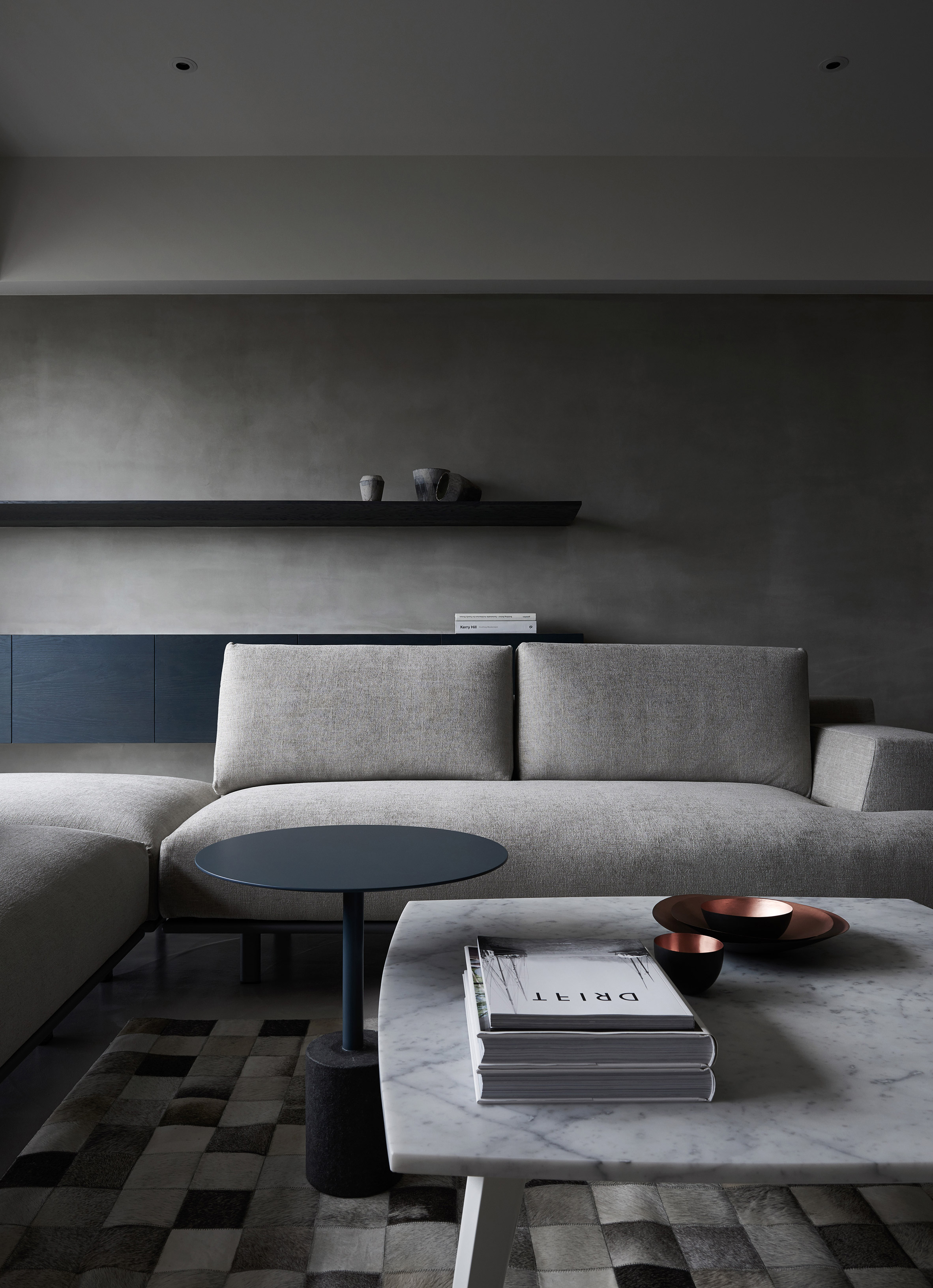
Designed by Wei Yo International Design Associates, the homeowners sought a balanced and smooth living space with a soft and comfortable atmosphere. This 270-square-meter apartment features three bedrooms, three bathrooms, a kitchen, a utility room, a living room, a dining room, and, of course, two balconies turned into terraces.
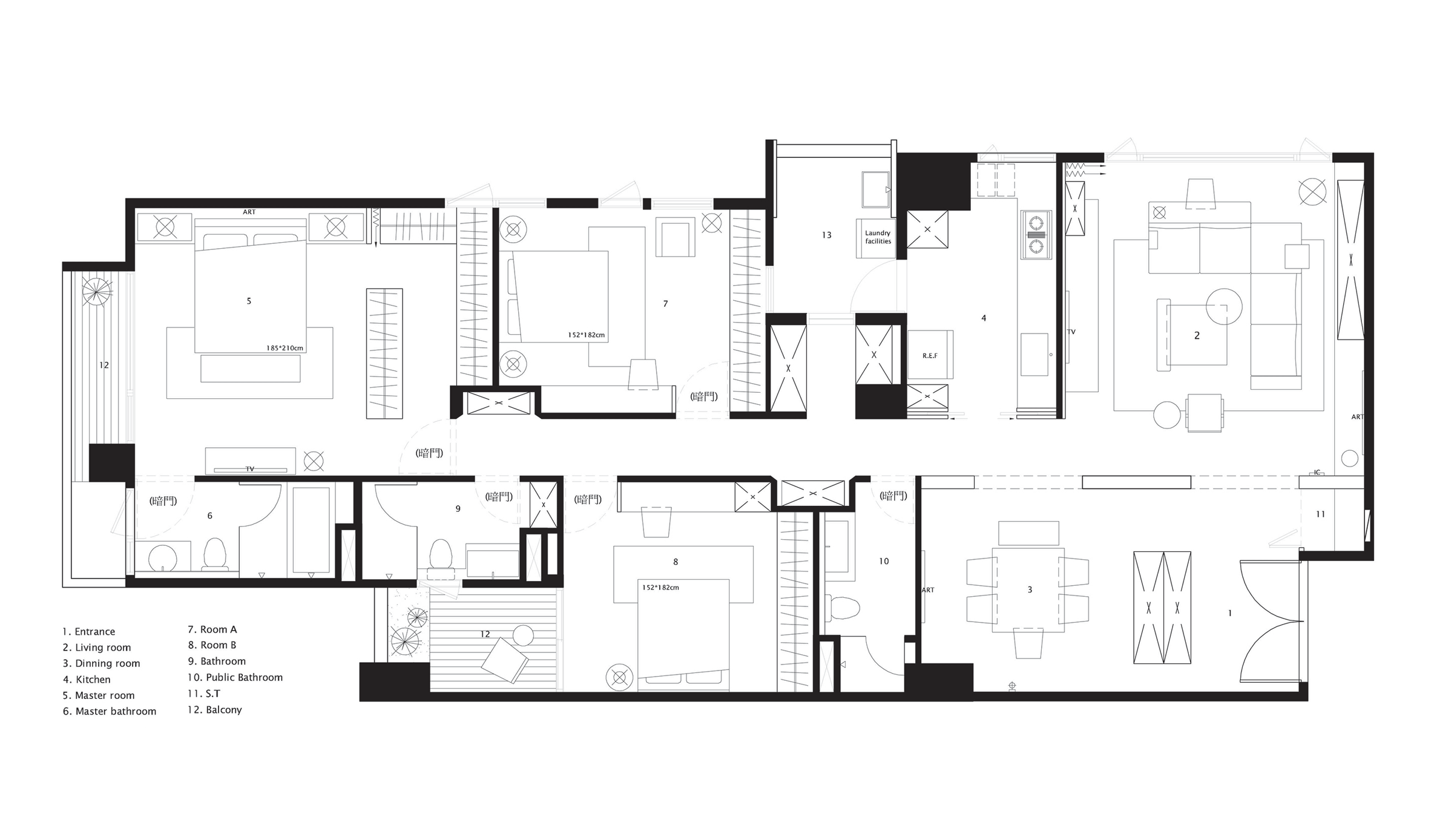
Here's the layout of the rooms within this apartment: The entrance, situated in a corner of the room, faces a white wardrobe. The living room is in the adjacent corner near the windows. Private areas are separated by concrete walls and connected by a corridor. The primary bedroom boasts an en-suite bathroom with a bathtub and a balcony at the end.
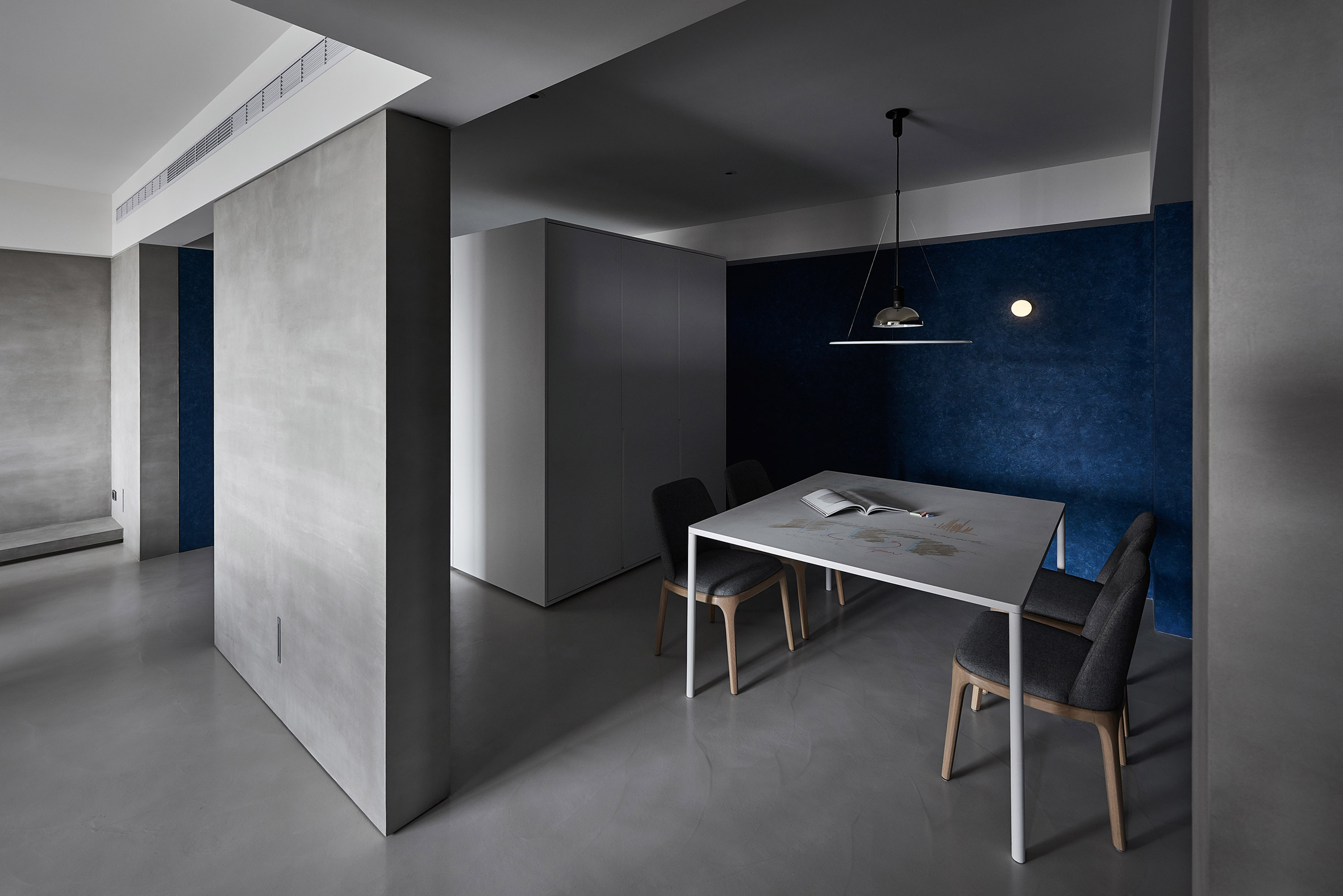
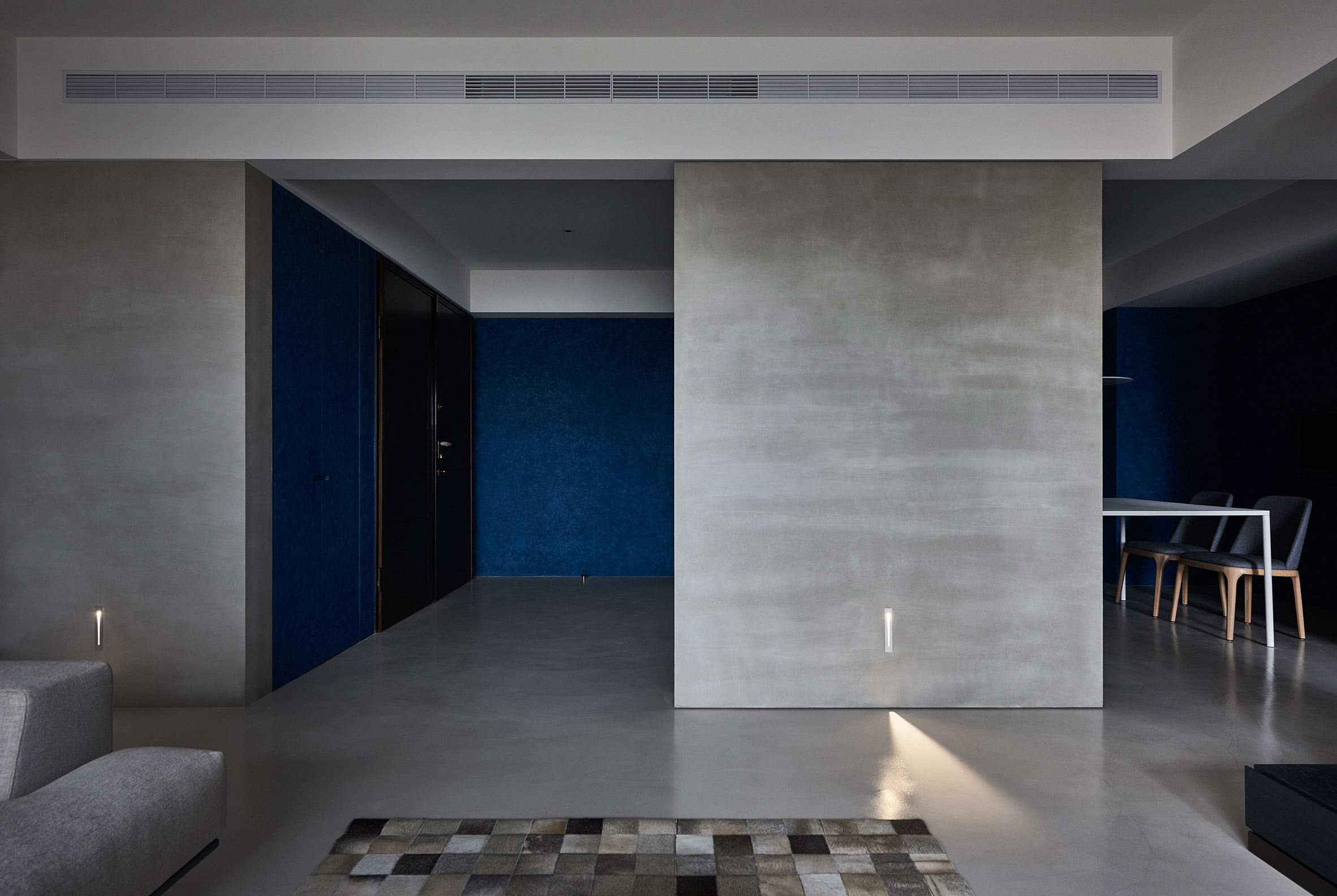
Beyond the grey color palette, a deep blue hue on the walls with an unfinished look in the entrance hall and dining area is divided by built-in cabinets placed in the middle of the two spaces.
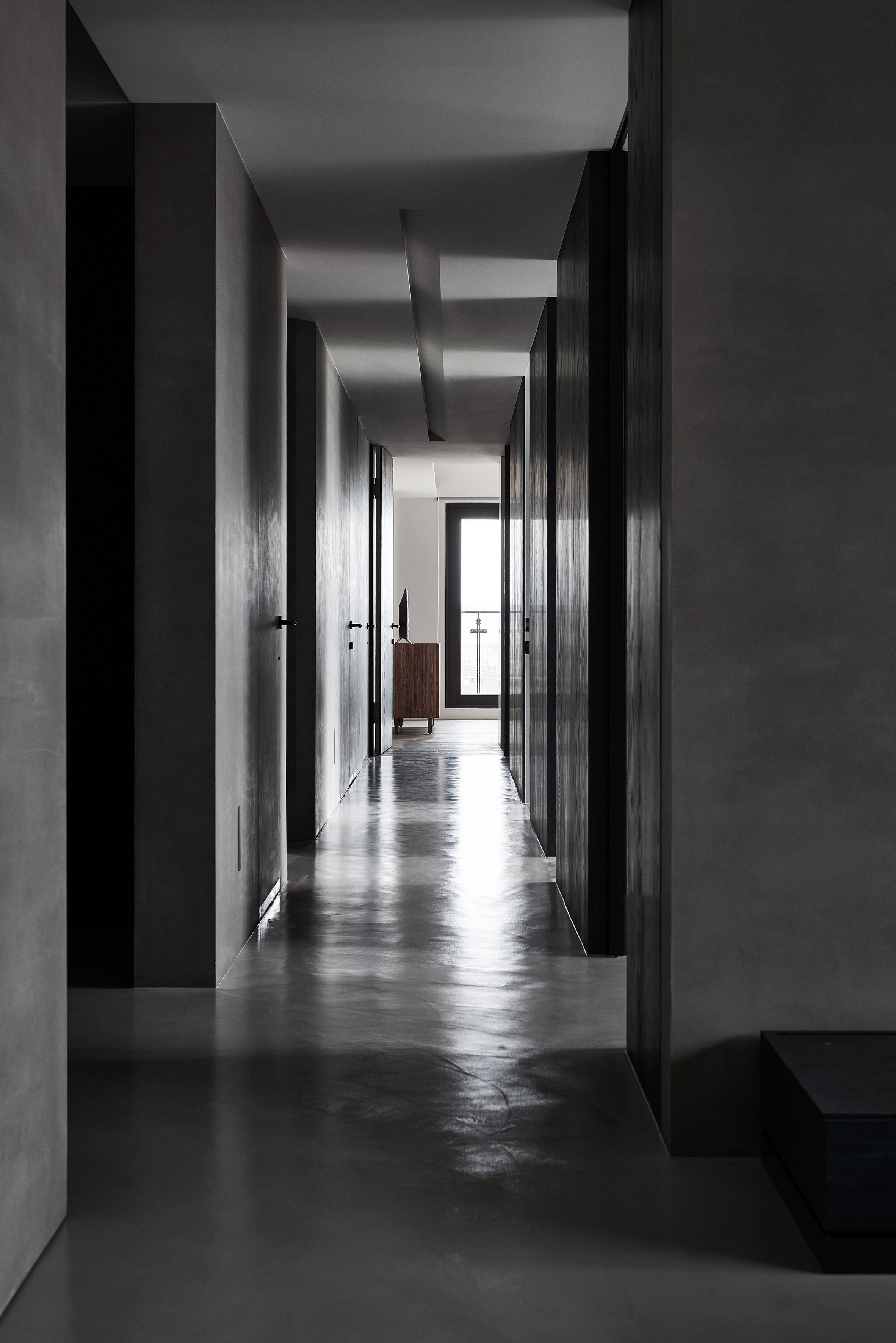
A long corridor within the apartment divides the rooms into two sections. This corridor also serves to bring light from the primary bedroom's window into the surrounding areas. Both the wall and floor materials help reflect light, preventing this grey-toned space from feeling dark.
A long corridor within the apartment divides the rooms into two sections. This corridor also serves to bring light from the primary bedroom's window into the surrounding areas. Both the wall and floor materials help reflect light, preventing this grey-toned space from feeling dark.
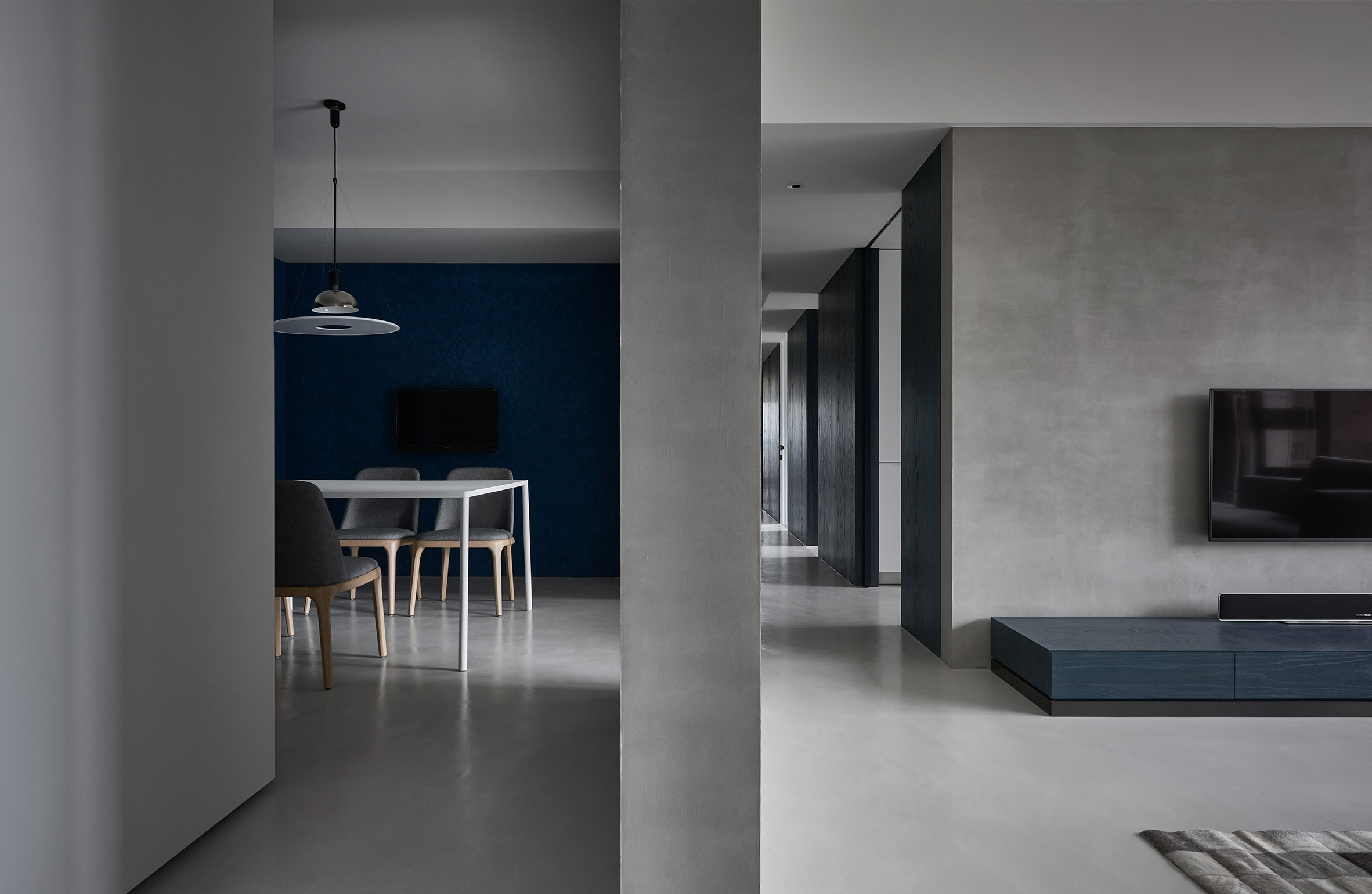
While previously the entrance hall and dining room were separated by a wardrobe, these two spaces are now divided by the living room through a sturdy concrete wall. However, the concrete wall doesn't entirely segregate the rooms. Open spaces make the various areas within this section feel more spacious and well-lit.
The architects describe the walls as not only room dividers but also as spiritual boundaries within the house. Clearly defined spatial boundaries help occupants understand their movement within the home.
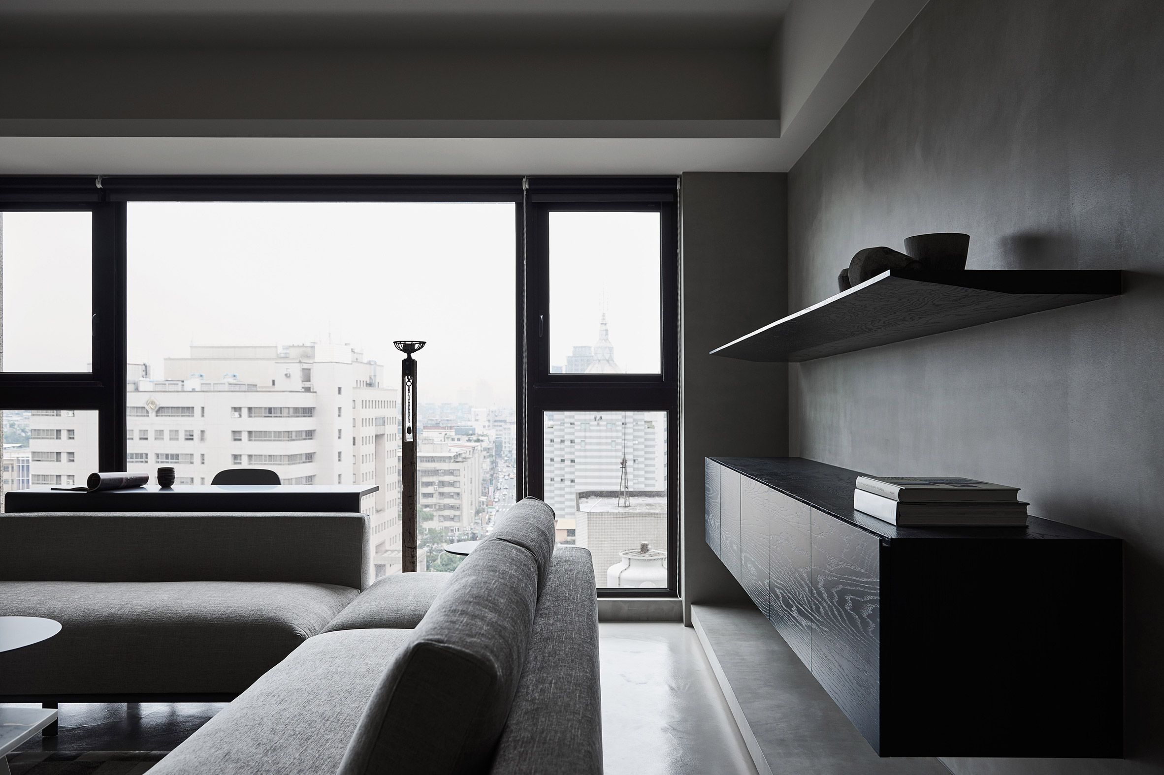
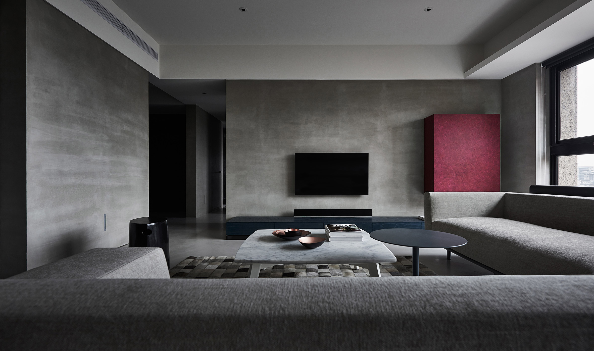
In the living room, the exposed concrete wall design acts as a canvas for the furniture, featuring shelves and storage spaces. The storage cabinets are finished with red accents, adding a pop of color to the grey room.
Large windows in the living room maximize natural light in the living space and surrounding areas, such as the entrance hall and open dining area. These windows also offer excellent urban views.
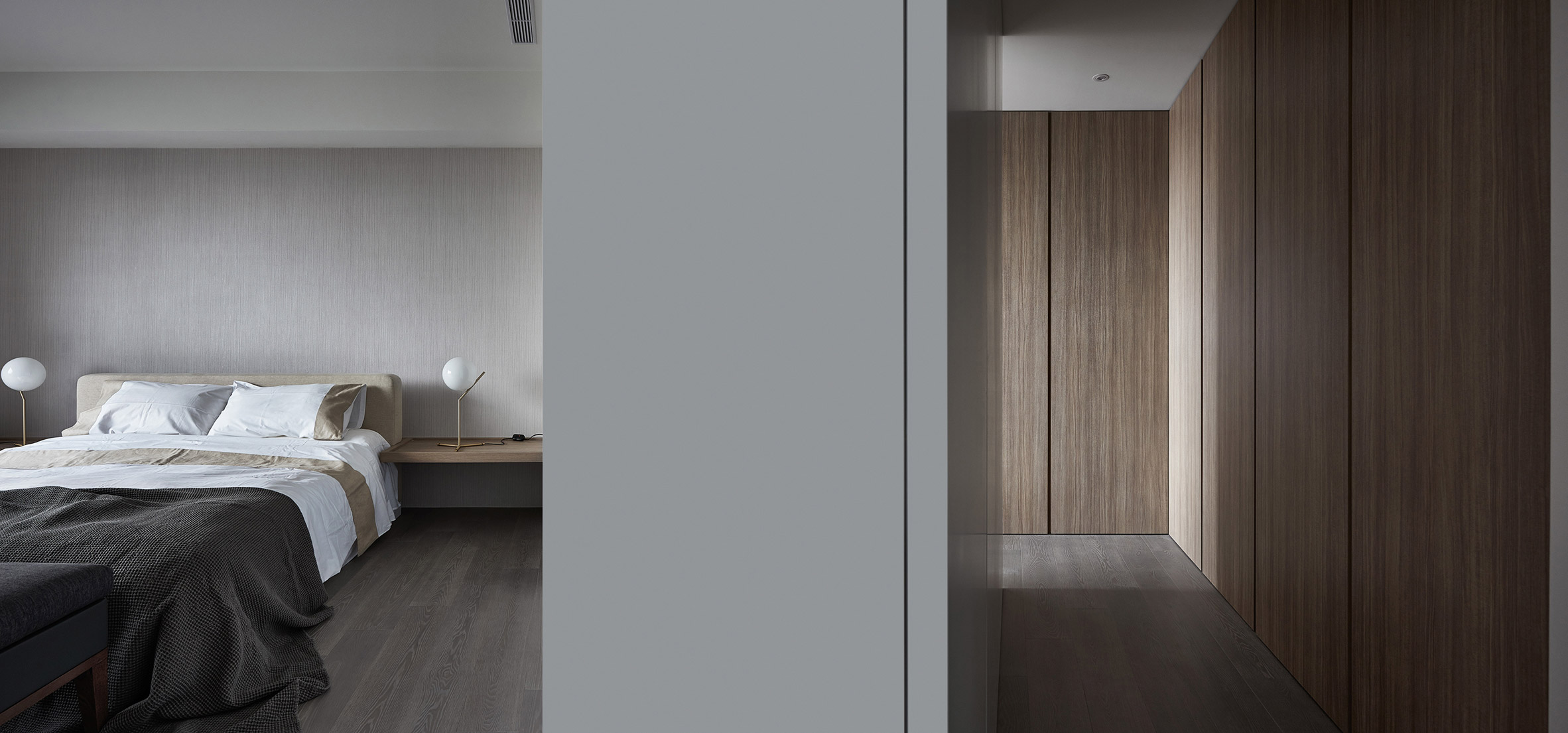
In the primary bedroom, there's a walk-in closet separated by white cabinets. The bedroom showcases a different side compared to its public areas, featuring abundant use of wood materials. Not just one but three different wood tones can be seen on the walls, floors, and cabinets.
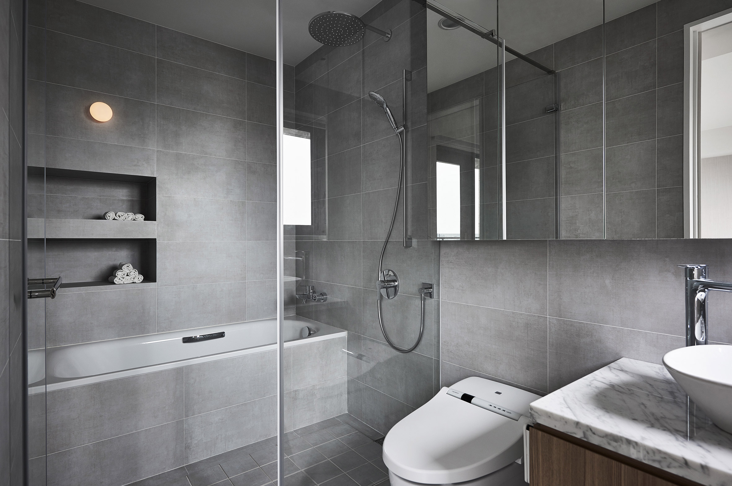
The bathroom is beautifully designed, dominated by shades of grey transitioning towards white. It creates a tranquil and prestigious ambiance, offering a soft and comfortable feeling when soaking in the bathtub.
Sumber: Shades of Grey


