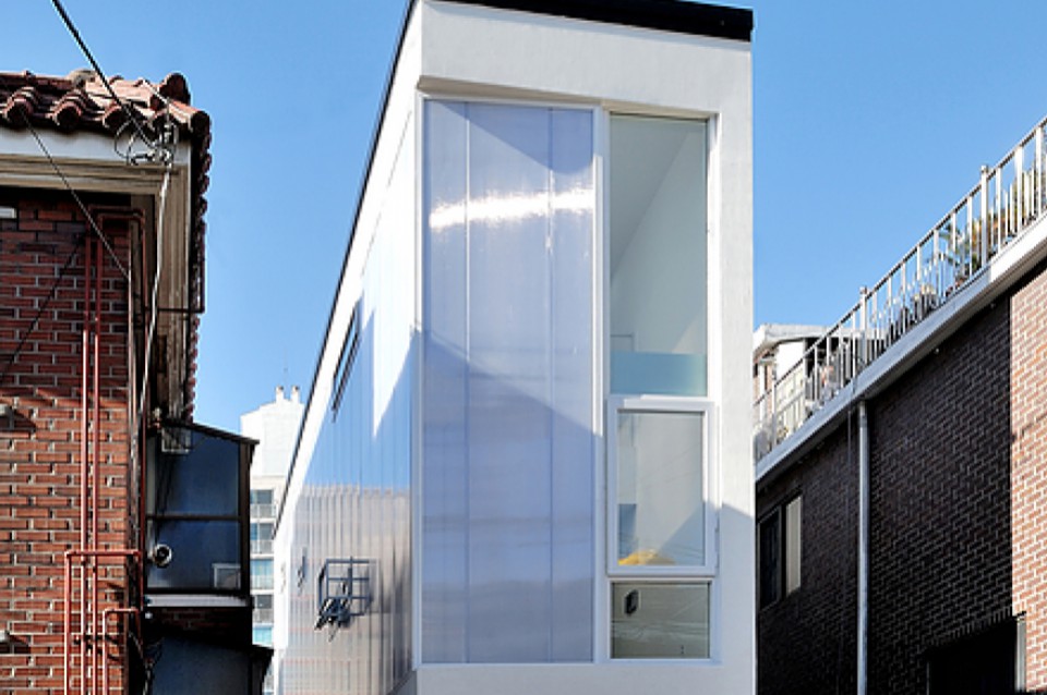
Tudor-Style House with a Modern Concept Dominated by Monochromatic Colors

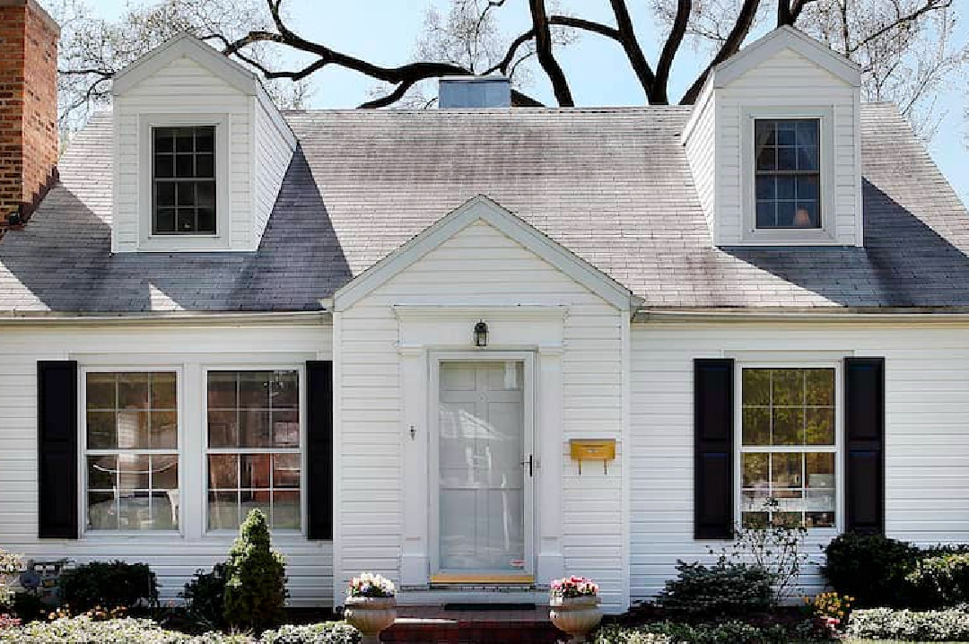
The Tudor-style house is a historical architectural design that originated in England, characterized by castle-like features and steeply pitched roofs.
In the case of this historically inspired home, designer Julie Charbonneau has given it a modern twist while preserving its historical charm.
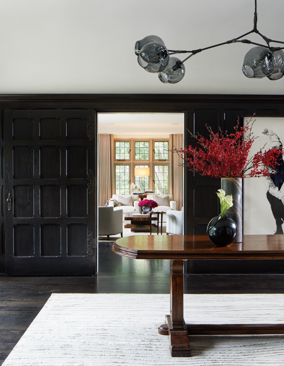
In the foyer area, Julie used black-stained wood for the door. For lighting, she chose futuristic-style fixtures designed by Lindsey Adelman. The combination of the black door and the unique lighting adds an elegant touch to this space.
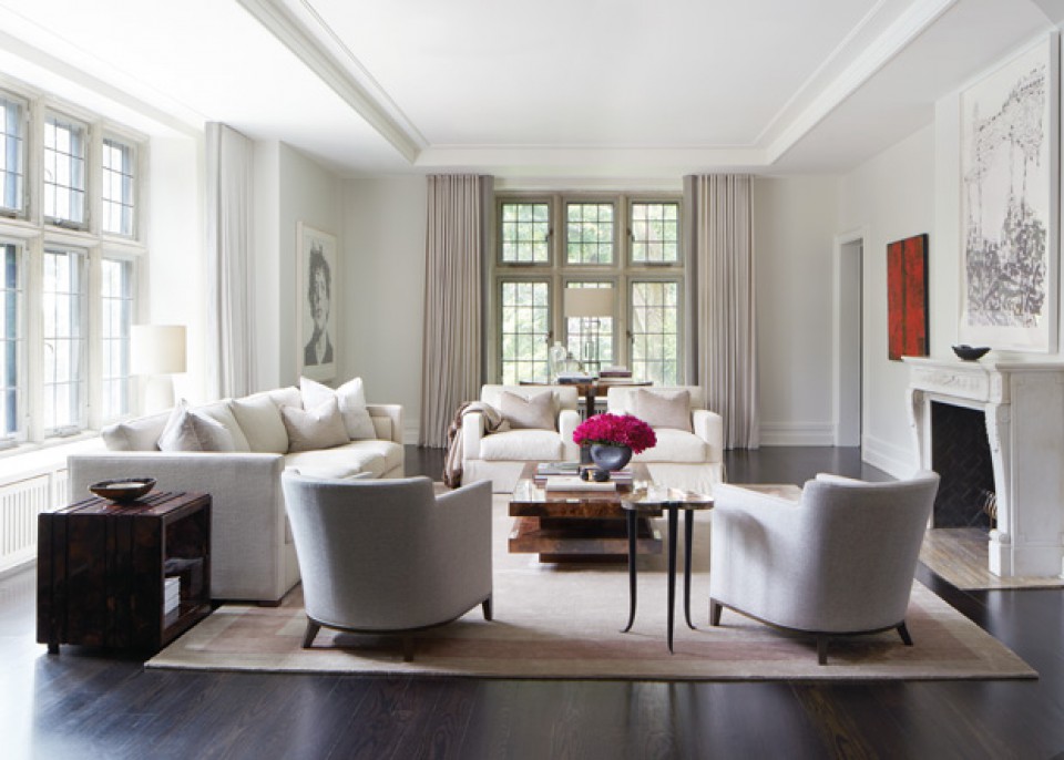
Moving into the living room, Julie placed white sofas to create a clean and fresh atmosphere. She aimed for a minimalist look in this area. For the coffee table, she chose a classic design by Aldo Tura, covered in goat leather. The windows feature stained glass dating back to the 1920s for the interior but have weather-resistant steel frames for the exterior.
In the dining room, Julie placed benches with fabric upholstery on both sides of the fireplace to create a dramatic effect and maximize space. The elegant ambiance continues in this area with neutral tones for the furniture. Modern design elements, often characterized by minimalist color schemes, are also incorporated into the dining space.
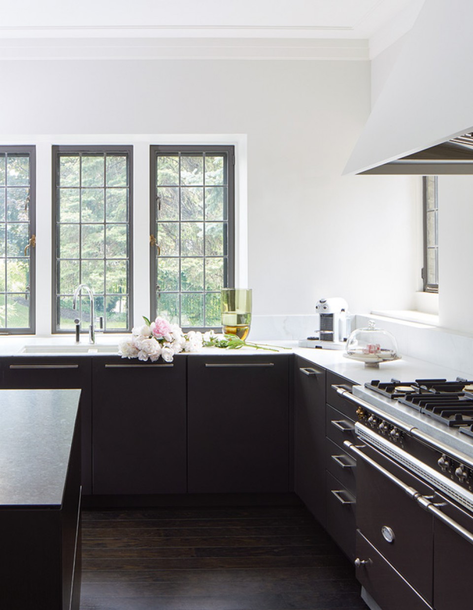
Still using the color black, this time Julie applied it to the kitchen cabinets. For those of you who are hesitant about choosing dark colors, you should definitely dispel those doubts! You can see it here, where the kitchen actually looks elegant and luxurious.
The black kitchen cabinets are paired with plain white walls, creating a striking contrast in this kitchen. Not to forget, she added a large vase of flowers to make the kitchen area more lively.
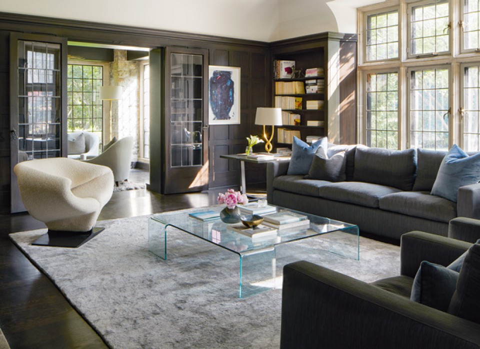
In the family area, dark tones are evident in the wood materials used, creating a dramatic impression in this space. Despite opting for dark elements, Julie ensures that the family area receives direct sunlight. Large windows are also incorporated here, allowing the beautiful sunlight to fill the space. A modern touch is also evident in the use of a glass coffee table..
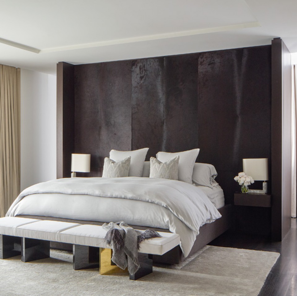
Moving on to the primary bedroom, Julie designed a tall, ceiling-reaching headboard that also functions as side tables on both sides of the bed. This tall, black headboard creates a focal point in the room, adding strength and character to the space.
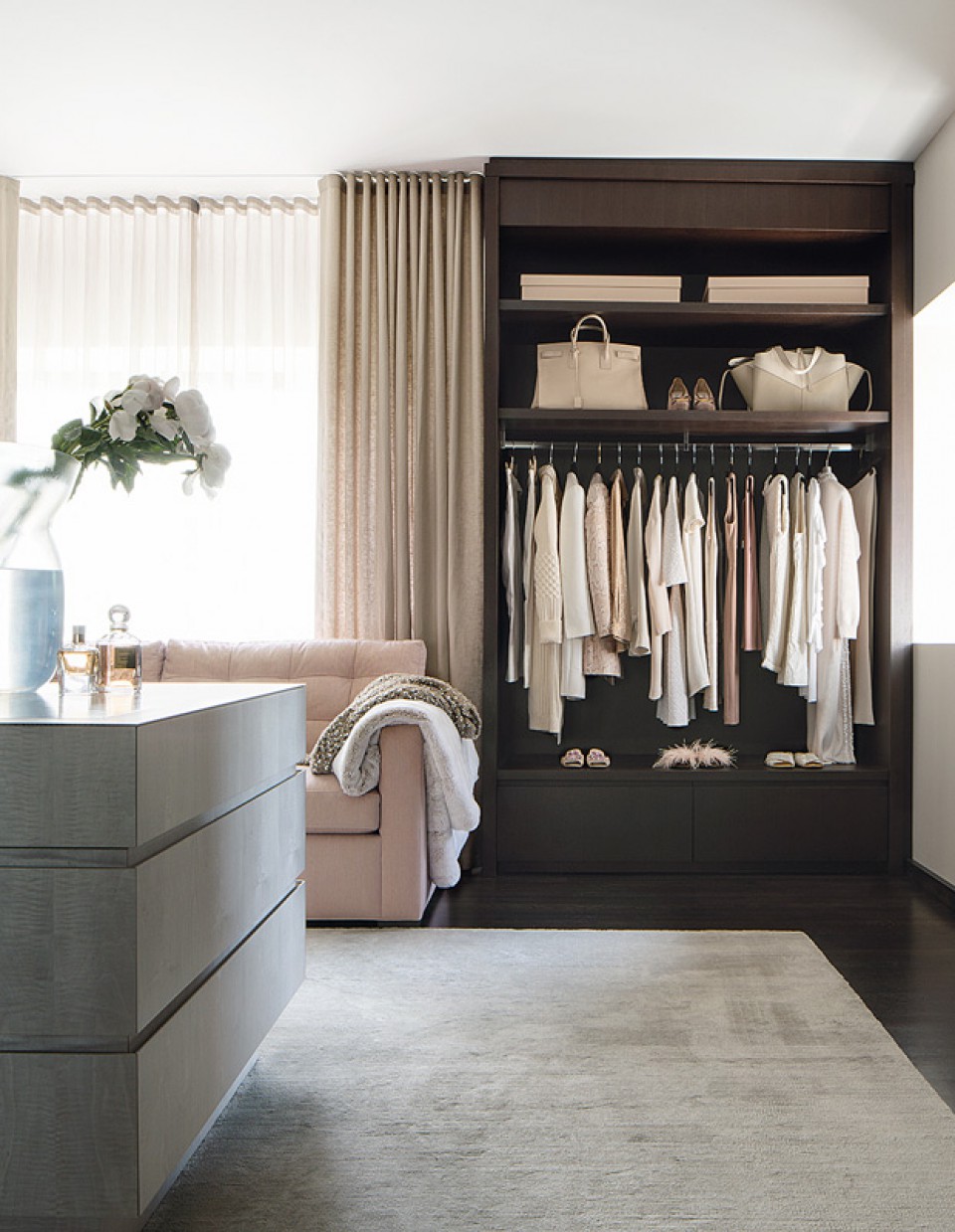
In the master bedroom, there is also a feminine-designed walk-in closet area. Although the wardrobe uses dark colors, Julie balances it by choosing a peach color that gives it a sweet appearance.
Julie places a comfortable sofa with additional blankets and curtains in matching colors. Interestingly, the presence of a sofa in this area often becomes a gathering space for guests who visit. Creating a comfortable space arrangement is one of the main factors.
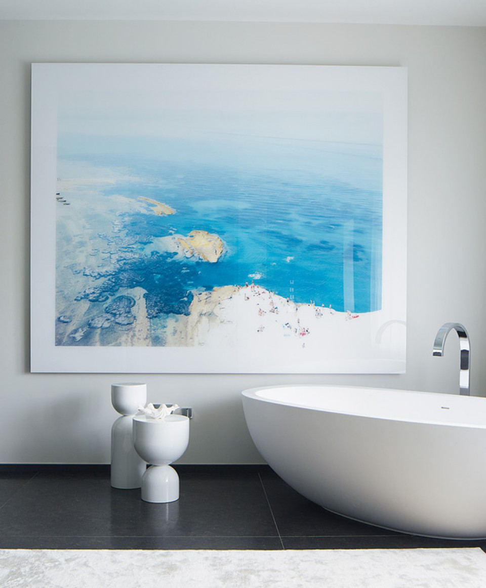
Next, Julie designed the bathroom with the addition of a large-scale artwork by the famous artist Massimo Vitali, taken from Scala der Turchi. Julie was inspired by the beauty of the sea that she admired. The placement of the artwork in the bathroom also enhances the feeling of relaxation when the occupants are soaking in their bathtub..

