Gramedia Digital Nusantara's office, let's explore it!
Gramedia Digital Nusantara, one of the subsidiaries of the Kompas Group, is currently undergoing a design renovation in the Kompas Tower building, spanning 1700m2 on the 18th floor. There are many interior design elements and references that are indulgent, intriguing, and unconventional, unlike typical office spaces. Let's explore the new interior design.
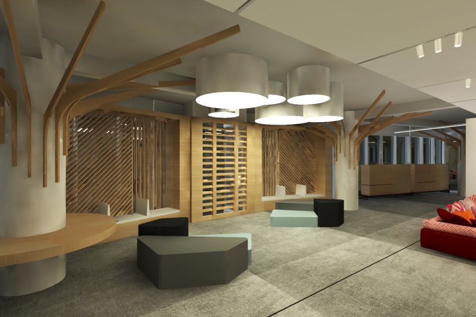
The stiff and rigid impression often associated with office interiors is nowhere to be found in this new design. The design above gives off a recreational atmosphere, devoid of stiffness and formality, instead resembling a co-working space or cafe. The basic white color of the building's columns and steel is combined with wood materials used as partitions and cantilever accents on each column. One unique element in this interior design is the simple wooden boards shaped like the letter L, installed as cantilevers. They catch the eye, give an artsy impression, but don't dominate the space and remain pleasant to look at.
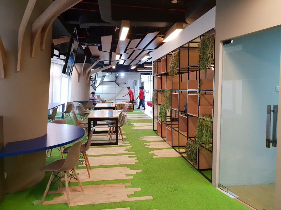
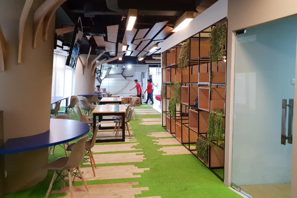
Unlike typical offices that often use the same design concept throughout the space, this approach is not applied to Gramedia's interior design. In other areas, a completely different design concept prevails. In this zone, the focus is on a natural and green theme to alleviate the monotony of office routines. The floor features light green carpets blending with parquet, shelves made of L-shaped iron adorned with trailing plants, and a ceiling made of randomly arranged wooden planks, further emphasizing the natural atmosphere of the room. Additionally, at the end of the wall, bookshelves resemble branched trees, inviting people to place items there. Quite intriguing, isn't it?
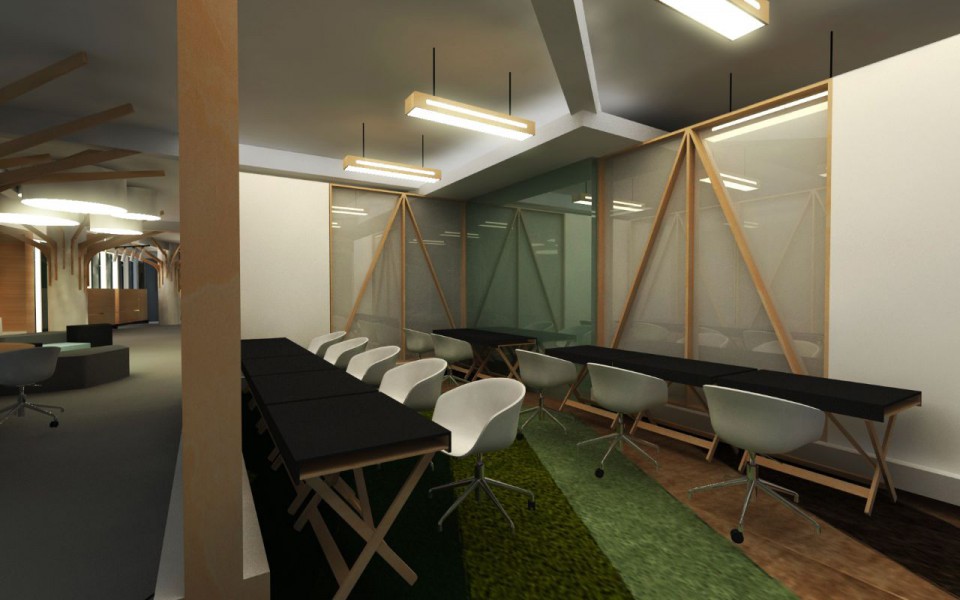
Moving to another area, you'll find rows of contrasting wooden tables and chairs that are very simple. Compared to other zones, the furniture layout in this area is quite common and resembles mainstream office layouts. However, there are large wooden and glass frame partitions. Does this design create a monotonous atmosphere in the area? Certainly not, because the floor is adorned with various layers of patterned and colorful carpets that still catch the eye. If the open space concept without partitions doesn't help you focus, perhaps sitting in front of the glass partition above will provide a bit of privacy for work or brainstorming.
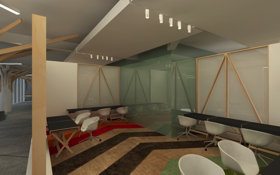
Heading to another area within the room, there is a space with a design similar to the previous zone but on a larger scale. In this larger space, the carpet motifs and materials are more prominent and appear very artsy and colorful. With the same table and chair concept and the same carpet material but with a larger space, it can accommodate more people and is more comfortable than the previous area. Such a zone is highly recommended for teamwork involving a larger number of members. Workers do not have to occupy a large meeting room to present their projects because every corner of the office has a place for work and discussions.
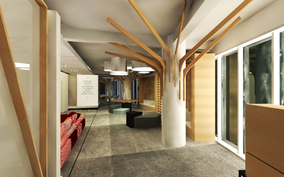
The final review of Gramedia's office design is an overall atmosphere that is attractive, relaxed, not stiff, and even places workspaces everywhere you find corridors or access for office occupants. While it undoubtedly requires a significant budget, it could serve as a design reference for open-space-themed offices.
source: tigagunungmas.com

