A Three-Story Residence with Simple Design and Various Uses of Natural Materials Inside
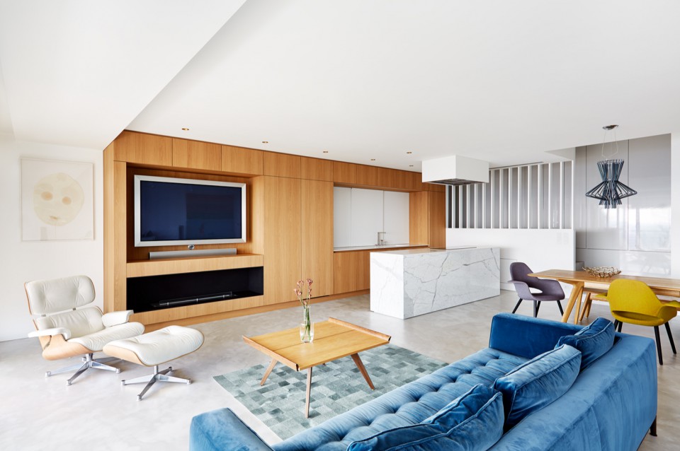
This apartment, designed by Lenka Mikova and Marketa Bromova, has a total area of 180 square meters. Completed in 2015, it is located in Prague, Czech Republic. The apartment is predominantly designed in white with interesting elements within its spaces. The clients requested the architects to redesign the existing apartment with beautiful views and create a modern home inspired by the interior style of American mid-century.
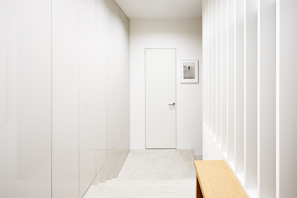
The mid-century style is characterized by clean and simple interior spaces with a distinct emphasis on surface texture. It minimizes details and conceals technical fixtures on the walls and floors, such as light switches and dangling cables. This approach highlights the natural texture of materials both visually and in terms of quality.
Careful material selection is evident in the flooring surfaces, with each floor and bathroom featuring different materials based on the room's function. Despite the different flooring materials on each floor, there are common elements that tie the interior together.
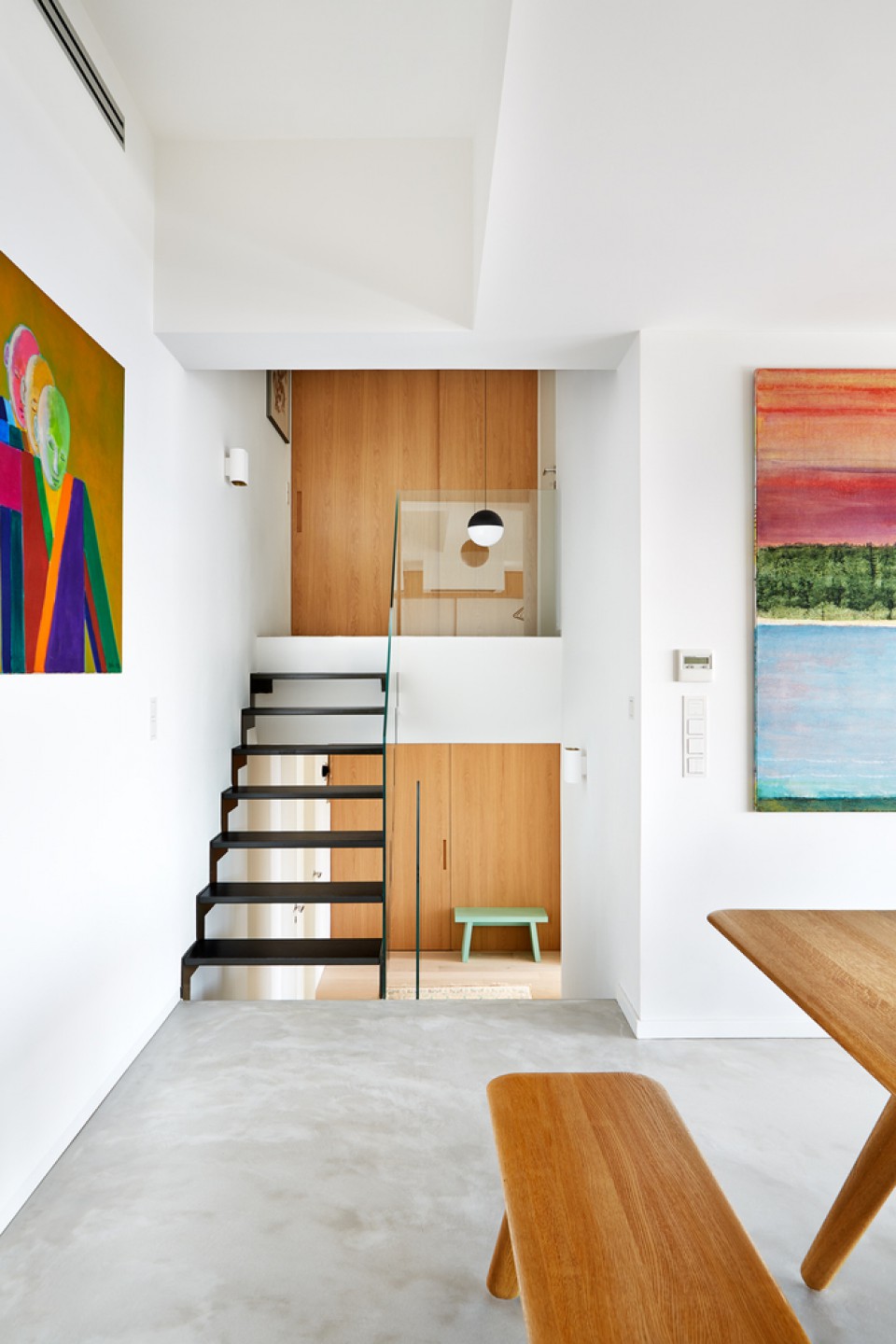
One such feature is the use of natural oak wood veneer. Oak veneer can be found on the walls of one of the floors, the sliding doors, and various furniture pieces in the bedrooms and bathrooms. The use of full-height doors from floor to ceiling creates a sense of spaciousness and height within the rooms.
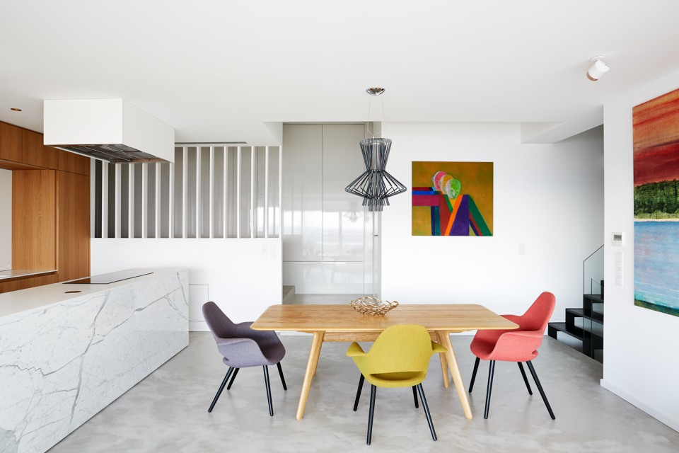
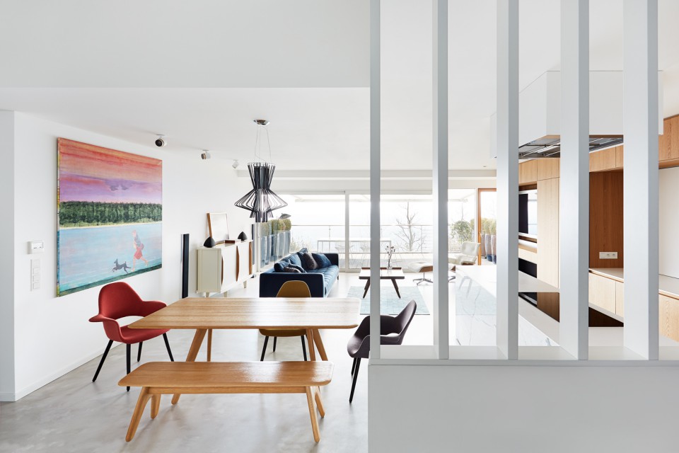
The apartment is divided into three levels, with each level having its own layout. The middle floor, or the main floor, serves as the entrance to the apartment. Visitors enter and are greeted by a corridor that leads to various rooms. This floor features a spacious living area with a TV-watching area, dining room, and an open kitchen. The open layout of these rooms creates a sense of expansiveness. Additionally, there is an outdoor terrace accessible through sliding glass windows.
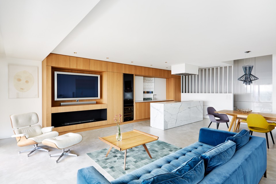
The main feature on this floor is a long wooden unit that serves as both a lounge and kitchen on its wall. In the living room area, this unit functions as storage and a place to put the television, while on the opposite side, it becomes a fully-equipped kitchen with a refrigerator and sink.
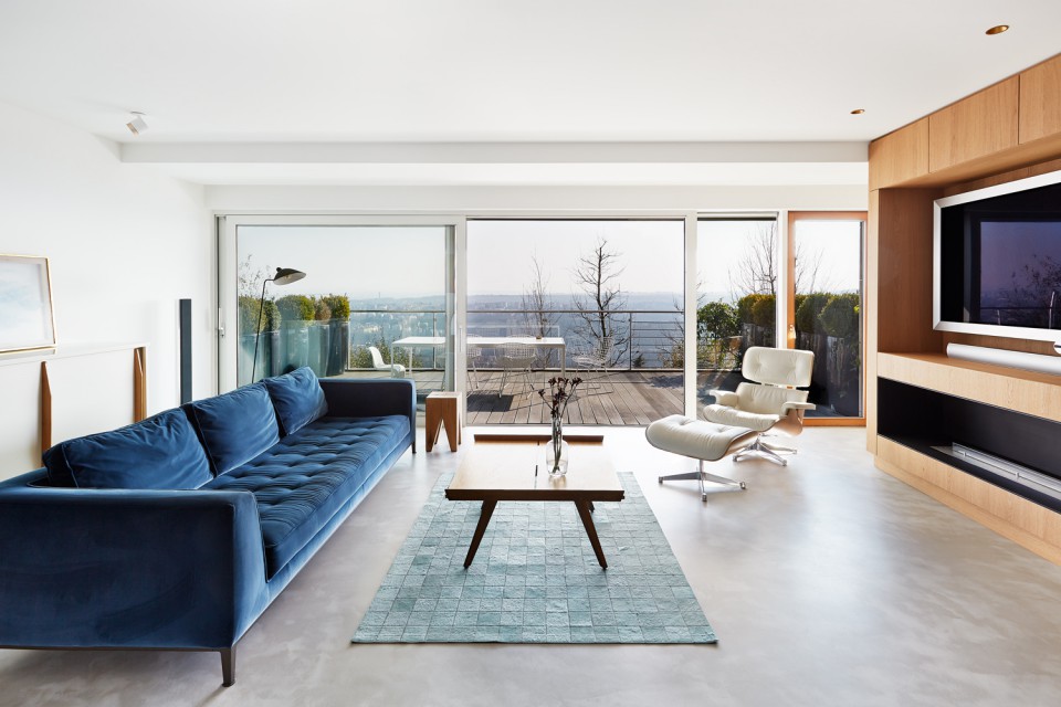
By consolidating various belongings on one side of the room, the other side can be utilized for hanging paintings. The kitchen area can be concealed when not in use, allowing it to blend into the living area seamlessly.
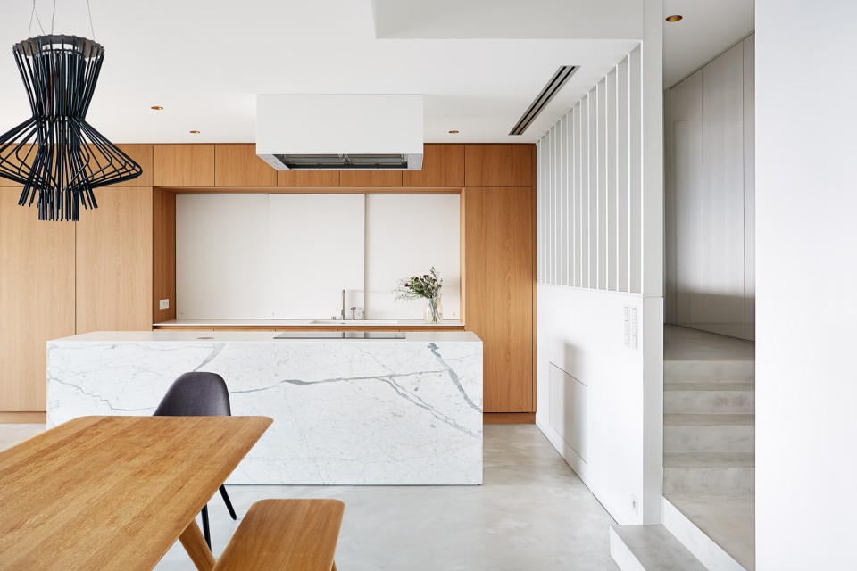
There is a white sliding panel behind the kitchen sink that serves as storage for kitchen equipment and spices. The kitchen area is separated from the entrance corridor by a perforated partition, allowing natural light to enter the corridor.
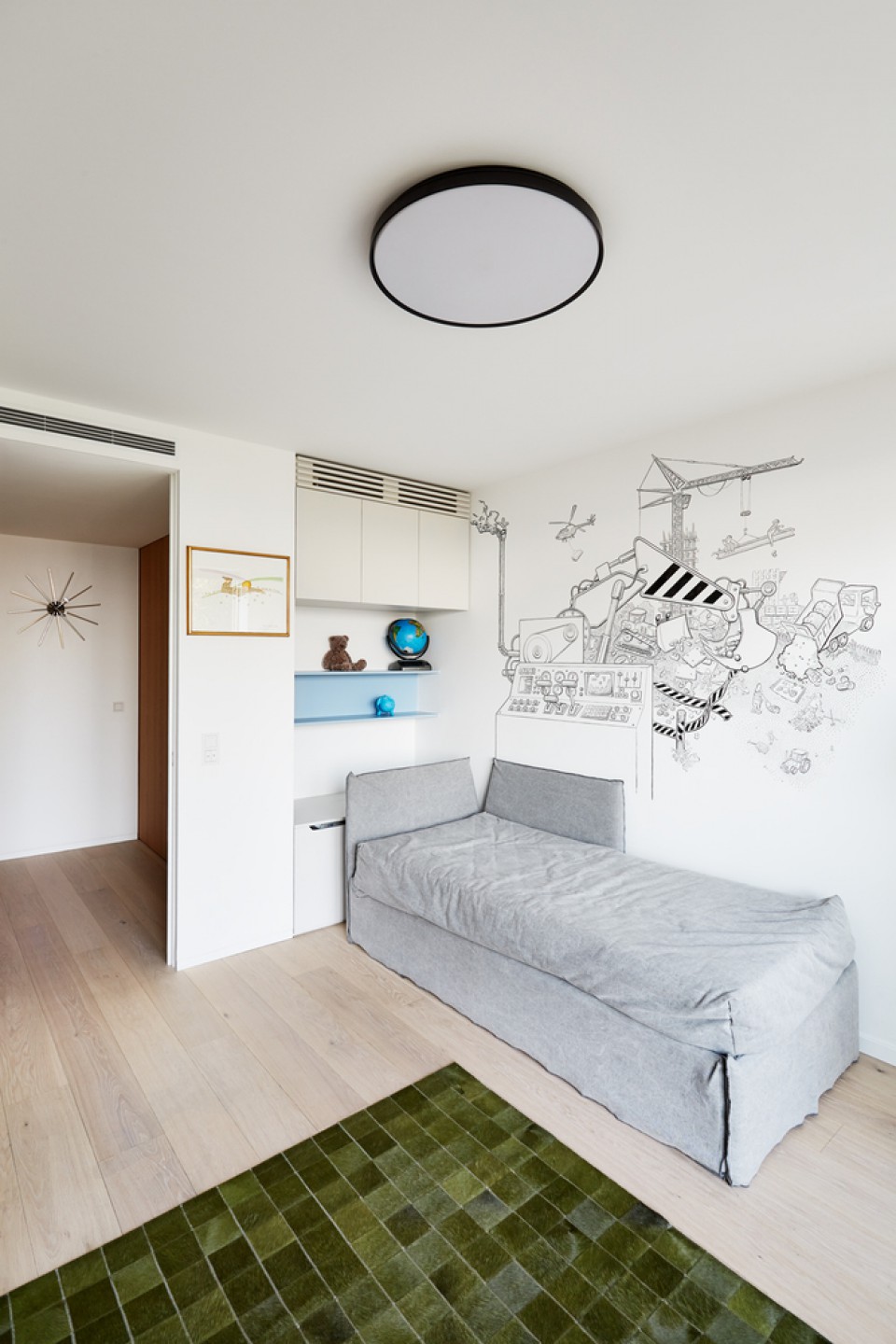
On the floor below, there is a children's bedroom equipped with a small play area. A single bed is placed in the corner of the room. The central area of the room is quite spacious, allowing for a fun play area from the hallway to the bedroom. The children's bedroom is equipped with an outdoor terrace accessed through sliding glass doors.
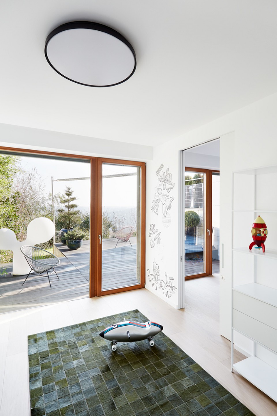
This terrace connects directly to the home's garden. Both children's bedrooms are decorated with captivating wall illustrations. There is also a walk-in closet area with soothing colors and a playful tile decor in the bathrooms.
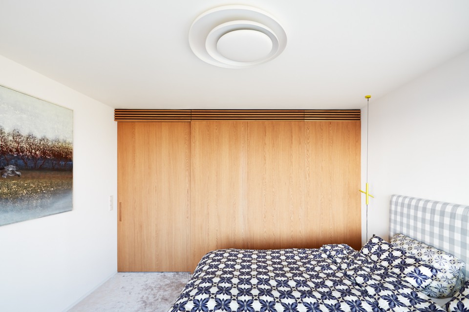
The uppermost floor is the private area for the parents. On this floor, there is a workspace and the master bedroom, complete with an en-suite bathroom and walk-in closet. The parents' bedroom is designed with simplicity in mind, free from excessive ornamentation. This creates a clean and simple ambiance in the room.
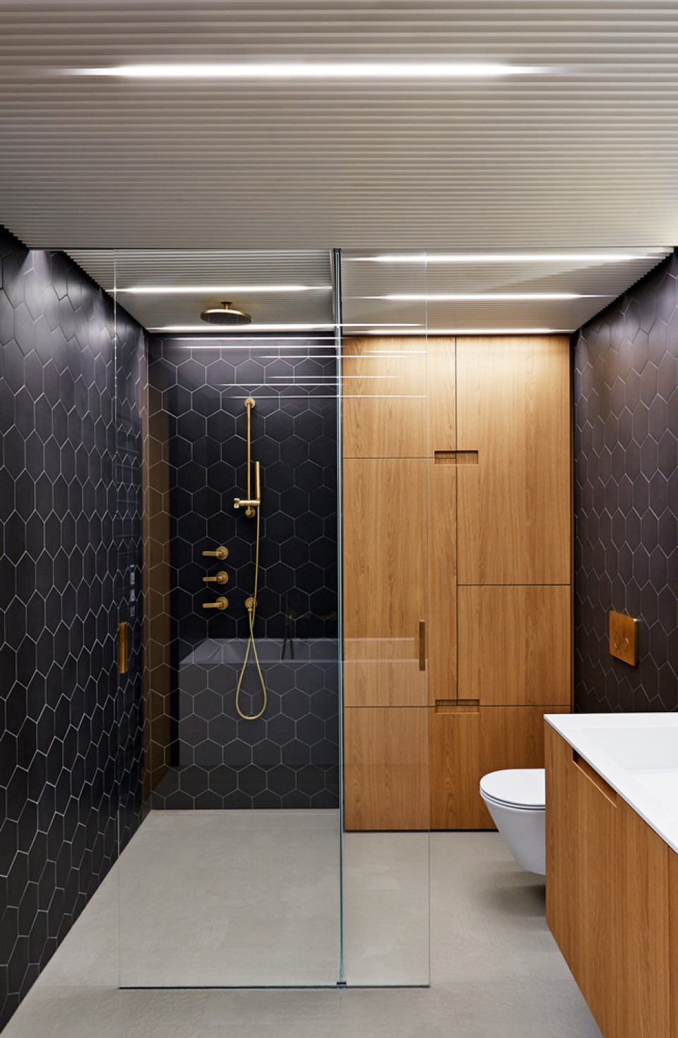
The bathroom for the parents is elegantly designed with black tiles covering the entire walls and gold accents for the bathroom fixtures, giving the space a luxurious and intimate feel. The placement of the faucets is carefully aligned with the hexagonal tiles.
source: triplex apartment photo by: Veronika Raffajová


