Creating Harmony Through the Right Color Choices
When it comes to designing a home, wall paint color is often the first element noticed—and also the most impactful in setting the room's atmosphere. But color choice isn’t just about aesthetics—color plays a major role in the psychological well-being of a home’s occupants. It can stimulate energy, calm the mind, or even change how we perceive space.
In the world of home decor, understanding wall colors and their psychological effects is key to creating a living space that is not only beautiful but emotionally supportive. This article will thoroughly explore how colors affect mood, how to choose colors for each room, current color trends, and tips for achieving a harmonious color palette.
1. Why Color Matters in Interior Design
Color is a visual language that works on a psychological level. It can evoke warmth, coolness, spaciousness, coziness, excitement, or calmness. In terms of home decor, wall color becomes the "main canvas" that guides the entire direction of the interior design.
Key benefits of proper color selection:
-
Influences mood and emotions
-
Enhances focus and productivity
-
Improves relaxation and sleep quality
-
Affects perception of space and lighting
2. Color Psychology: Meanings and Effects on a Room
Here are common interior colors and their psychological effects:
a. White – Clean and Spacious
Represents purity and tranquility. Great for making small spaces appear larger. Too much white, however, can feel cold or clinical.
b. Gray – Elegant and Neutral
Ideal for modern or industrial-style homes. Offers a sense of maturity and professionalism. Combine with bright accent colors for balance.
c. Blue – Calming and Focused
Promotes calmness, lowers stress levels, and boosts focus. Suitable for bedrooms and home offices.
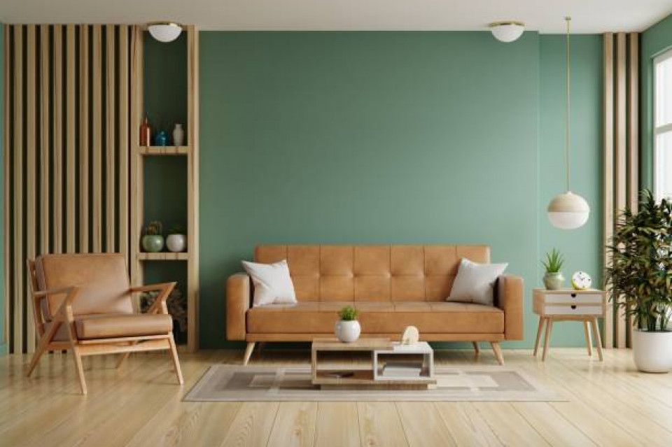
d. Green – Fresh and Balanced
Symbolizes nature and renewal. Creates a peaceful atmosphere. Great for living rooms, children’s rooms, and dining areas.
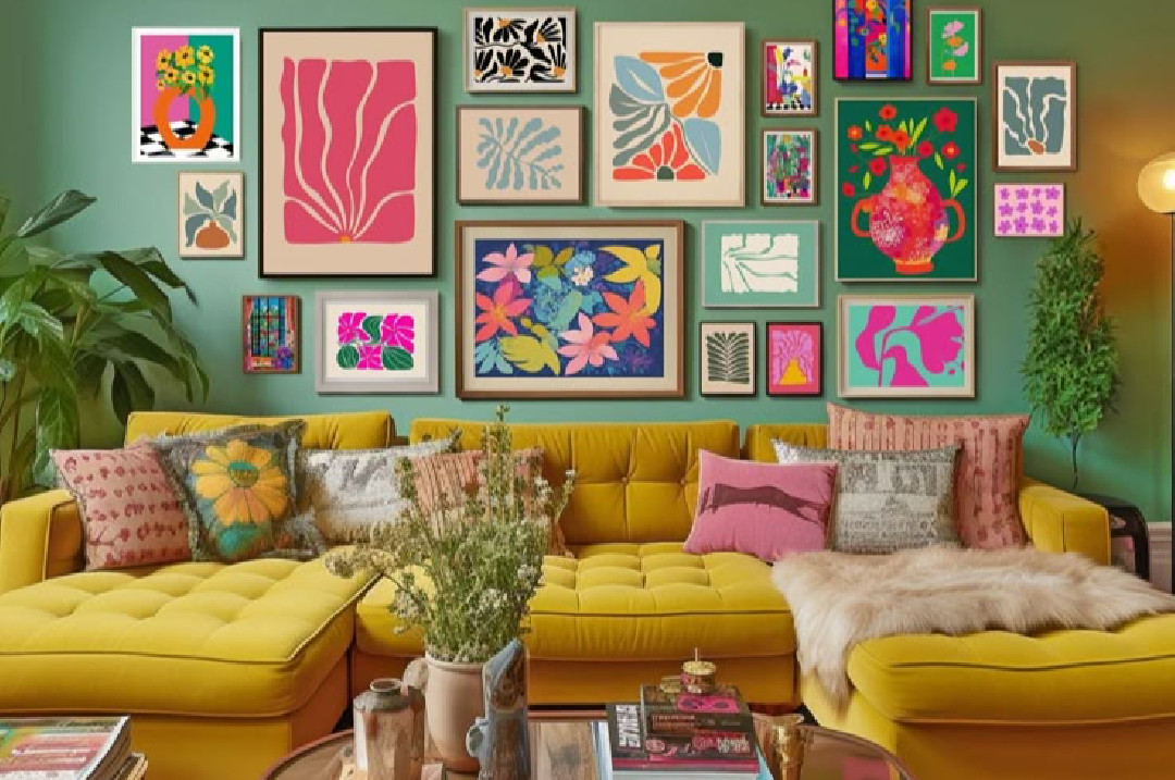
e. Yellow – Cheerful and Energetic
Adds warmth and positivity. Perfect for kitchens, dining rooms, or kids’ play areas. Avoid overly bright yellows in bedrooms, as they can disrupt sleep.
f. Red – Energetic and Bold
Stimulates energy and appetite. Best used as an accent color. Great for dining areas to enhance social interaction and appetite.
g. Brown – Warm and Secure
A natural earth tone that brings comfort and stability. Works well in bedrooms and living rooms.
h. Black – Strong and Sophisticated
Use sparingly as an accent. Excessive black can make a space feel dark or closed-in.
3. Choosing Color Based on Room Function
Each room serves a different purpose, and color should match the intended atmosphere:
a. Living Room
Goal: Entertaining guests and family gathering
Ideal colors: Light gray, warm white, neutral blue, beige
Tip: Add warm-colored decor like cushions or rugs for coziness
b. Bedroom
Goal: Rest and relaxation
Ideal colors: Soft blue, pastel green, lavender, cream
Tip: Avoid bright colors like red or vibrant orange
c. Kitchen
Goal: Cooking and energy
Ideal colors: Soft yellow, white, fresh green
Tip: Combine with wood tones for warmth
d. Bathroom
Goal: Cleanliness and refreshment
Ideal colors: White, light blue, mint green
Tip: Use moisture-resistant paint or semi-gloss finish
e. Home Office
Goal: Focus and productivity
Ideal colors: Neutral gray, deep blue, olive green
Tip: Add colorful accents to avoid monotony
4. Techniques for Harmonious Color Combinations
To maintain balance in a room, consider these common color approaches:
-
Monochromatic: Variations of one color in different shades and tints
-
Analogous: Colors next to each other on the color wheel (e.g., blue–green–yellow)
-
Complementary: Opposite colors on the wheel (e.g., blue and orange)
-
Triadic: Three equally spaced colors on the wheel (e.g., red–yellow–blue)
Each combination creates a different mood and visual impact.
5. Home Paint Color Trends for 2025
Here are some of the rising color trends for home interiors in 2025:
-
Earthy tones: Terracotta, olive green, sand beige—natural and grounding
-
Warm neutrals: Cream, ivory, taupe—replacing flat white with cozy tones
-
Muted pastels: Dewy blue, sage green, dusty pink—perfect for calm environments
-
Elegant darks: Navy, charcoal, even black—luxurious when paired with proper lighting
-
Bold accents: Maroon, mustard, emerald—used to give rooms a distinctive personality
6. Practical Painting Tips for the Home
-
Test paint samples first: Apply them to the wall and observe under different lighting throughout the day
-
Consider natural lighting: Sunlight and artificial lighting affect how colors look
-
Use interior-specific paints: They resist stains and are easier to clean
-
Choose the right finish: Matte for soft look, semi-gloss for humid areas
-
Don’t forget ceilings: Lighter shades or white make ceilings feel higher
7. Conclusion
Choosing paint color is more than just a visual decision—it involves emotional, functional, and spatial considerations. By understanding color psychology, room functions, trending palettes, and harmonious combinations, you can design a home that is beautiful and emotionally nurturing.
Remember, color reflects personality. Don’t hesitate to experiment. Let your home be a canvas of expression that provides comfort, inspiration, and joy every day.