Get to know the impression of the living room through 14 different colors in the living room design
The living room is the room at the front of the house. Functioning to receive guests, this room must be designed to be comfortable for both the owner and the guests who visit. So what kind of design can make this room comfortable without losing its artistic value?
Through the use of various colors, the room will give a different impression. The following use of 14 colors in the living room helps you recognize the impression it causes. So that later you will be easier and wiser to give coloring to the living room in your home.
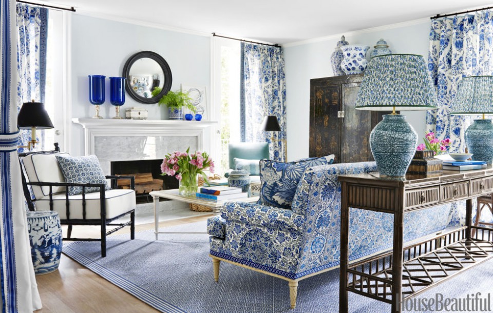
Deep Blue

The color blue is quite popular for home coloring. It gives the impression of stability and confidence when people look at it. Blue also gives a cool and calm feel when you and your guests are in it. Communication can also be smoother because this color can clear the mind. Although dark blue does give off a bit of a formal impression.
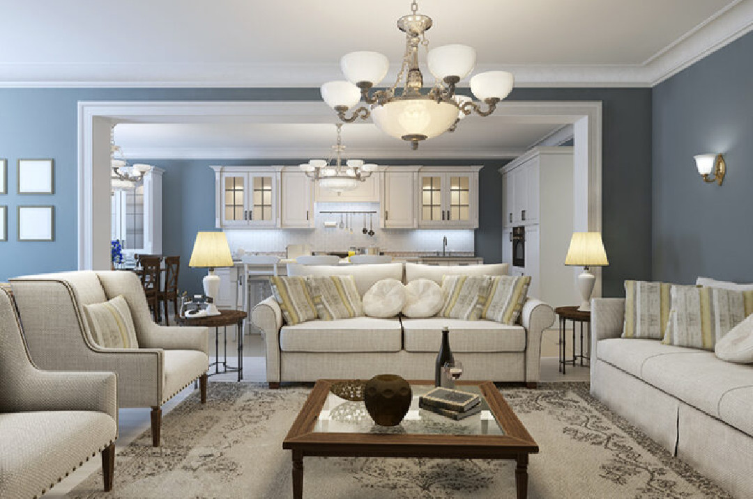
Cream / Beige

A room with a touch of beige color will give a classic impression. Cozy and soft are also present in this living room. Combine this color with neutral colors such as white, gray, or black so that the color can stand out more than other colors. Cozy and classy.
Red

Who would have thought that red could look so appealing to the eye. Yep! This striking red color gives the impression of passion, warmth, and courage. Choosing this color means you dare to face challenges because it is not easy to give this color to the living room. But with the right combination, the red color gives comfort to the space. This color is very striking so don't immediately give this color to all sides of the room.
Yellow

Choosing yellow means making the living room brighter and more cheerful. Warmth and friendliness can be felt by visitors in this space. This color also has a strong appeal. Stimulating the eyes so that it spoils the eyes when looking at this color. Of course, it remains in a certain scheme that is not excessive. Yellow also increases the level of concentration and a more intimate atmosphere is established. But if too much yellow will give an atmosphere of anxiety and fear.
Black
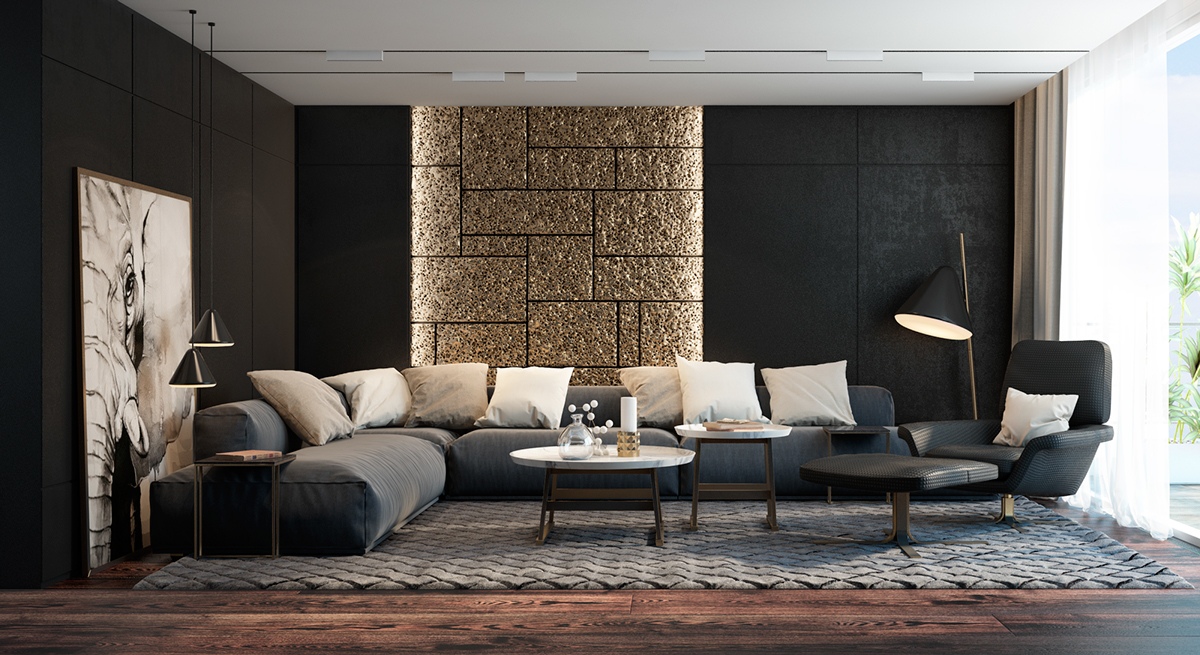
Black is a solid and strong color. In addition to giving assertiveness to the room, glamor and elegance are portrayed in the living room. Guests also feel exclusive in a room like this. Homeowners also seem mysterious with this color. With the addition of the right material such as gold color on the wall, it will add a dramatic impression to the room.
Pink

For this one color, many agree that it will give a feminine impression. Pink as a whole will look different from fiery red. If red gives a stimulating and strong nature, pink gives a meek and calming nature. Eliminate the tension that occurs. As for this color also describes the romance in the room.
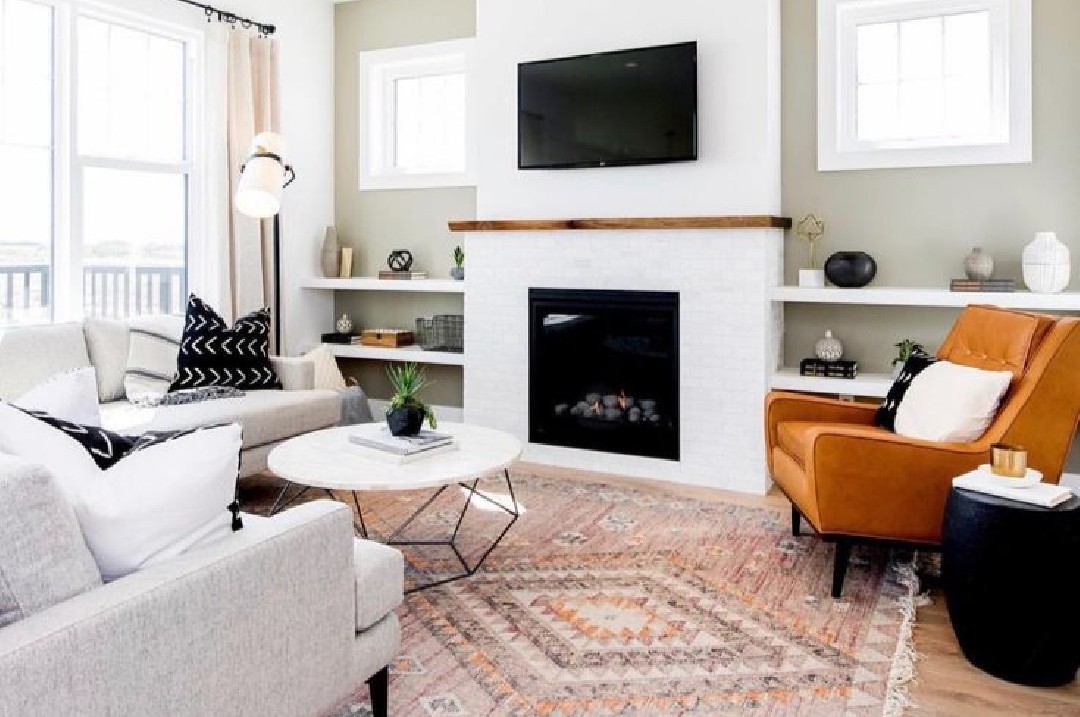
White

http://www.goodhousekeeping.com
Well for this one color is a color that is suitable for all spaces. Symbolizing cleanliness and purity, the room looks simple and peaceful. Can be combined with various colors and other materials. The room becomes brighter and wider. Do not forget to also provide freedom of movement in the room.
Teal

The combination of green and blue is plentiful and eye-catching. Teal color gives a calm impression and implies a change for the better. Safe and reliable is connected with this color. The owner of this space will look dignified and sophisticated. This color goes well with cheerful or neutral colors.
Brown

http://www.houseandgarden.co.uk
Who is not familiar with this color? The brown color is identical to wood material. Provides warmth and also a natural impression on the room. As for this color, it gives a formal and serious impression. Even so, the brown living room is a welcoming color. Antique and old impressions are also evoked, but it is really comfortable for the room's surroundings.
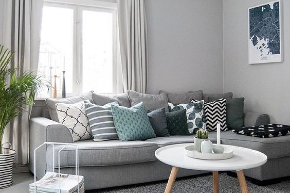
Grey
Give a room a touch of gray and it will provide shade. One of the colors that is also close to nature, neutral and non-contrasting. Suitable to be combined with various colors. The living room will not be too prominent but soothing and reassuring.
Tosca

This color that leans towards green and blue is quite popular. Called tosca, this color brings brightness to the space and calmness. The light that directly penetrates this tosca color is very beautiful. Looking fresher and wiser, this color provides clarity and concentration of mind when talking to others as it calms the nerves. This color also reduces loneliness and enhances creativity. Beautiful and attractive for use in the living room.
Green

http://www.houseandgarden.co.uk
Another color that is close to the color of nature. Yep, green! As if reminiscent of a natural atmosphere with grass and leaves on the trees. Harmony and harmony in space can be felt with this color. Relaxing and also calming. Gives freshness to people who are in the room. But when used incorrectly it will give a bland impression to the room.
Purple
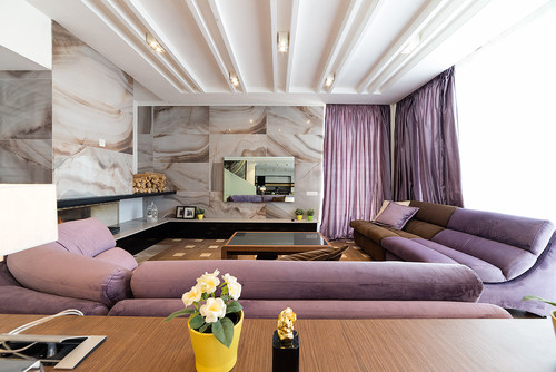
Spiritual and majestic are the properties of the color purple. It gives a luxurious impression to the room it decorates. Purple also gives calmness in it, therefore this color is suitable for meditation. This color is also close to its "magical" impression so that it gives more imagination in the room.
Chartreuse

http://www.houseandgarden.co.uk
Not many are familiar with the use of this last color. Chartreuse reminds us of the color of unripe or unripe fruit. A sour and loyal impression is given to the room. The bright yellow color not only gives the impression of loyalty but also royalty. Quite stylish for the room but don't forget to combine it with neutral colors so it doesn't look dull.