The house with a building width of 3.4 meters has an attractive façade and interior
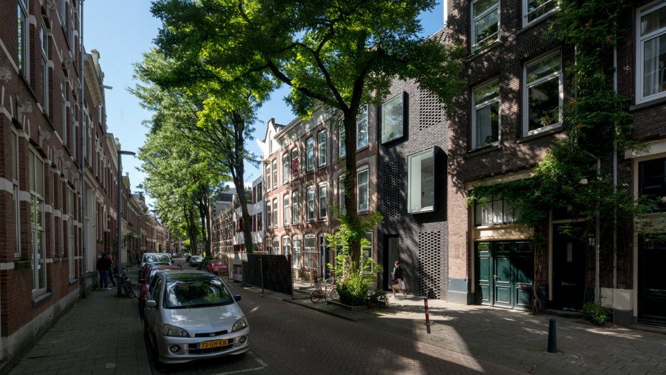
Dutch architect couple Gwendolyn Huisman and Marijn Boterman designed a sleek house in Rotterdam for them to live in. With a land size of 3.4 meters wide and 20 meters long, flanked by two tall buildings. Therefore, the couple made the house into three floors.
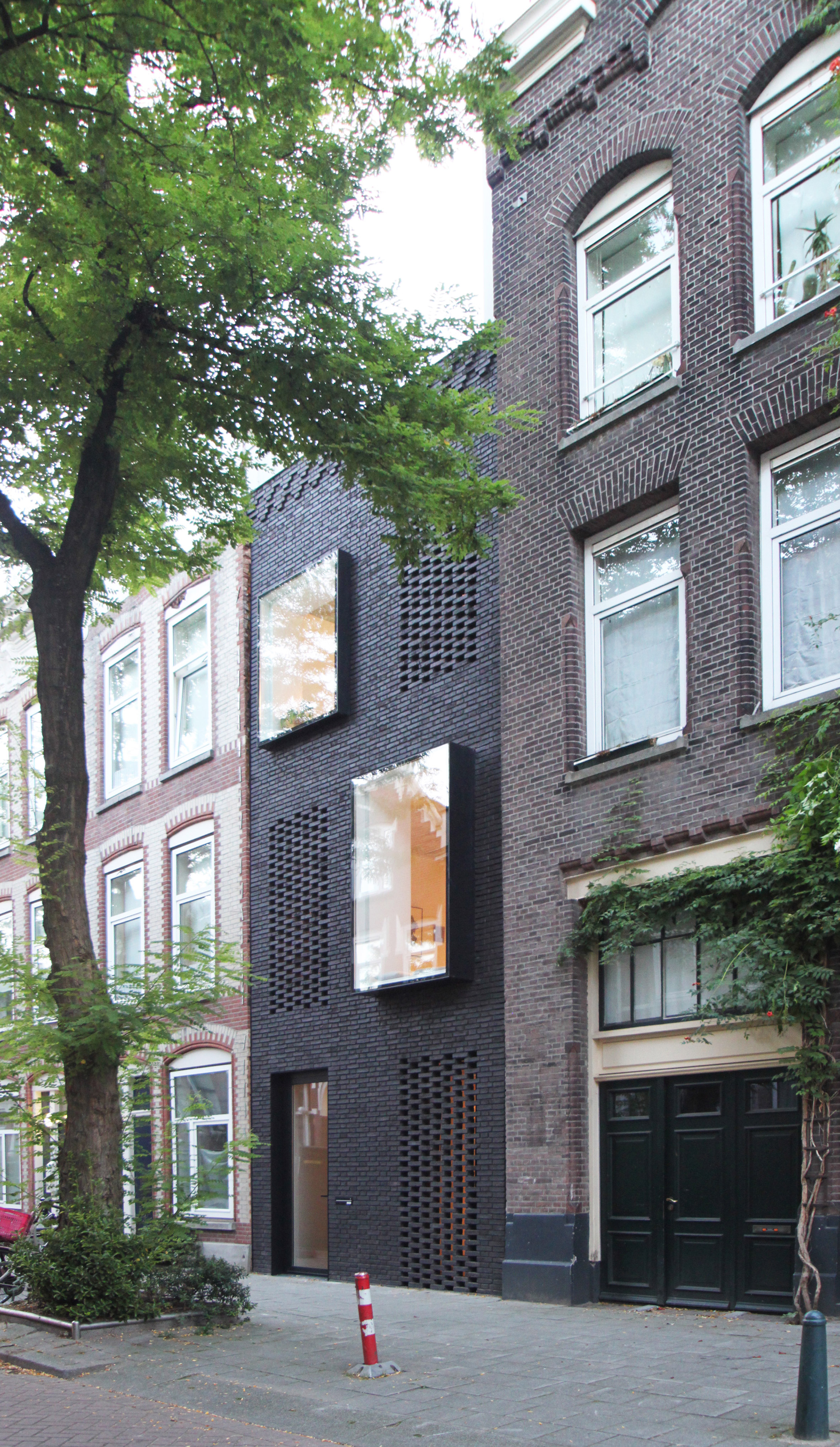
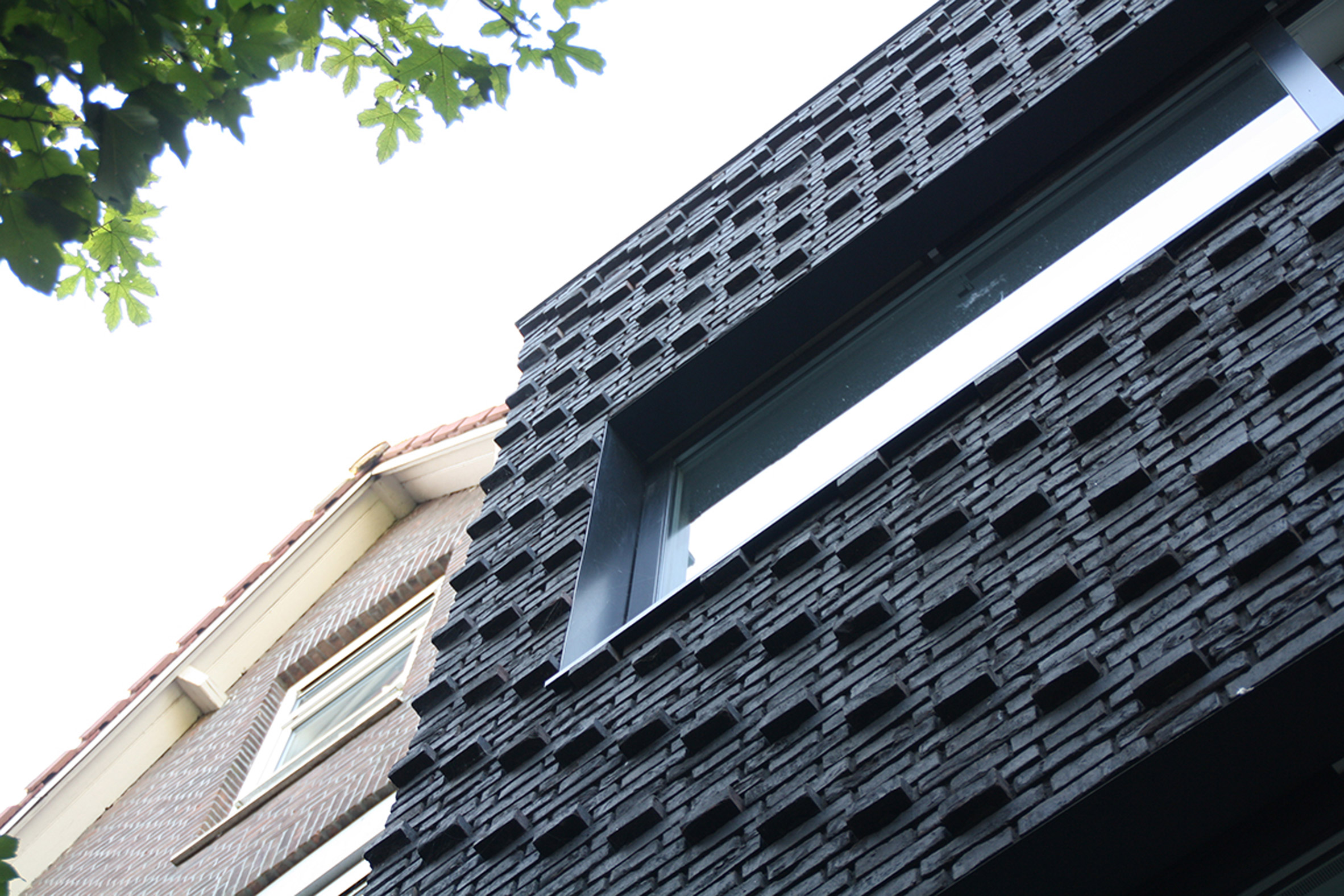
It can be seen in the photo, the house is covered with black brick material with large enough window openings. This is because the architect wants to make this sleek house get maximum lighting from outside the building and also the building still looks magnificent.
The use of bricks was applied to adjust the surrounding home environment. Architects want to design a house that looks modern so that it has its own identity but also does not forget the history of the environment. Plus the architect wants to present a sleek house that can meet all the activities of daily life.
Some things to consider for this sleek house are the structure of the building due to the proportion of the building that is long to the back. On the front and rear facades of the building are equipped with concrete slab structures made vertically directly to the massive foundation.
This is done so that the load received by the building will be directly channeled to the ground. Not to forget also this structure will allow architects to design large window openings on both facades.
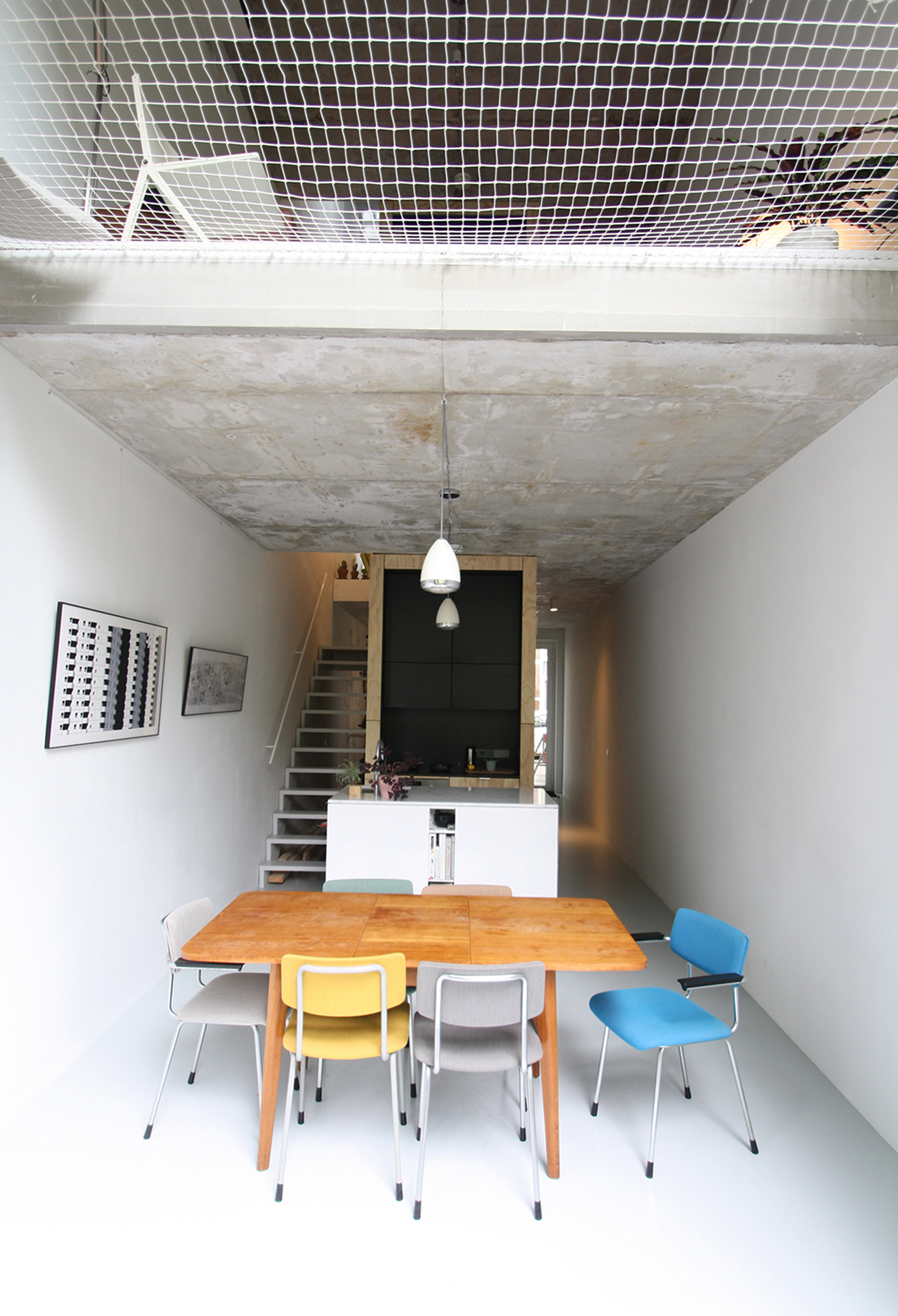
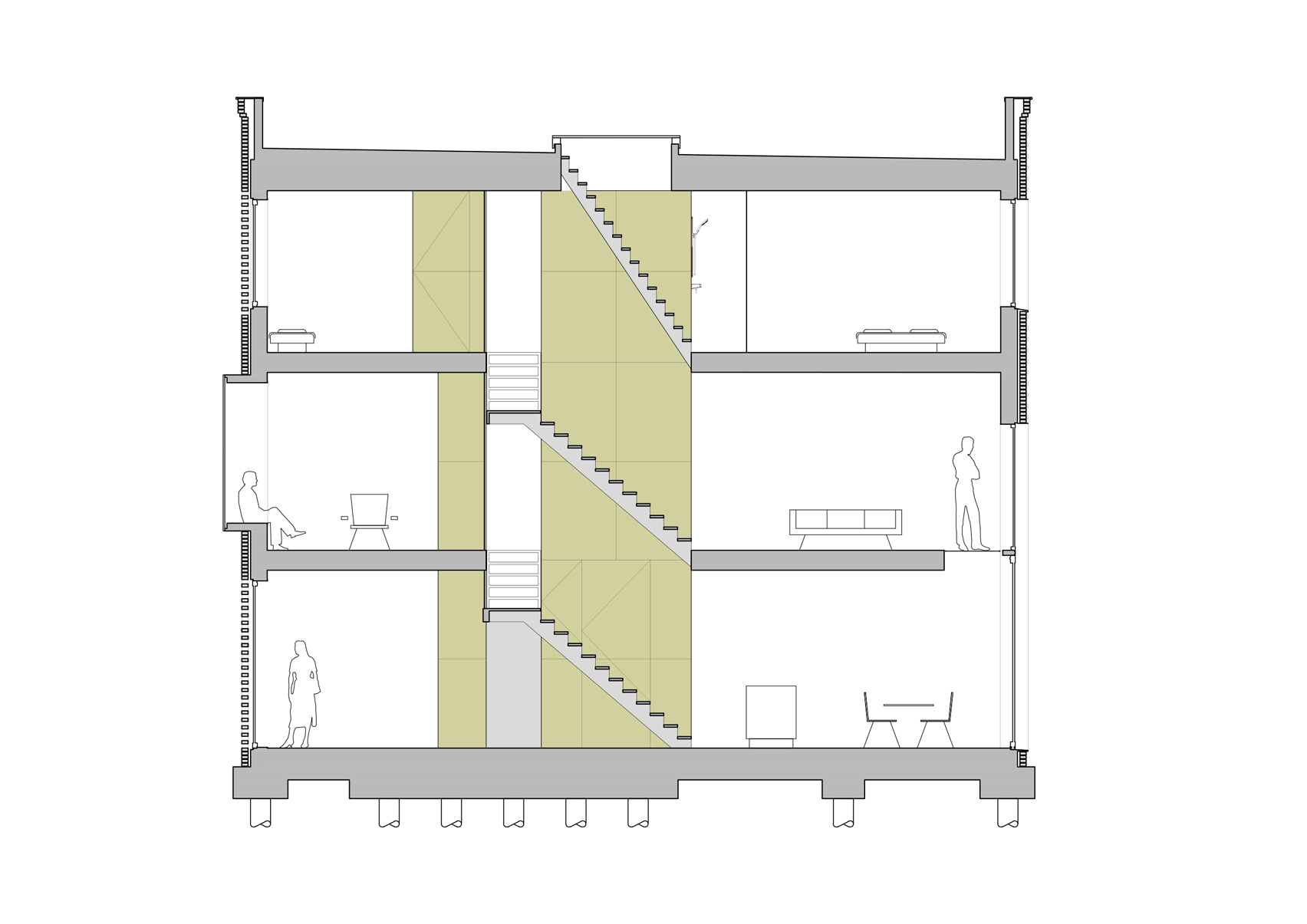
On the ground floor, it is used as a dining room, kitchen and entrance. When entering the house, visitors will be faced with the front area which is also used as a garage and plywood storage cupboard. Plywood itself is used as a coating for concrete core columns that are built from the bottom to the top of the building.
After the entrance, you will see a small dining room but enough for several people. While the kitchen is also made mini on the core of the building. The use of various colors on furniture makes this all-white room look more alive.
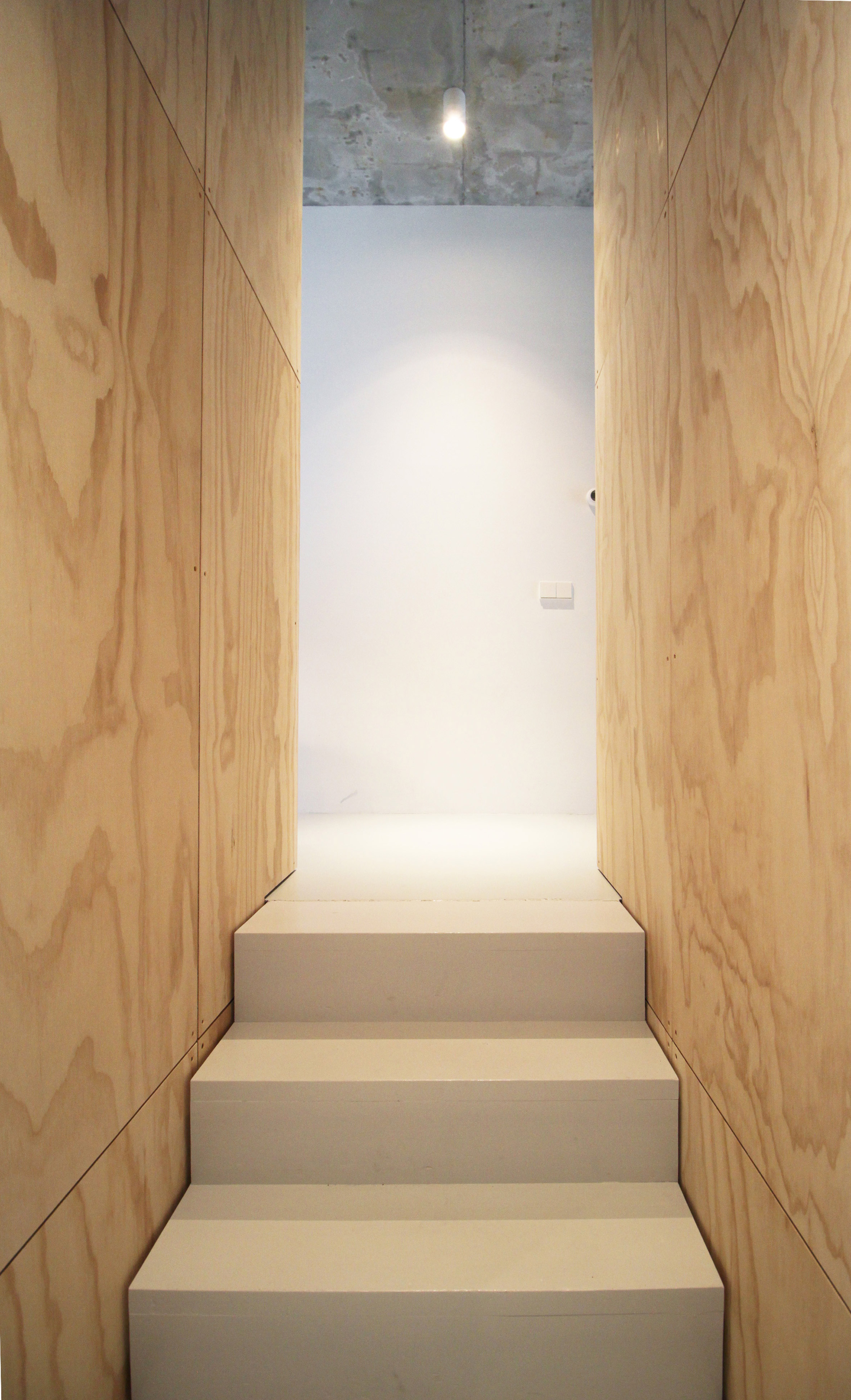
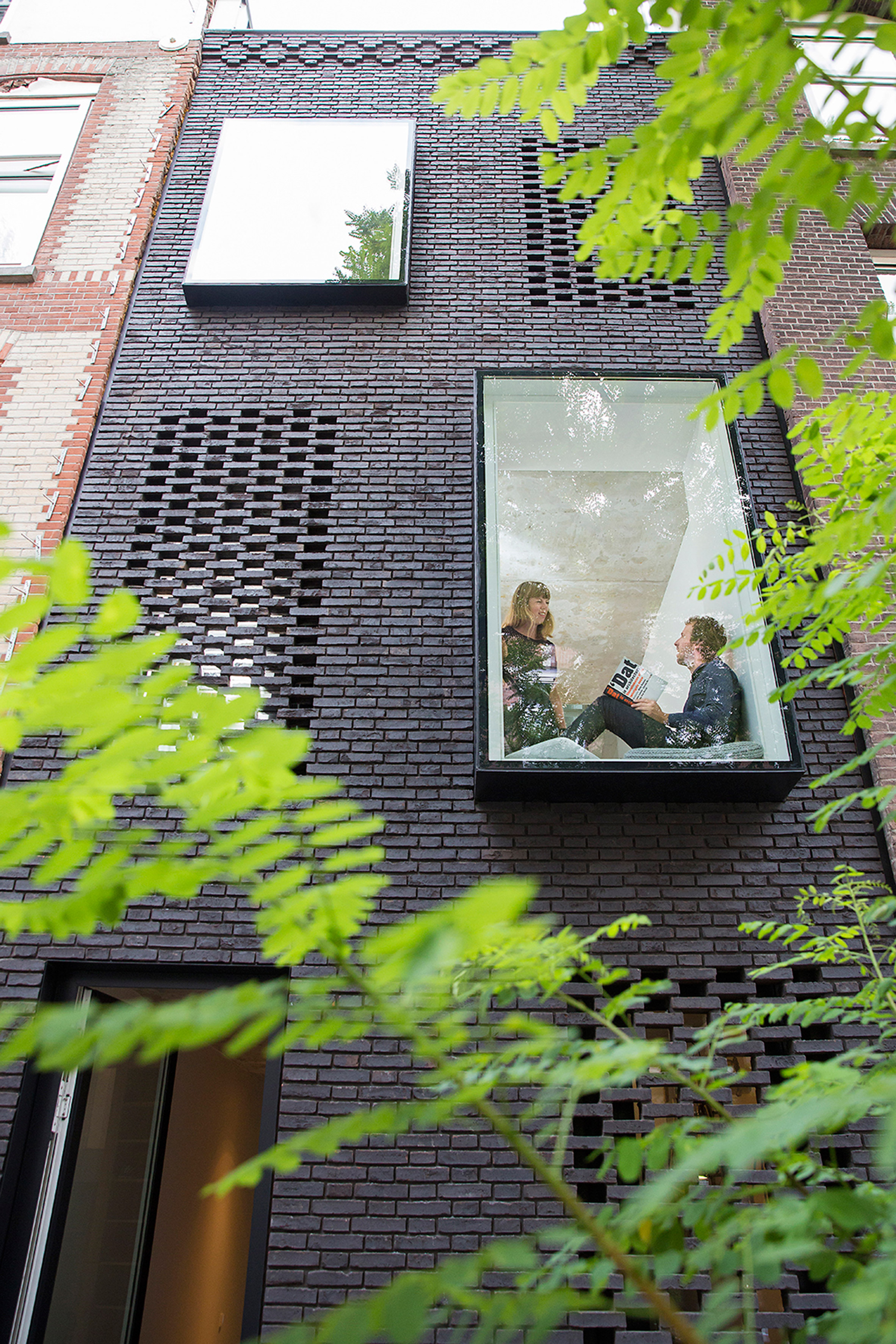
The stairs themselves are designed in the shape of the letter L so that on the top floor, the room is divided into two sides. For the second floor there is a reading room and also a family room.
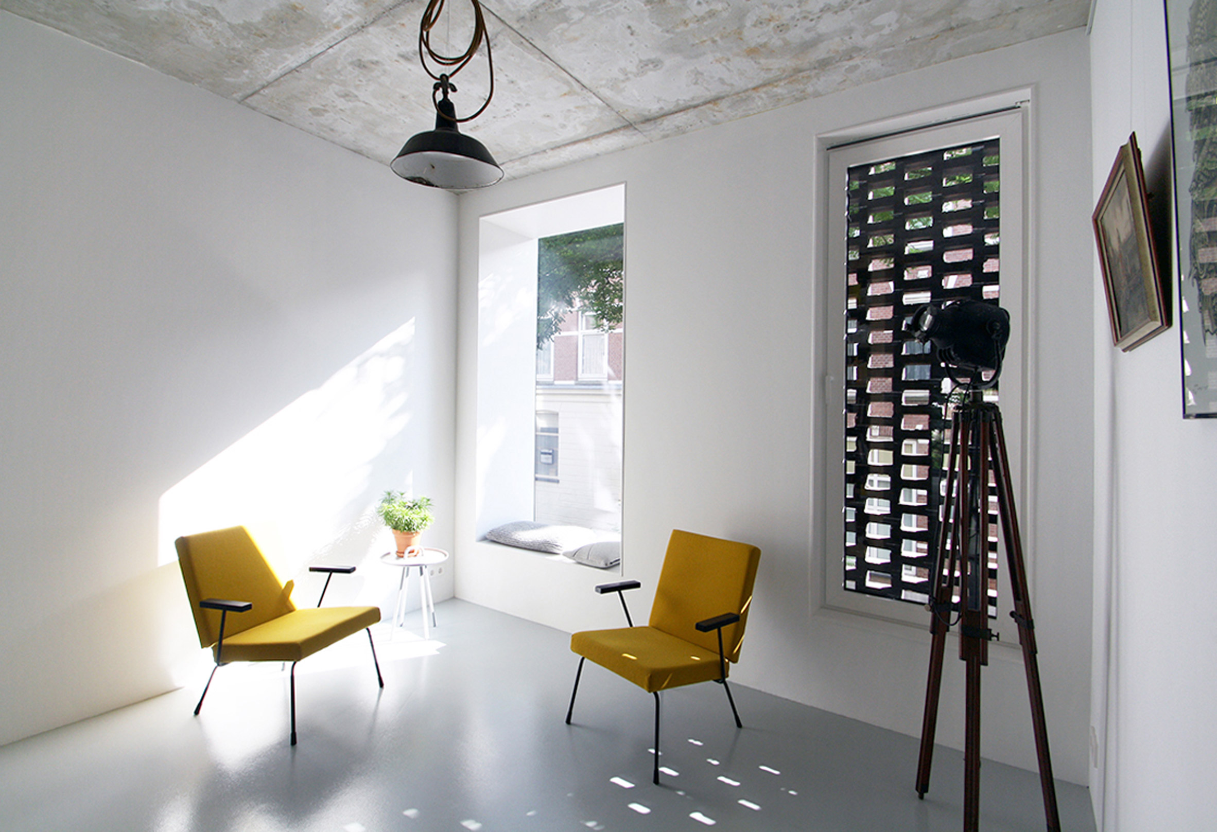
The reading room is located in the front area of the building. The windows on the façade are made to protrude forward so that they can also be used as seats. Another unique thing, this small hole made of a pile of bricks turned out to have a hidden window in it. This window will only be visible from the outside at night and the lights inside the house are turned on. Otherwise, from the outside it just looks like a façade game.
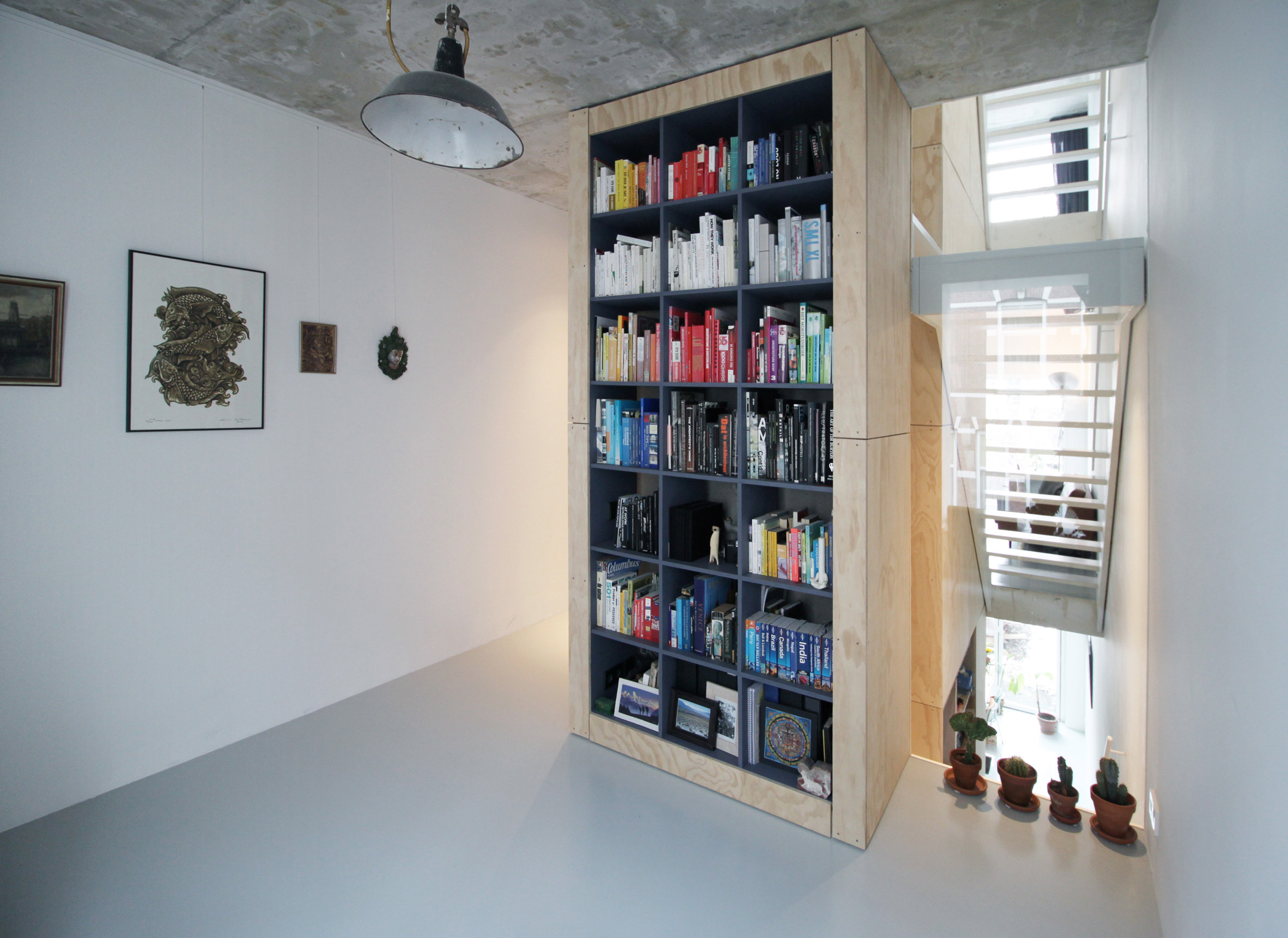
Of course, the reading room would not be complete without bookshelves. The bookshelf in this room is located on the core of the building covered with plywood. Just like the previous column in the dining room.
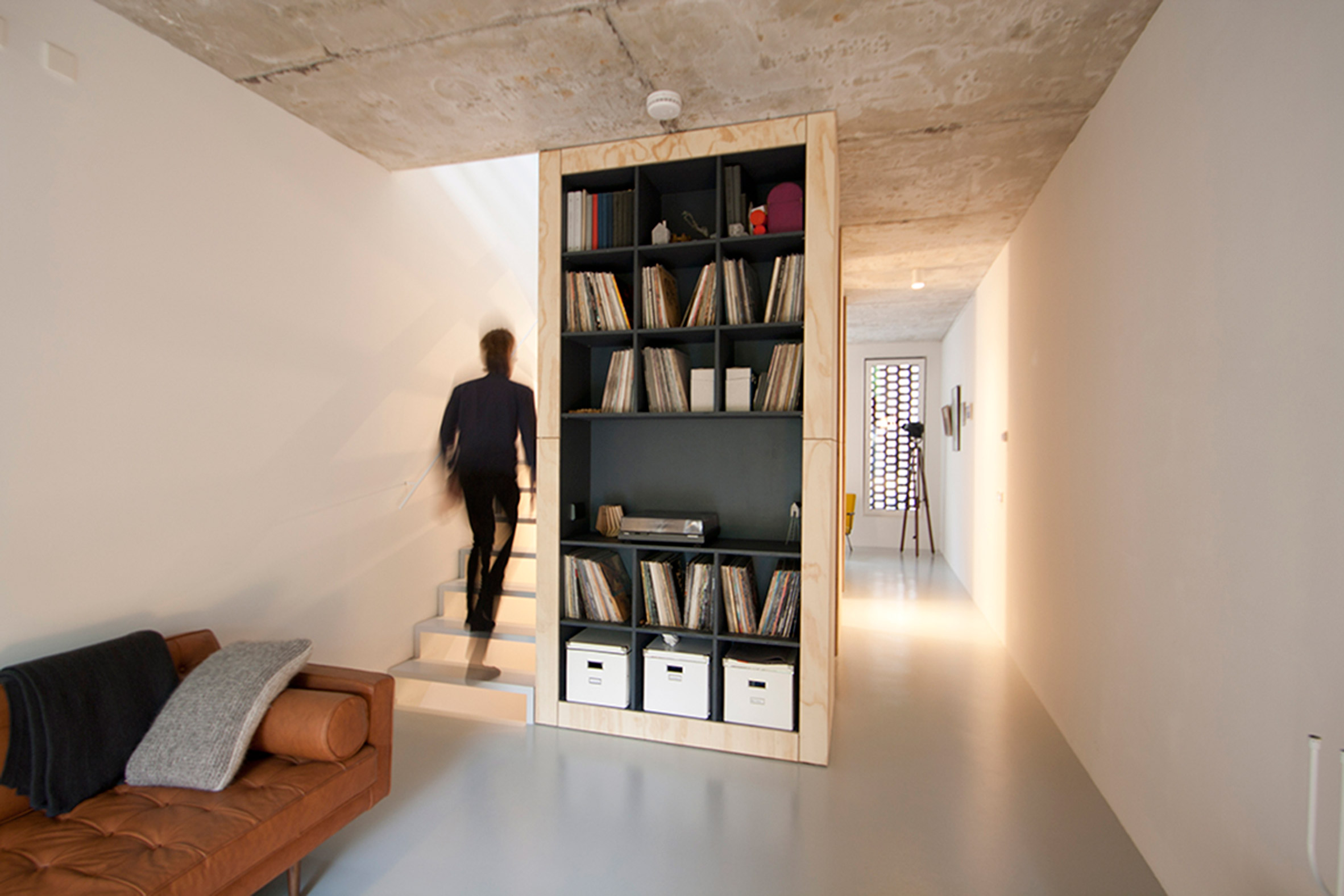
Then in the family area there are also bookshelves and sofas. It can also be seen that the stairs on the walls of the building are made open on the optrede, namely the ascending step so that the skylight on the void of the main stairs can be maximized from above to the ground floor.
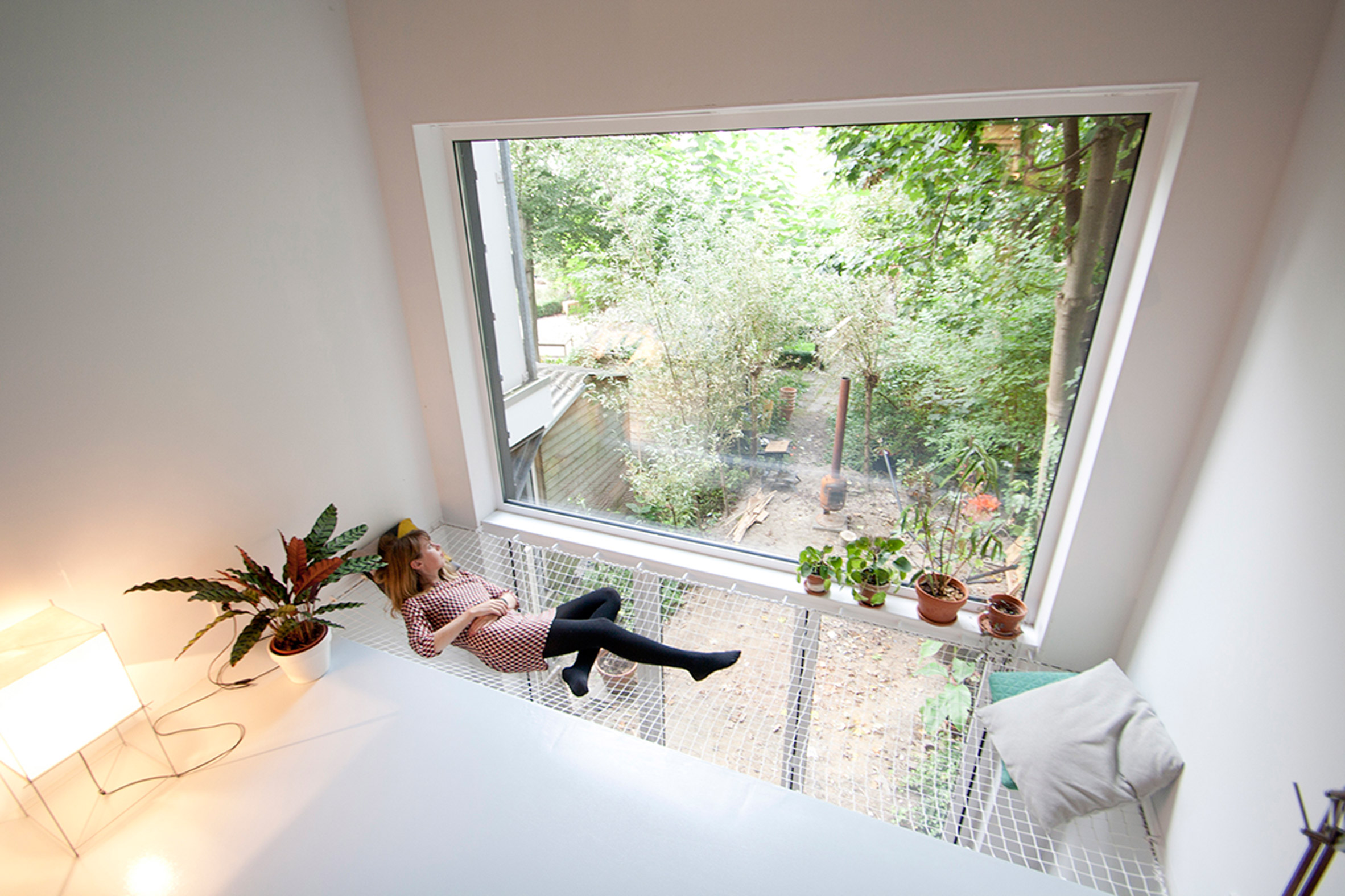
Not to forget also another interesting part of this house is the void part in this family room placed hammock facing a large glass window leading to the backyard of the house. Can be used to relax while enjoying the view. And at the bottom, namely the ground floor, the room that functions as a dining room is also equipped with folding windows so that it can be opened as wide as possible.
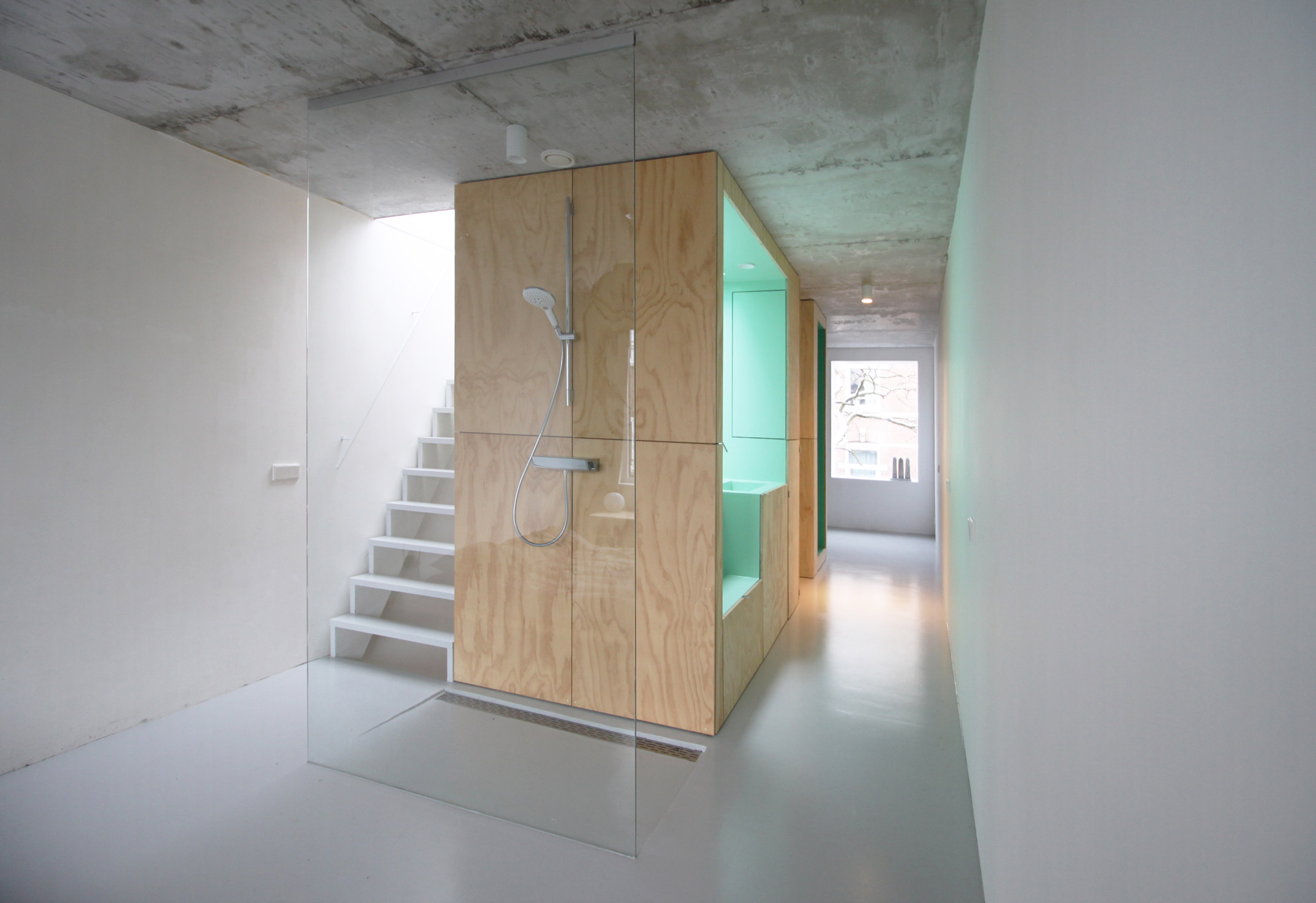
On the top floor there are two bedrooms and also a bathroom. In the master bedroom, there is a shower area that is only covered with glass material. Next to this shower area there is a bathtub area and also a sink. While in smaller bedrooms, the core plywood column is used as a toilet and wardrobe.
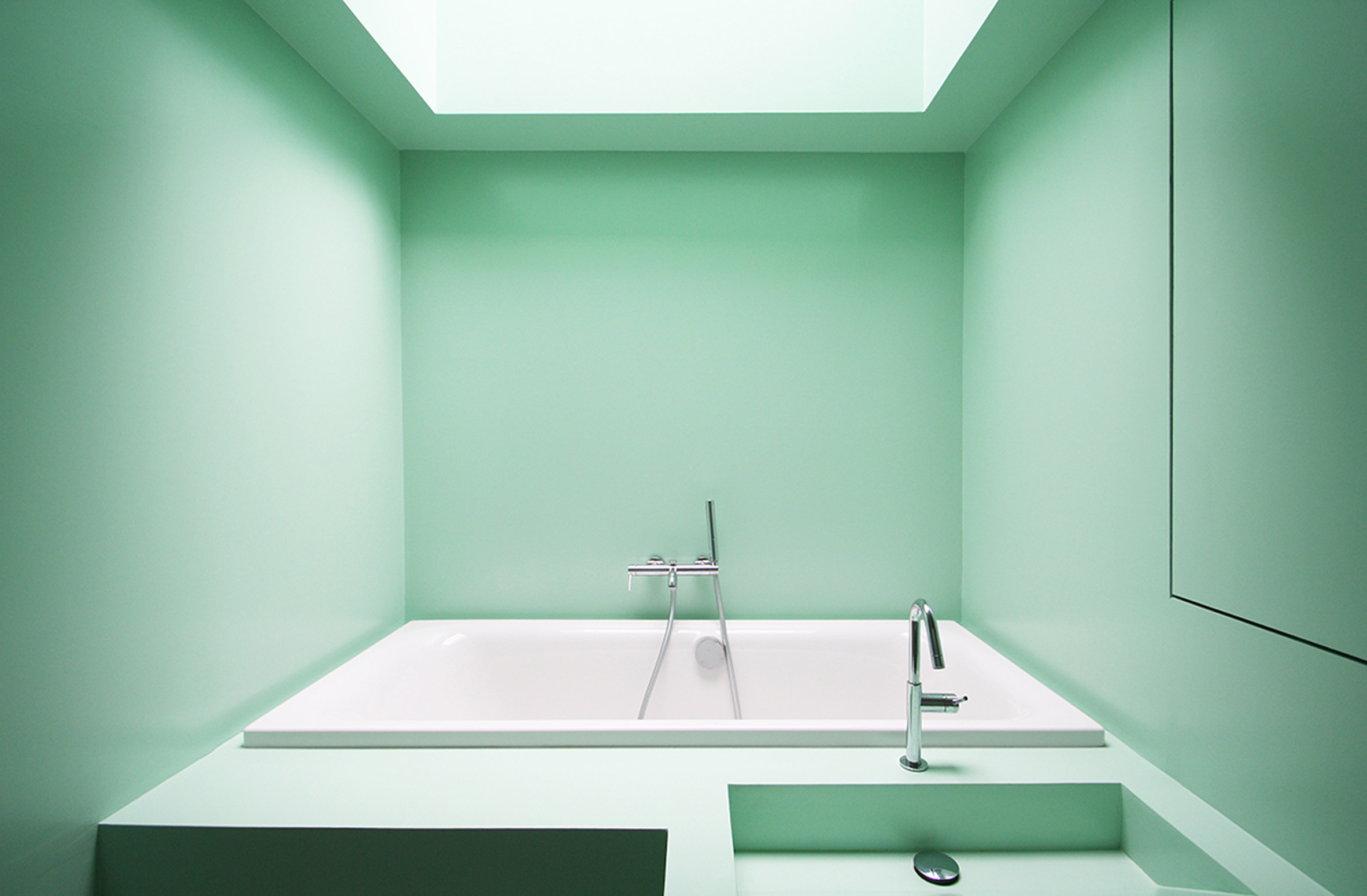
The bathtub area is raised so that it does not directly border the floor in the building. Equipped with a skylight at the top of the bathtub, providing views of the sky and surroundings that give a natural and natural impression when bathing and relaxing in this tub. Plus also to maximize lighting in the bathroom. Coloring in the bathroom makes it look more lively and also modern.
The placement of space on each floor has also been considered through daily habits based on the time of activity. As well as the ground floor in the form of an entrance and kitchen, then a reading room and family that is usually used in the afternoon and a bedroom and bathroom on the top floor. In accordance with the daily cycle of building owners.
source: skinny home, rotterdam