In Contrast to Tony Stark's House in Iron Man, Robert Downey Jr.'s Unique Residence in Hampton is Artistic and Beautiful!!!
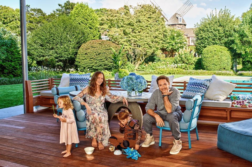
Who doesn't know this very famous Iron Man actor? Robert Downey Jr., who has portrayed Tony Stark brilliantly, has a home quite different from his on-screen residence. The highly-paid actor from the latest Marvel film, "Avengers: Infinity War," owns houses in various locations. The design of each of his homes is breathtaking and leaves guests in awe. One of them is his windmill house. The house, equipped with a countryside-style windmill, features an artistic interior.

Front view of the residence via architecturaldigest
The house Robert purchased is a rather historical one. Located in the Hamptons, this house went through an interior overhaul to suit his and his wife, Susan's, tastes. The various changes made will surely amaze you. They renovated the house in a relatively short period. With the help of designer Joe Nahem, the interior came alive in just six weeks. Let's look at the changes below.
1. Entry Hall
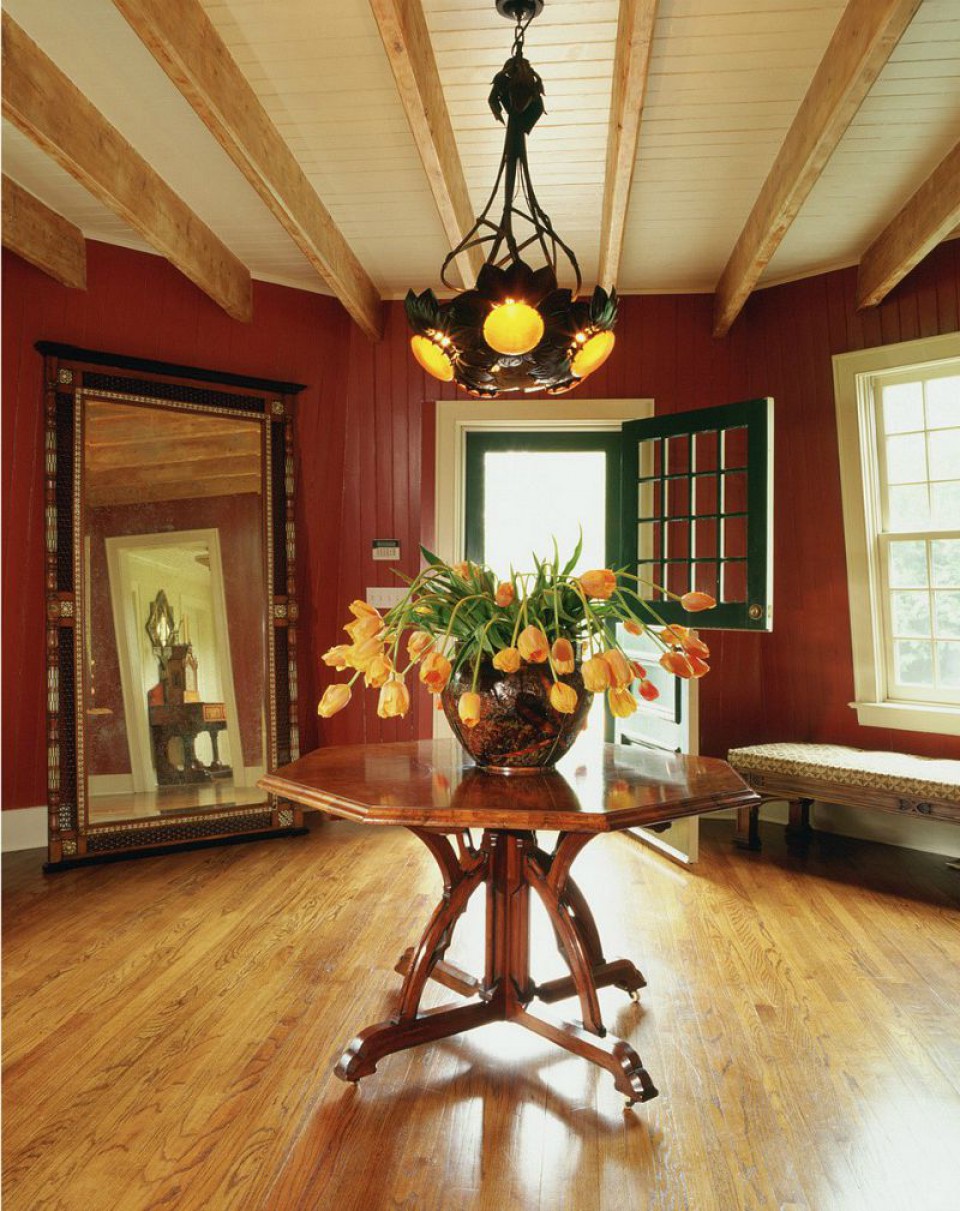
entry hall before
The entry hall is the space where visitors entering the house form their first impressions. Therefore, it needs to be well-designed and leave an attractive impression on guests. In the previous residence, the hall looked like a typical classic house. It had a natural ambiance with wooden floors and walls, complemented by flowers on the table.
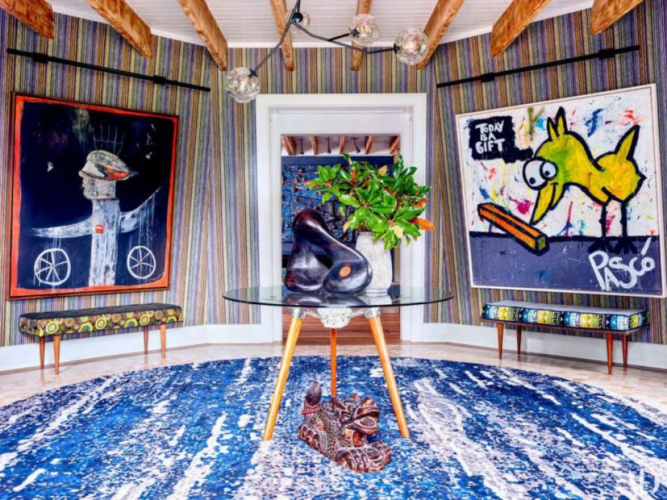
entry hall after
Artistic ambiance is prominent in this room. Besides being vibrant, the front hall feels alive. The striking blue color on the carpet and vertical lines on the wall give a sense of height to the room. It's unique and makes for a great first impression upon entering this residence.
2. Living Room
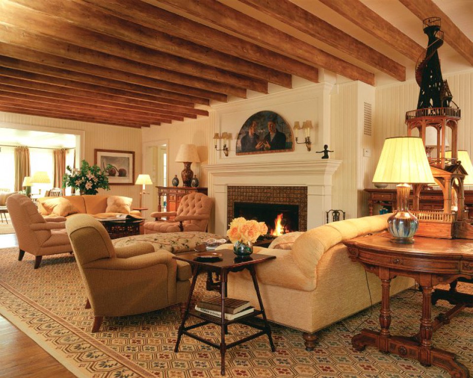
living room before
This kind of setup is often seen in living rooms. A comfortable sofa by the fireplace, making the room cozy and warm. The design of the fireplace looks quite typical.
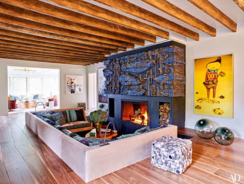
living room after
This 360-degree change showcases a modern and beautiful style. The floor is lowered to encase the sofa seating. The design of the fireplace is truly eye-catching. The dark blue color stands out in the room. The furniture also feels more stylish compared to before.
3. Dining Room
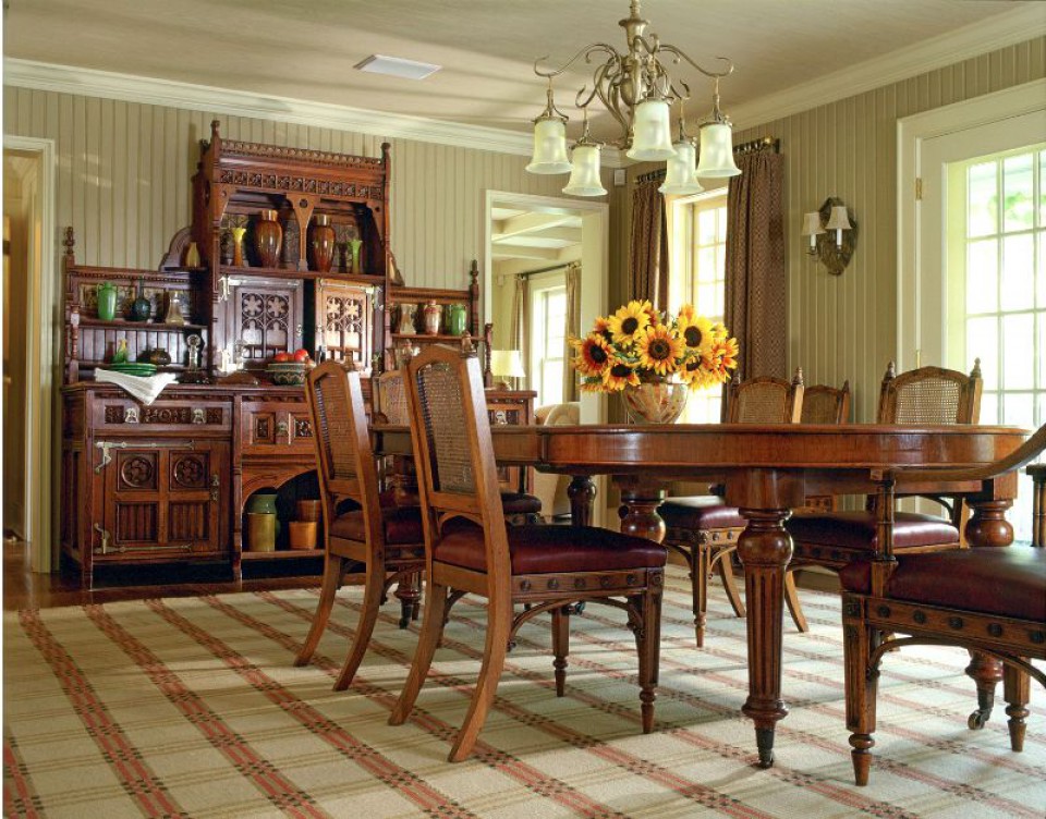
Dining room before
An oval table, wooden chairs, and wooden cabinet shelves are present in this dining area. The warm atmosphere in the room perfectly suits its purpose, providing a suitable space for family meals.
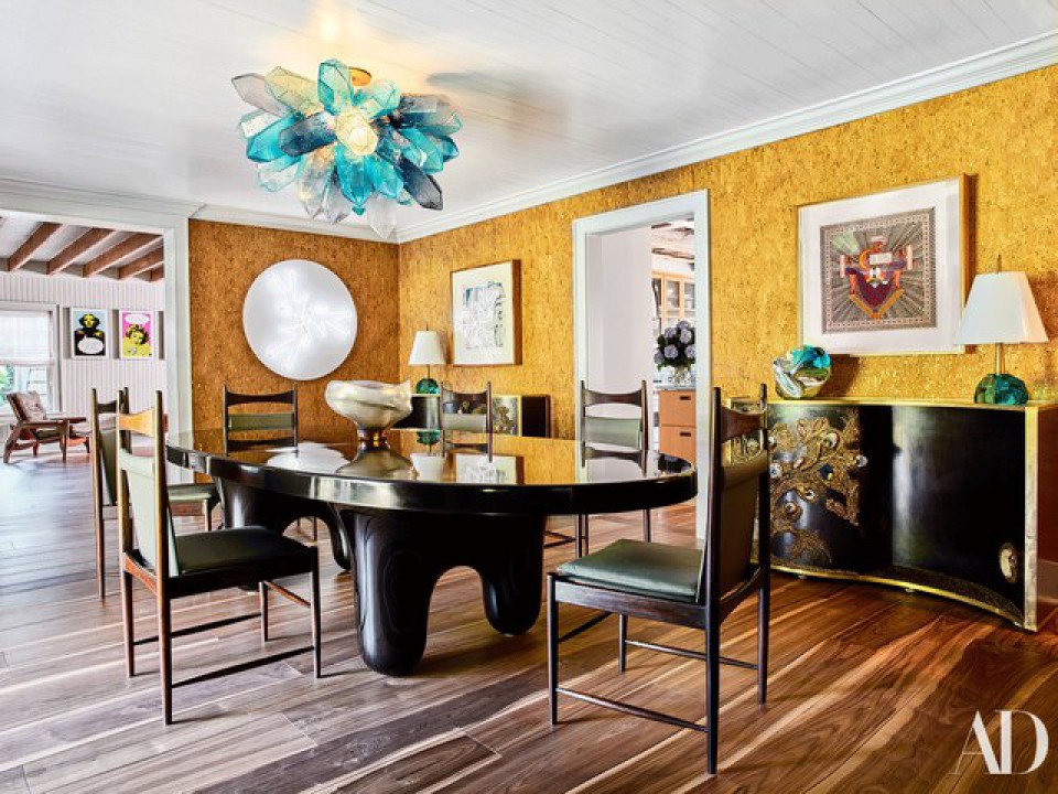
dining room after
The dining room undergoes a drastic change, looking unique. The glossy black round table exudes elegance. The modern table legs and the bright yellow color add a lively touch. These unique elements tie each room in the house together.
4. Kitchen
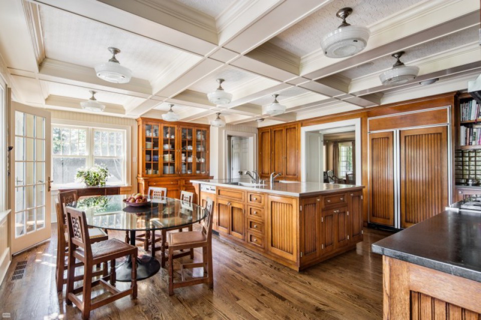
kitchen before
Wood is the primary material in this room, giving a classy feel. The large kitchen table and a round breakfast table create a cozy morning atmosphere. The overall look is cohesive, evident in the cabinet doors and the kitchen table doors showing similar patterns.
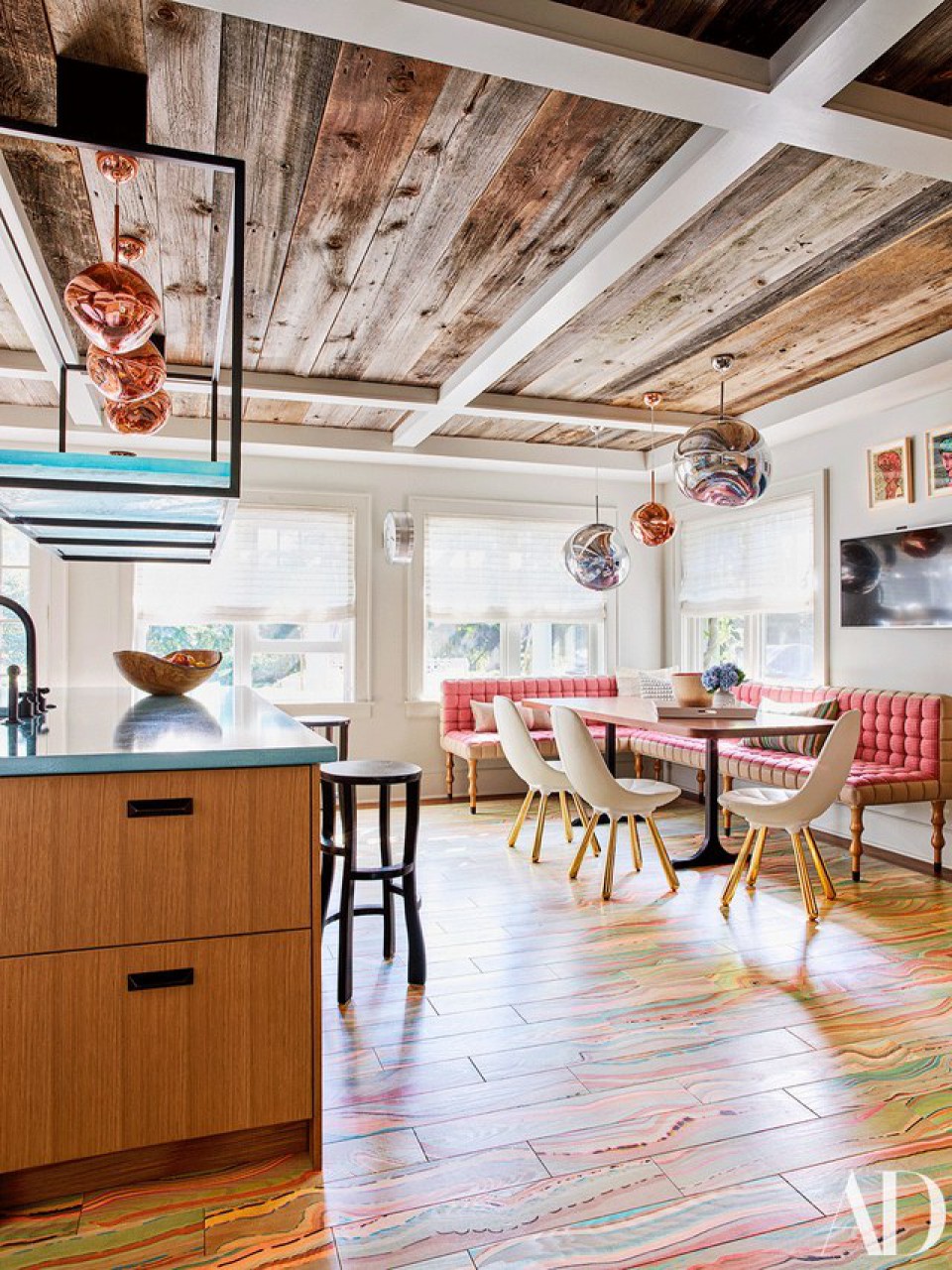
kitchen after
Quite different from the previous design, this kitchen has a fun vibe. Everything from the colors to the furniture choices presents a non-formal atmosphere. The ceiling has a natural-looking wooden pattern. The pink corner sofa looks bright due to the light from outside. Cozy and chic!
5. Enclosed Porch
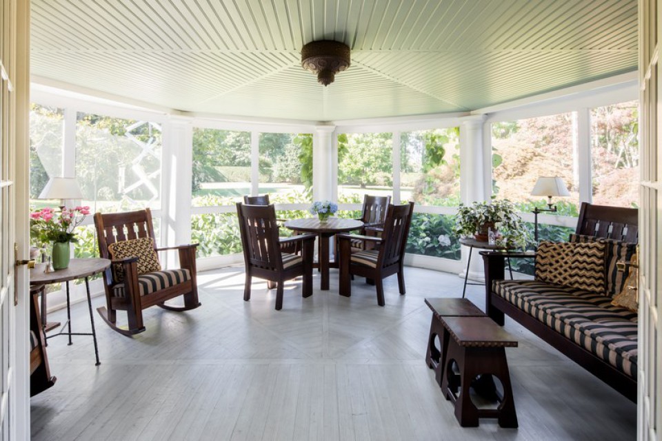
Porch before
As an area that receives a lot of sunlight, white flooring and ceiling are suitable choices. The incoming light reflects within the room, giving a bright feel. The dark wood furniture contrasts nicely against the white surroundings.
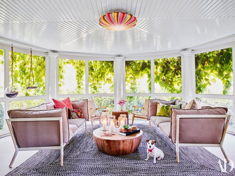
Porch After
Although the room looked more spacious and open in the previous design, Robert and his wife had a different vision. Despite the white surroundings, they chose to showcase a variety of unique colors inside the room, avoiding a monotonous feel. This is seen in everything from the lampshades to the sofas and tables. The room also feels more compact compared to the previous design.
6. Bedroom
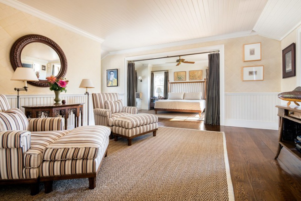
bedroom before
The master bedroom looks very comfortable, with a relaxation area for the couple. The design is calming and serene, with a cream color scheme throughout the room. There's a curtain separator between the relaxation area and the sleeping area, ensuring sleep activities are not disturbed by others in the relaxation space.
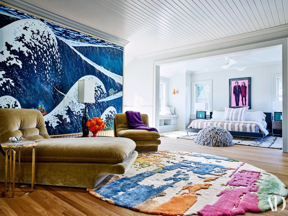
bedroom after
The layout of the furniture in the bedroom is somewhat similar to the previous design. The drastic difference lies in the room's ambiance, with wallpapered walls and a colorful carpet with a unique pattern. The relaxation sofa still serves a similar function but has a more modern design than the previous sofa. It looks very pleasant in the room.
7. Swimming Pool
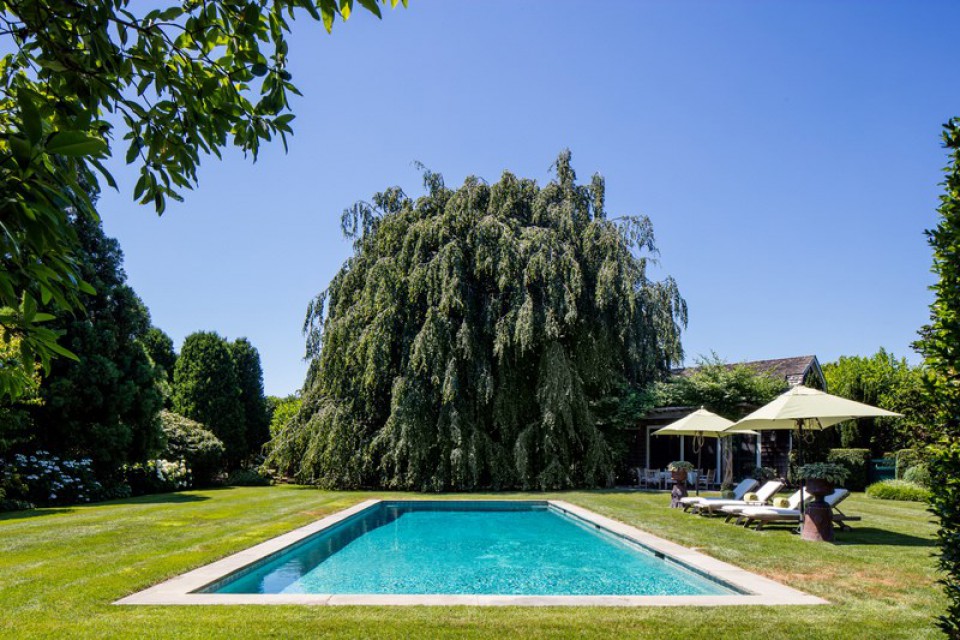
pool before
The open backyard swimming pool looks serene, surrounded by trees and grass. There's a sunbathing area with umbrellas to prevent overheating under the sun.
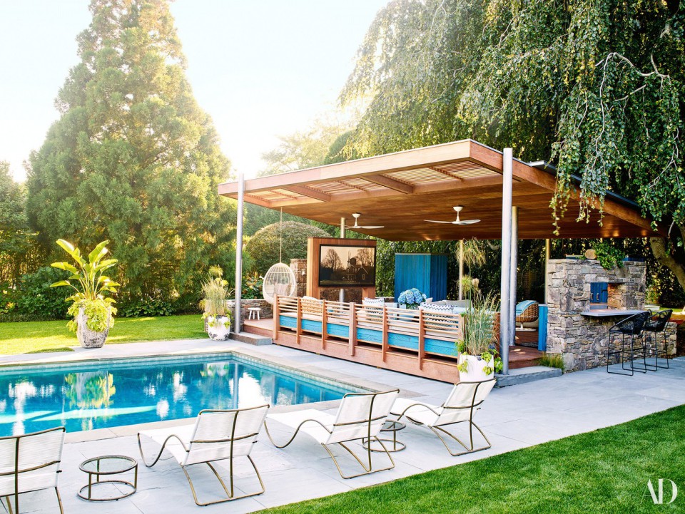
pool after
This pool, in Robert's house, has a relaxed and lively appearance. At the end of the pool, a pergola area has been added for relaxation, dining, and chatting with family and friends. While enjoying the natural scenery, this pool design is vastly different from the previous one. Hardscape flooring surrounds the pool so that when exiting the pool while wet, you don't step directly onto the grass.
8. Exterior
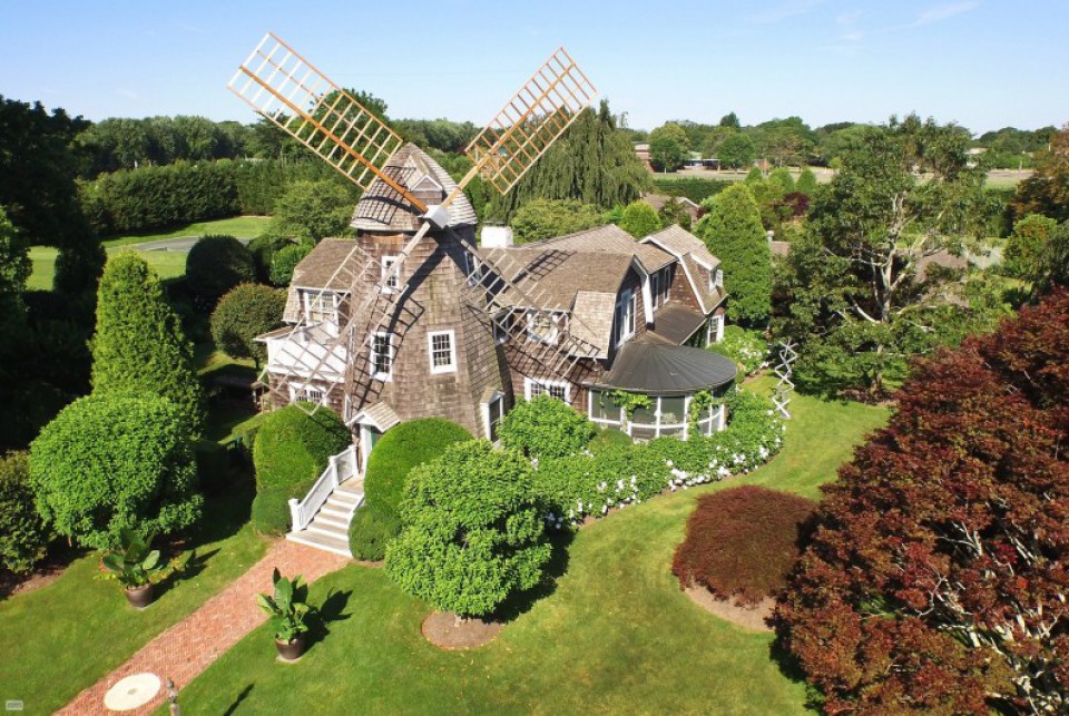
house before, nothing changed
Nothing has changed about this old building. The building that was once a movie set location indeed has its own charm. With a giant windmill and a serene surrounding, the house is very appealing.
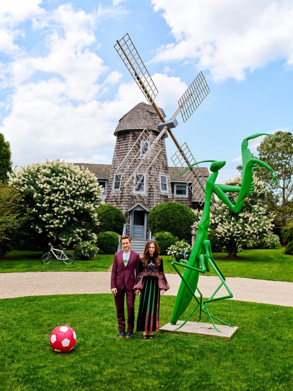
sculpture in front of the house
The building itself is already beautiful, so no changes were necessary. A notable feature in the front of the house is the tall green grasshopper sculpture. This aligns with the fun concept embraced throughout the house. Moreover, this house would surely make children enjoy playing around it.
Image sources :
- before: hookedonhouses
- after (Robert Downey Jr.'s house): architecturaldigest


