Japanese-Style Shop-House that is Simple and Modern! Inspiration for Those Who Want a Simple Home with a Business Space Inside.
Shop-houses, or 'ruko' as the abbreviation for 'rumah toko,' are quite common in Indonesia. We often see various two-story shop-houses, with one floor dedicated to business and the other for residential purposes. This type of building is undoubtedly convenient for owners to run their businesses. However, not all shop-houses provide comfortable living spaces. The design of these Japanese shop-houses can serve as inspiration. With their simplicity, these shop-houses appear comfortable and spacious.
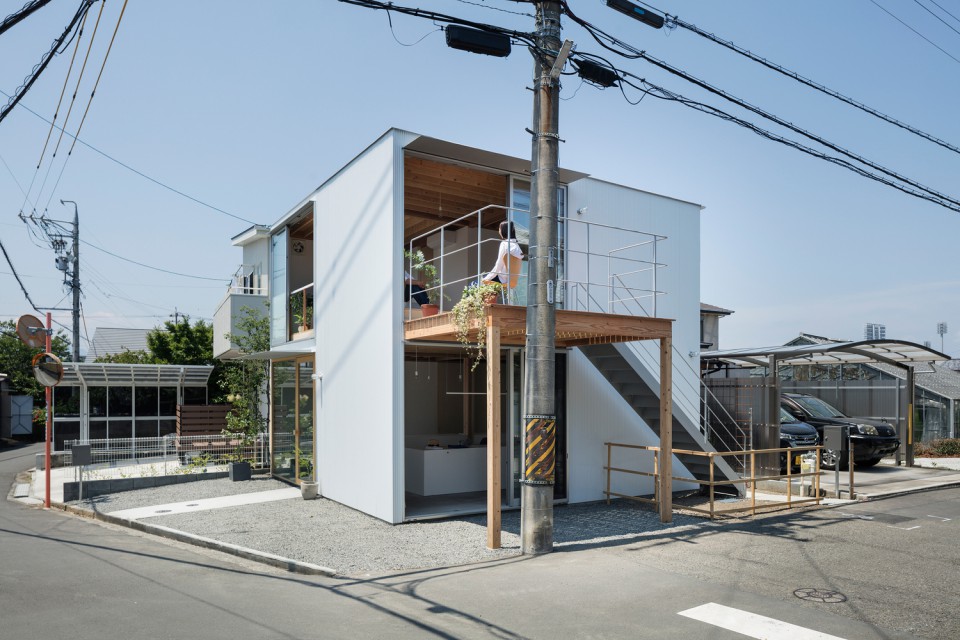
The building located in the hilly area outside the center of Shizuoka, Japan, has a total area of 79.45 square meters. It was designed by the Japanese architect firm Suzuki Architects. The surrounding area features various functions, including multi-purpose buildings, old farms, tea gardens, and residential areas. What makes this building unique is its location on a hilly terrain with a view towards Mount Fuji.
The first thing the architect did in the design process was to create a building that seamlessly integrates the house with its surroundings. This involved designing dividing walls that harmonize with the environment, serve the building's function, and at the same time, maintain privacy for the residential part of the house. The shop-house was also designed with openings that allow views of the outside landscape while not exposing the interior's private spaces.
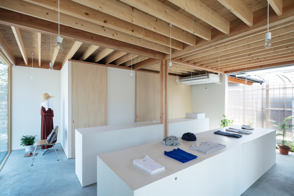
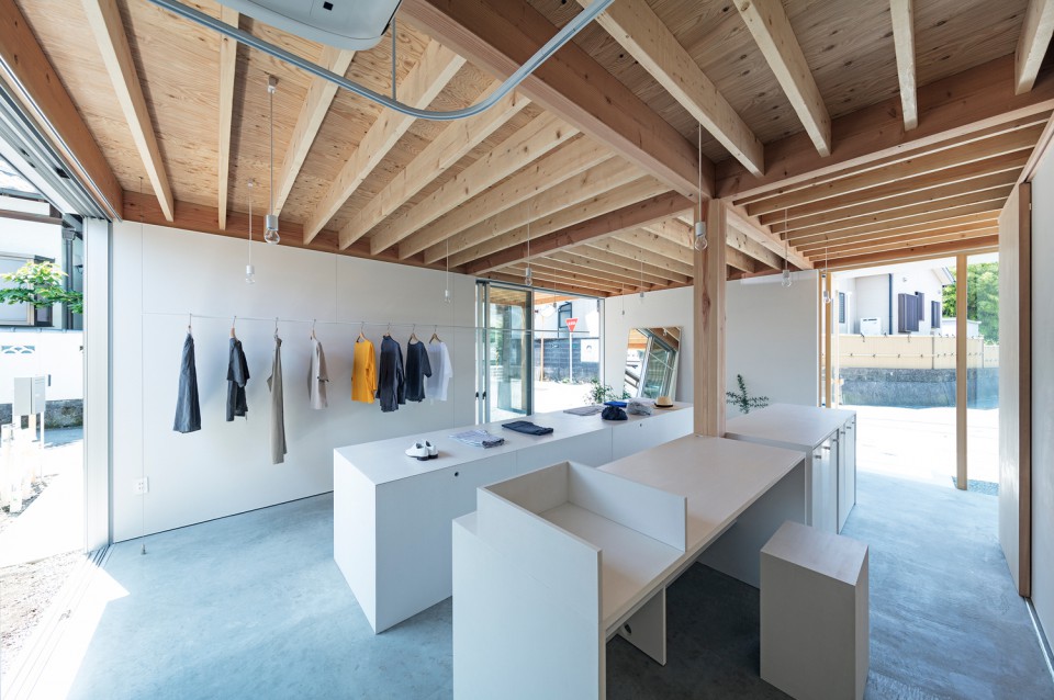
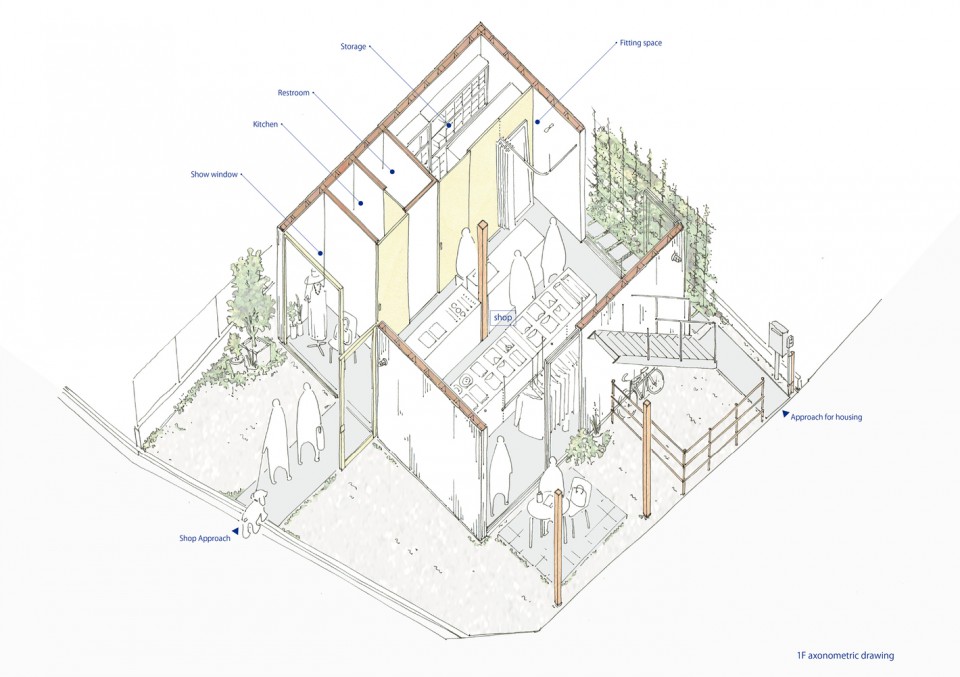
On the ground floor, the owner utilizes the space for business purposes. It's a store selling clothing and unique items made from natural materials. In addition to retail space and various displays for showcasing the merchandise, there is also a fitting room available in this area. The fitting room is, of course, a crucial aspect of running a clothing business. Additionally, there is a pantry and a restroom for store employees, as well as a storage area for storing the inventory of items being sold.
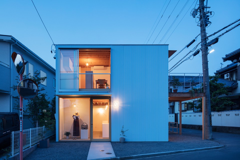
At the front of the store, there is a display area with glass walls showcasing mannequins dressed in highlighted store merchandise. It's a prominent feature, accentuated by the unique façade of the building that combines transparency with closed sections. The entrance to the store is also designed with a straight walkway that clearly directs visitors into the building.
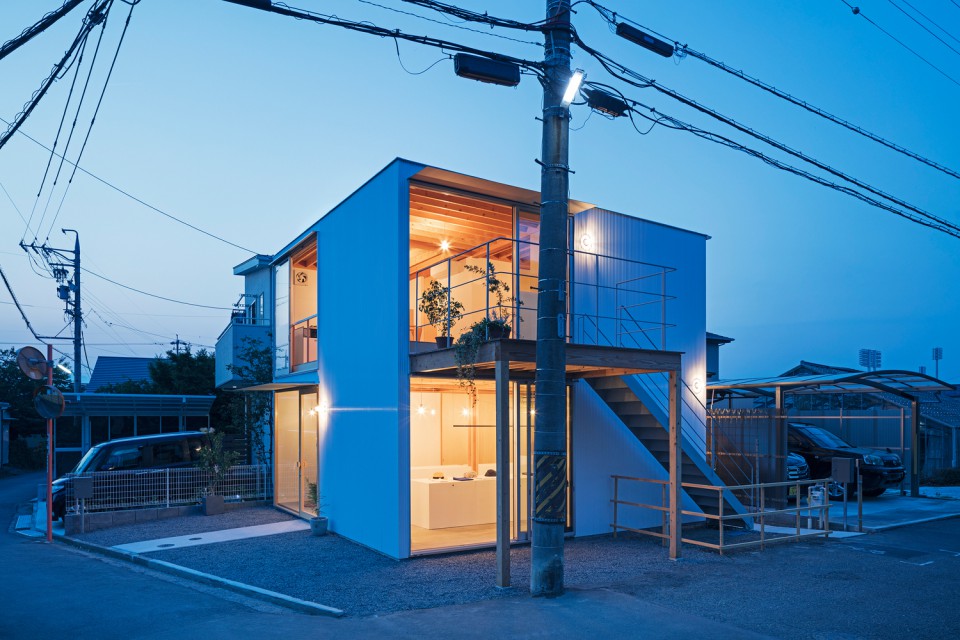
On both sides of this ground floor, there are openings like sliding doors and relaxation areas under the terrace of the second-floor residence. Meanwhile, other openings are adorned with vertical plant walls, creating a natural and serene ambiance. Light and air can freely enter the space, ensuring it doesn't feel cramped. What adds a unique touch is the contrast of this very simple design with the exposed wooden ceiling structure.
Meanwhile, the entrance to the residence is separate from the shop's entrance. The staircase, enclosed by a wooden fence, is located on the other side of the street from the shop. Climbing this staircase, visitors are immediately greeted by a wooden terrace that offers views of the surrounding environment. This terrace is equipped with iron railings to ensure safety for those inside.
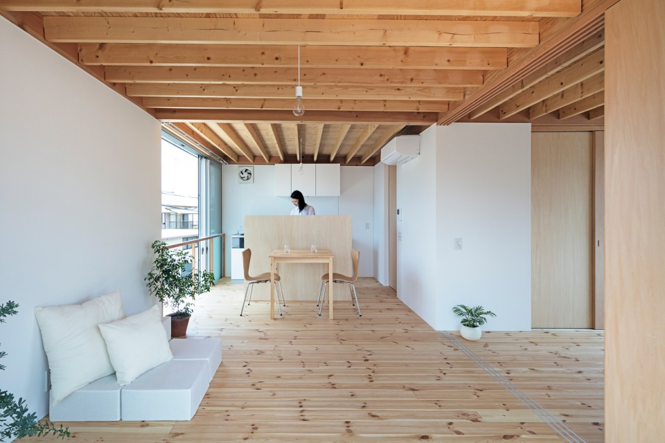
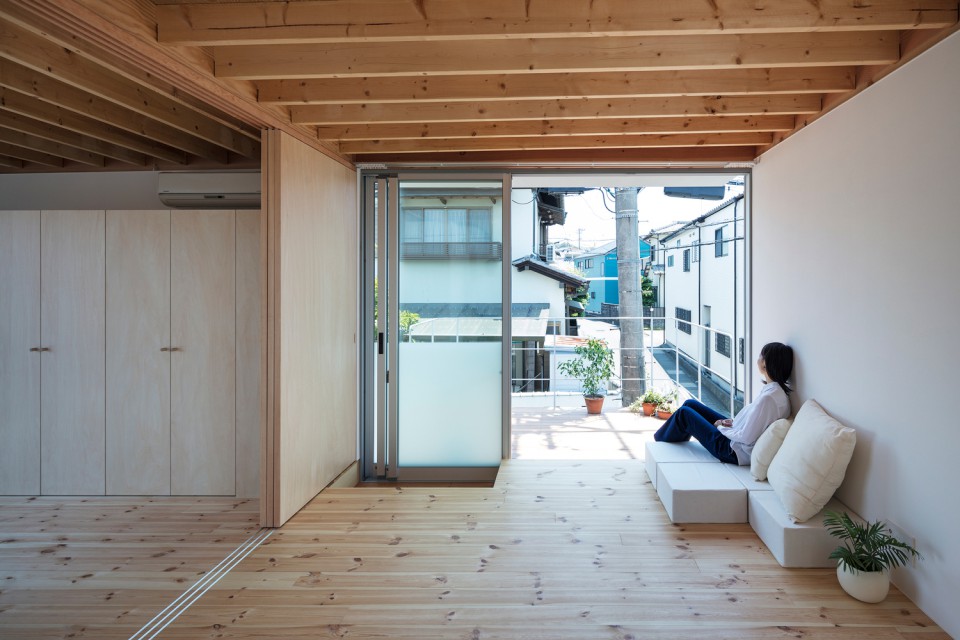
The residence is designed in a very modern and comfortable style. Various simple furnishings make the rooms feel spacious. Upon entering through the terrace, visitors are greeted by a living room that seamlessly connects to the kitchen and dining area.
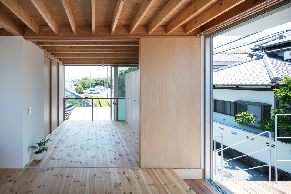
Due to the Japanese tradition of using thin bedding, the sleeping area can be utilized as another space during the daytime. However, this room is also designed to provide privacy from the living area through sliding wooden doors. The bedroom is equipped with a wardrobe for storing clothing and the occupant's sleeping mattress.
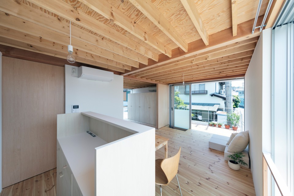
The bathroom can be accessed through a sliding door in the kitchen area. The toilet and the shower area are in separate spaces within the bathroom. The wooden flooring in the residence not only provides a natural look but also adds warmth to the interior. The ceiling design is consistent with the shop area, with a harmonious blend of white and light brown tones in the wood, creating an appealing and cohesive atmosphere.
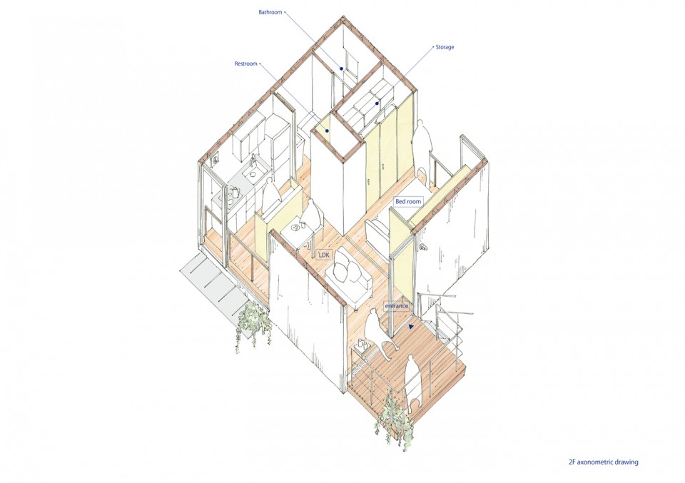
Suffice to say, the architect has successfully designed two distinct functions within a single building with separate spaces. This arrangement allows both functions to operate smoothly according to their respective activities. The simple, box-shaped design functions effectively as both a business space and a home. In contrast, many shop-houses in Indonesia often share the same entrance, which can lead to discomfort as activities from one part may disrupt the other. Perhaps this Japanese shop-house can indeed serve as inspiration for those planning to design similar structures.
source: archdaily


