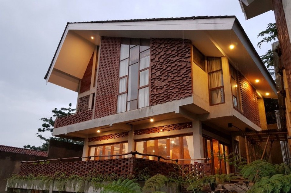
Sujiva Living: Blending Balinese Architectural Principles into Contemporary Modern Homes
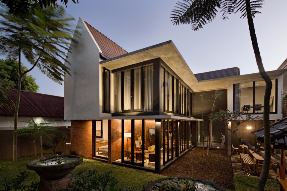
The residential house designed in South Denpasar has an area of 372 square meters. Designed by Somia Design Studio, the house named Sujiva carries the meaning of comfortable living. Its design is inspired and influenced by the principles of Balinese architecture known as Asta Kosala Kosali and contemporary tropical architectural style.

Asta Kosala Kosali is a Balinese feng shui system that involves guidelines, layouts, and building arrangements for residences and sacred structures. This traditional Balinese arrangement is based on Nawa Sanga, which divides the site into nine areas with various functions, centered around the cardinal directions and imaginary lines connecting the mountains, sea, and sunrise-sunset points.

The Sanggah Kemulan is the most sacred area for prayer, located in the northeast direction, facing the mountains. The Aling-aling, or entrance gate, is placed in the south, facing the sea, and is considered the most impure area. The north-south axis line varies depending on the specific location in Bali because the center of the sacred area, considered to be the north, corresponds to Mount Agung, which is located in the eastern part of the island.

For houses consisting of multiple building masses, it can be challenging to observe these design principles. The implementation of the Asta Kosala Kosali principles varies but includes elements such as placing the pura (temple) area in the east and the entrance gate in the south, even if the main entrance faces the west. These principles reflect the local beliefs and customs of the area.

To accommodate the tropical climate, the buildings are configured with a modern contemporary architectural style and details. The building masses are configured simply, replacing traditional Balinese architectural ornaments with appropriate materials. This minimizes construction and maintenance costs.

This house not only serves as a residence but also as the office of the architectural studio. Understanding the client's profession is essential in designing the house. The combination of a house and office requires the architect to design a space that meets both needs.

The ratio of built-up area to green space is 40:60, emphasizing the relationship between indoor and outdoor spaces. This ratio also applies to the division between public and private zones within the building. The partition walls are designed to clearly delineate spaces with different functions.

The architecture consultancy studio is designed to accommodate eight people under the client's leadership. The studio creates a friendly and warm atmosphere, fostering creativity. Employees can work in the surrounding areas, not just within the studio, to generate architectural ideas. The meeting room is positioned next to a garden area and a deck.

The land surrounding the house is covered with gravel and features a row of wooden decks with benches, serving as an outdoor gathering area. The spacious landscape provides a sense of relief for those in it.

The interior of the house is ergonomic and equipped with glass enclosures with black timber frames. This allows easy visibility both inside and outside the house and showcases various experiences from every angle. The central open space functions as a family gathering area and dining room. Red brick walls create a warm atmosphere within the room.

The master bedroom is located in the east, right next to the grassy garden, providing a beautiful view and allowing sunlight to enter the room. The bedroom also features the main bathroom, where the toilet and shower areas are separated and placed opposite each other, with a wall in between. A sink is located in the front.

Upstairs, there are two bedrooms with shared bathroom facilities and a family room in the middle as a gathering place for the children.

The choice of materials in this house consists of three finishing colors. Red is taken from exposed brickwork to provide accents. This material is also local, creating a natural impression and often used in traditional buildings. Black is chosen to create contrast and add an elegant and masculine touch. The last color is gray from exposed concrete to balance the colors of brick and black.

source: Sujiva Living

