7 Architects Who Aren't Afraid to Use Bold Colors in Their Designs
The use of color in architectural design is a matter of preference, with some architects opting for simplicity and monochromatic palettes like white to gray or other neutral shades. This is often associated with modernist styles where color can be seen as gauche. However, some architects break the mold when it comes to the stereotype of color in architecture. Here are 7 architects, both from the past and present, who boldly embrace vivid colors in their building designs:
1. Antoni Gaudi (1852-1926)
.jpg?1507476262)
Known as one of the pioneers of Catalan Modernism and Art Nouveau, Gaudi designed buildings with distinctive and decorative characteristics. Using materials like stained glass, ceramics, and steel, he created eccentric and ornate structures. His designs were often inspired by natural forms, mythology, and religion. Gaudi's work is known for its polychromatic tiles and brickwork, seen in projects like Casa Vicens, El Capricho, and many more.

2. Luis Barragan (1902-1988)

Luis Barragan had a unique and unconventional approach to color. His work is filled with bright, contrasting colors that might seem uncomfortable to the eye. His use of yellows and other bold hues in conjunction with contrasting colors is anything but ordinary. Barragan's projects reflect his obsession with tranquility, silence, intimacy, and an admiration for these vibrant colors.

3. Michael Graves (1934-2015)

While he admired Borromini, Michael Graves believed that using an all-white palette could make a design look flat. The American architect transformed the notion of purity in design by integrating bold colors and daring shapes into his modern designs. This is evident in projects like St. Coletta School, Portland Building, and the Dolphin Resort at Walt Disney World.
4. Theo Van Doesburg (1883-1931)

An architect and self-taught artist, Theo Van Doesburg applied his ideas about color to various spaces in collaboration with other designers, such as in his design for Cafe l'Aubette. He implemented color on various surface planes, allowing him to play with color tones, contrast angles, horizontal and vertical elements, and spatial geometry. This led him to use strong primary colors to convey his abstract concepts.
5. Peter Cook

Peter Cook from CRAB Studio designs spaces that appear mysterious, dark, and magical. For him, the architecture of Archigram is characterized by colorful designs, radical concepts, and clever designs. Cook is unafraid to use vibrant colors in his work.

6. Richard Rogers

High-tech, functional, adaptable, and colorful are the hallmarks of Richard Rogers' work, which is still evident in the many buildings he has designed throughout his career, including The Centre Georges Pompidou. This massive museum is marked by its colorful piping. Each color signifies a different utility, such as blue for air ventilation, green for water pipes and fire suppression, yellow and orange for electrical systems, red for elevators and shafts, and white for the structure and the largest ventilation components.
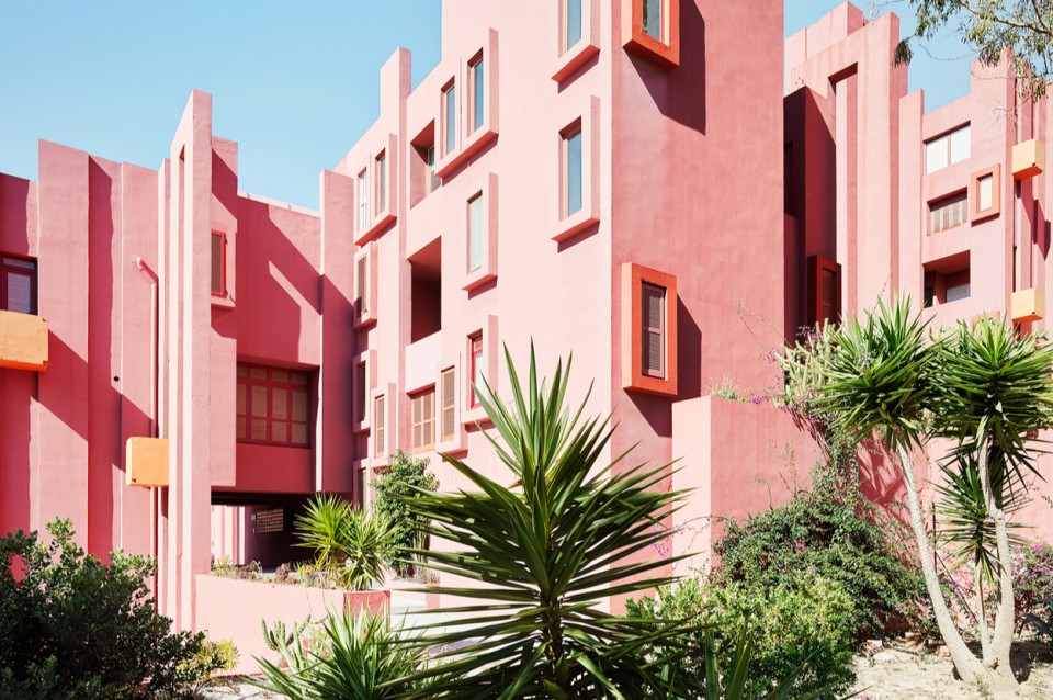
7. Ricardo Bofill

This Spanish architect specializes in housing projects such as El Sargazo Apartments, Gaudi District, Kafka, Castle, and many other designs often referred to as surreal. Bofill applies a single solid color to his designs and transforms multi-story buildings to create dramatic forms. His use of color often contrasts with the surrounding landscape.

sumber: 7 Arsitek